30 March 2010

Creating the blueprint tutorial

The last step to finishing this image is to have the guys holding a blueprint as requested by the client. The Pen tool is the best way to go about this. Many tutorials would suggest using it to make a path, then load a selection, and fill it on a new layer. However, there is a better way that leaves you with a shape that is much more editable with fewer steps.

Start with the Pen tool, but check the option at the far left of the Options bar to make a shape layer instead of just a path. There are so many benefits to working with a vector shape in Photoshop. As you can see, you can build it so that it extends past the edge of the image. This way, Layer Styles will follow the edge of the shape, rather than the image. PMS 642 was used because it's a good color for blueprints and has a nice range of light to dark. An Inner Glow and Gradient Overlay were added, both in Multiply mode using dark blues from the same range as the 642. Noise was added to the glow to give the paper some texture. A reflected gradient was used to darken the sides, giving the blueprint a bit of a curve. To complete the look, add a new layer above the vector shape layer, hold down ALT/OPT and click between the two layers to use the bottom one as a clipping mask. Render the Clouds filter on the new layer with PMS 643 and white as the foreground/background colors. Set the layer's blend mode to Multiply so that the white becomes transparent. Lower the Opacity to 60%.

To create the rules on the paper, duplicate the blueprint shape layer and move it above the clouds layer. Transform the layer to make it smaller than the paper. Because the shape layers use vector masks and are resolution independent, you can transform them over and over without any loss of quality. Use Layer styles to give it a stroke of dark blue and Inner and Outer Glows of dark blue in Multiply mode. To make the fill of the shape transparent but keep the effects, lower the Fill (not the Opacity) to 0%.

For the drawing to go on the blueprint, the client provided a black-and-white schematic. That image was dragged into the final illustration. Change its blend mode to Multiply to make the white transparent. To make it look like it's actually on the curving paper, use Transform and then Warp. With this option, you can move the corners independently like Distort, but you also have control handles that allow you to curve or envelope the sides. Move the points and adjust the sides to mimic the curvature of the paper. Don't worry about being too exact, so when it looks good, apply the transformation. To make the schematic blue, add a layer above it and use the schematic layer as a clipping mask. make a selection on this empty layer that covers the schematic,  fill it with PMS 654, and set its blend mode to color. The schematic is now blue, but it's a bit too dark, so lower the opacity of the schematic layer to 80%.

For the final touches, shadows were painted with PMS 296 on a layer set to Multiply. Lower its opacity until it looks good. The edge of the paper curling over was done with the pen tool to make a new shape layer with PMS 642. A little Inner Shadow effect was added to turn the curve. The last step is to add yet another layer in Multiply mode, clip it to the curling paper, and paint just a hint of shadow from the guy's arm. That should do it.

Stay tuned so see what I can come up with for next month's tutorial.

22 March 2010

Painting people tutorial

Drawing and painting people accurately is one of the greatest challenges in art. This is one area where doing it digitally doesn't offer many shortcuts. But we can apply many of the principles used for other subject matter here as well.

Unless you are an unbelievably talented artist, working from photos is crucial to drawing human figures and faces correctly. Here you can see the photographic source material for the guy on the train, scaled down to about the right size. Work on a new blank layer to paint a flat silhouette of the figure. Don't tell anyone, but you can put your photo in the exact spot you need it, then trace over it. Pick a midtone color that is related to any noticeable areas of large color in the photo. In this case, it's PMS 5405, a good choice as a base for denim. This layer will act as a clipping mask for the layers of detail painting. Add a layer mask to it, load a selection from the railing mask or alpha channel by CMD (Mac)/CTRL (PC)+clicking on its layer or channel thumbnail, and use it to paint black on the silhouette's layer mask where the rail covers up the guy. Since the other layers clipped to this one will use its layer mask, you won't need separate masks for each one.

Create new layers, clip them to the bottom layer with the flat silhouette, and get painting. I'll be using my favorite brush again, the 9-pixel thin pencil brush with the Opacity jitter set to Tablet. Size the brush up and down as needed by tapping the left and right bracket keys (just to the right of the P). You can pick colors directly from the photo if you want to. Hold down the ALT/OPT key while painting to turn your brush into the eyedropper temporarily. When picking colors from photos, it's a good idea to check your Sample Size. Select the eyedropper from the Tools panel and look at its options. Make sure the Sample Size is set to 3 by 3 average or higher. Because photos contain so many different colors, you may not want to pick a color from just one pixel. This option averages out that pixel with the pixels around it, so what you get is a more accurate representation of the blend of colors in that area. The more color noise in your photo, the higher this setting should be. Break your details up into layers. I used one for the hands and head, one for the pants and shirt, and one for the orange safety vest.

Paint the reflective stripes on a new layer not clipped with the rest because they need to be their own clipping mask. Add an Outer Glow to simulate the light this tape can reflect back. You can use the standard yellow color for the glow, but change the Blend Mode to Linear Dodge to make it really intense. This effect is a bit exaggerated, but it looks cool, and isn't that what it's all about? You may need to load a selection of the opacity of the main silhouette layer and use that as a mask on this layer so that the stripes don't stick out past the edges. Make a new layer and clip it to the stripes layer then add a few quick light and dark swatches to indicate the highlights and shadows on the folds of the tape. Now, the workman needs a hardhat, because you never know when something is going to fall on your head while you are on a train. The same approach was used for the hat. Put it on its own layer not clipped to the rest; that way, you can extend it past the edges of the head. Paint it as a solid color, then add the highlights and shadows on a new layer, using the bottom on as a clipping mask. That should do it. Just to keep things organized, put all these layers into their own group.

Now, it's time for the closeups. Since these are not really portraits, they don't need as much effort put into them. It's not a likeness, so there's no need to worry if it looks like your source photo or not; what's more important is correct anatomy.  Start out with a flat base layer. For this guy, it's PMS 7516. All of the skin, face, and hair detail was painted on just one layer using the base layer as a clipping mask. I Did put a subtle dark to transparent gradient in Multiply mode as an effect on this layer to slightly darken the figure toward the back. All the upper layers clipped to this one will 'inherit' this same effect. If this had been a serious portrait, more time and effort would be required and several layers should have been used to allow for minute adjustments. Colors were picked directly from the photo. The shirt and vest were painted on separate layers also clipped to the base layer. Just like on the guy riding the train, paint the hardhat on a new layer not clipped along with the others. It will serve as a new clipping mask for the details above it. This is a yellow hardhat, so I used PMS 116 as the base.

You can try another little Layer Styles trick for the shadow cast by the hardhat. Load the opacity of the base hardhat layer as a selection, make a new layer above the painted face, clip it along with the others to the 7516 base, and fill it with a dark yellow (the color doesn't really matter). Then, add a Drop Shadow effect along the bottom of this shape. Because this layer uses the base as a clipping mask, not only do you not see any of it that sticks out beyond the original silhouette, but you don't see any effects outside of it, either. This is easier than trying to paint in the drop shadow and it is adjustable. The reflective tape stripes were added on a layer above all these ones just like on the train workman. That about does it. The other guy was painted using the same techniques. If the job requires it, logos can be added (and then later removed as the client requests) on separate layers above the hardhats.

15 March 2010

Painting the final details tutorial

Now it's time to finish this part up. We need to paint on the final details to make it look as realistic as we can. Rails tend to look rough and rusty, except on the top, which is polished smooth and shiny by the continual movement of the wheels over it, so it reflects the color of the sky. Make a new layer to do some quick, loose painting. The mask is the alpha channel of this geometry that was rendered from Cinema 4D. The next layer is for shadows. I painted those with PMS 296 on a layer in Multiply mode and used the same alpha channel for a mask. The next layer is for the pieces at the intersection, called a frog because they supposedly look like a frog (I don't really see it, either). Now the rails are looking done. The last details like the clips that hold them down can be added. As usual, the main shape was created as a solid color on its own layer, then the details were painted on a layer above it, then clipped to the bottom layer.

For the railing, I used the rendered alpha channel and used it as the mask for this layer. Notice how the painting can be very loose and indistinct and yet with the clean edges of the mask and the 3D render underneath, it looks okay. Depending on the complexity of the model and its overlapping areas, several alpha channels may have to be rendered. But this will be enough and the other details can be added on separate layers.

Whenever possible, try to use vector shape layers to keep clean edges and maximize editability. For the framework around the screens, start with the Rectangle tool. Make sure the Shape Layers option is chosen at the upper left of the Options top bar. After making the rectangle, hold down the ALT/OPT key to subtract from the current shape and put holes in the rectangle, making it look like a frame with crossbars. Use the Path Selection tool (the black arrow) to select all the separate shapes on the one shape layer. Now you can copy and paste these shapes or just ALT/OPT+drag them to make a copy. Notice that with the Path Selection tool active and paths selected, some very helpful options become available. A number of Align and Distribute buttons can be used to make sure the shapes are evenly spaced out. Click the large Combine button to combine all the separate shapes into one path on the shape layer.

Now that the paths are all one and the unfilled areas hanging out below are gone, it is easy to transform the frame. Create some lines on an upper layer to serve as perspective guide lines. Follow the angles of the 3D geometry. Use Distort and Skew to match the edges to the perspective lines. Then add some Bevel & Emboss and Inner Shadow layer styles to give it some dimension. A layer clipped to it is used for some quick scribbles to add hints of dirt and rust. The shape on the screen layer was filled a fence pattern, then scaled down and transformed to match the frame. A Color Overlay adjusted the color and a Stroke thickened it up a bit.

Now, it just needs some final details to finish it off. I didn't bother to build and render these in 3D because they are fairly simple. You can create them in Photoshop as vector objects on a shape layer. With layer styles, add a Gradient Overlay and Inner Shadow. In this case, the shadow is really going to be a soft highlight. Change the Blend Mode to Color Dodge and pick a light warm grey. Use a reflected gradient with the same light grey in Color Dodge to add the wide highlights on either side. Now there is a soft shadow going up and down the middle. The painting was added on an upper layer using this vector shape layer as a clipping mask. You won't need to paint much on this details layer; just indicate some dark smudges and streaks. I did this exhaust pipe and the canister behind it in the same way. This should do it; the train, rail, and tracks are done. In the next tutorial, I'll cover how to paint some people into the scene.


09 March 2010

Painting and texturing the 3D render tutorial

The object I had to illustrate for this image was quite complex, so I decided to build a simple 3D model of it to take care of the perspective and major shapes. I used Cinema 4D to build my geometry and give it some simple materials. It was rendered with global illumination and with an alpha channel. You may need to render out several alpha channels, depending on the complexity of your models. It looks pretty good, but it's a bit dark and it doesn't mesh so well with my painted background.

The first thing to do is to load the alpha channel as a layer mask. That's why alpha channels are so important when you do your 3D render.  Since the image came out a bit dark, you can add an adjustment layer. I also added a color pass layer on top that brightened it up quite a bit. Do whatever color and value adjustments you need in Photoshop to get the render to match your background. The rendered image will be a base layer that the adjustment and painted layers will use as a clipping mask.

Start painting the wood texture on the ties. I used my favorite pencil thin brush again. The ties already had a wood material applied in Cinema 4D, but it didn't look so great and it was going the wrong way. I did a bit of loose painting to suggest the rough wood grain. This layer was clipped along with others to the render layer, so it was using that mask, but it needs one on its own layer so that the painting doesn't cover up the rails. I rendered out an alpha channel channel of just the rails, then loaded its selection to use as a mask on the ties painting layer. Invert the mask so that the rails are black and the background white. Now the painting doesn't cover up the rails. Since renders can be very time consuming, you can turn off options like textures, lights, ambient occlusion, etc. when rendering alpha channels. This will save some time. 

Continue painting other details on additional layers. Multiply mode works well for dark areas. For the solar panel, work on a new layer. Start with a simple shape with lines drawn across it. The final look is achieved with Layer Styles. The bright glare comes from a gradient overlay, using a light blue in Color Dodge blending mode. Using this mode with light colors is a great way to simulate luminosity or strong, specular highlights. 

The final details will be painted in on the top layer. Use small brushes for the most part to hint at the details that aren't in the model. You can also try some scatter brushes to suggest dirt or rust. This is how the painting looks on its own layer. You can see that it relies heavily on the 3D model underneath. The train and tracks also need some shadowing to tie them into the background. Right now, they look like they are floating above everything, so they need some shadows. For outdoor sunlit scenes, I like to use PMS 296 to give the shadows a bit of blue. Shadows are rarely pure black; warm lights will cast cool shadows. Since they are outside of the alpha channel, put them down in the ground group above the ballast layers. Use Multiply mode, which will darken the underlying layers, while letting some of their details show through. Remember that shadows are darker and sharper the closer they are to the object casting them and get lighter and softer as the distance increases. 

Now you can see how it is all coming together. The crisp, clean lines of the 3D model are softened and made to look less perfect and uniform. There is a bit of looseness which matches the look of the background. As a final step, note that all the layers of the train and ties are inside a layer group. Add a mask to the group and you can paint out the edges of the ties so that it looks like they are sunk into the ballast. Doing this on the group's mask keeps the mask made from the rendered alpha channel pristine. I try to avoid painting on these masks. What is really cool is that layers like the ties painting are being affected by three masks at the same time: the opacity of the bottom layer they are clipped to, their own layer masks, and the mask of the entire group. This allows for a great deal of flexibility.

In the next tutorial, we will continue with the details and finish off the train and rails. 

06 March 2010

Painting the background tutorial

As with most of these images, I start them 9x12 at 300 ppi. It can end up being a large file, but most are used primarily for print and this size gives me a bit of leeway for fullpage magazine ad sizes. I always begin with the sky, as this gives the overall mood for me to build on. The base layer is PMS 542 and I added a gradient of PMS 290 on a layer above it in Screen mode. Since I wanted a very light, almost overexposed look for the sky, I kept duplicating that layer until got the effect I wanted. Notice that the horizon is basically blown out to pure white. Then I added a light cool grey gradient on top.

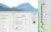
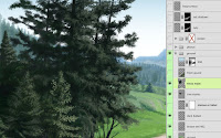
Next come the mountains. Start out on a new layer and paint the silhouette with a periwinkle blue color. Add an Inner Shadow effect to that layer. This is to simulate light wrap from the sky around the edge. Set the Angle to 90 so that the effect is just along the top. To make it more of a glow instead of a shadow, change the Blend Mode to Screen and pick a light blue. Remember that shadows do not have to be dark. Adjust the Size and Opacity to your own tastes. Paint the details like trees, highlights, and shadows on a separate layer that is clipped to the base mountain layer. That way, these details will 'inherit' the effects of the bottom layer. If you like, you could also add Color and Gradient Overlay effects to the bottom layer to push the mountains further back.

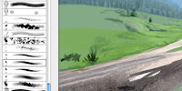
At this point, perhaps I should say something about the brush. My favorite brush and one that I use at least 75% of the time is one that comes with Photoshop. It's a 9-pixel thin pencil brush, found in the Natural Brushes 2 set. For me, the regular round brushes are too uniform and unnatural. I like this one because it has a bit of an organic shape that sort of mimics a real brush. Of course, it needs some customizing, so set the Opacity Jitter to Pen Pressure and use your tablet and stylus.

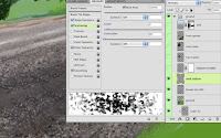
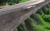
The painting is fairly loose, especially in the more background areas. The foreground areas naturally need more attention and detail. Painting all the rocks under the rails (called ballast) requires a special approach unless you want to paint each one individually. I  certainly wouldn't. This is the perfect time to use a scatter brush. I'm still using my favorite brush, but I made another version where I added Size, Angle, and Roundness Jitter to the Shape Dynamics, then cranked the Scatter all the way up to 1000% on both axes. This is a great way to paint rocks, gravel, sand, or other bumpy textures. Just pick various dark and light greys and have at it. Reduce the brush size and paint with less pressure as you get farther away. I added a layer in Color mode and painted on it with PMS 462 brown to tint the rather colorless rocks underneath. Rocks will always have some interesting colors scattered in them, so look for these opportunities to add color whenever you can. The end result is pretty nice and would be next to impossible without a scatter brush. You may need to do some detailed manual touch-up in the extreme foreground, but that's about it. Finally, I added another layer in Multiply mode and painted some dark scattered rocks.

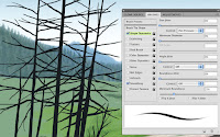
Not much more can be done here until the tracks are in, so we'll hold off on that for now. But it's time for some trees. On a new layer, paint the trunks using PMS 426. This is a very dark warm grey, almost a brownish-black. The trunks and branches won't need much detail because they will be shadowed and covered up by the leaves and greenery. To paint them, use the good old thin pencil brush, but this time with the Opacity Jitter turned off and the Size Jitter set to Pen Pressure. This is one of the few times I don't use the sensitivity of the tablet to control opacity. In this case, pressing down will give you the thicker trunks, while easing up on the stylus will create the tapering of the branches as they grow out from the tree, all while keeping the opacity constant.

Now it's time to paint the leaves, nettles, or whatever. Scatter brushes work well for this. Try some of Photoshop's Natural Media brushes and customize them by adding some Scatter and Jitter to the Shape Dynamics categories. Don't forget to set the Opacity Jitter to Pen Pressure. You'll see that the trunks and branches mostly get covered up in these kinds of trees, but they still provide the necessary underlying structure. I have found that very dark greens are needed to paint trees. I usually start out too light and have to end up going back in with darker colors. For the final touches, choose a small brush with no Scattering and paint some more definite leaves.

At this point, all that's left is to paint the foreground grass and bushes. Surprisingly, I have found that Photoshop's own grass brushes do a pretty good job of painting near grass, of all things. Just uncheck the Color Dynamics and make sure the Opacity Jitter is set to Pen Pressure. The only problem is that they are extremely large, so you'll just have to size them down. You may notice that I started out with a large brush and quickly scribbled in hints of highlight and shadow on grass and bushes. Then I went back with a smaller brush and painted the details. I used some scatter brushes along the way as well. Some of the foreground and even the midground are left unfinished because I'll be putting in things like the tracks, train, and people, so I'm not worried about finishing everything off here. Remember that in professional situations time is money, so don't spend any extra effort that you don't have to. For the next tutorial, we'll put in the 3D rendered items and start painting them.

01 March 2010

Advertising excellence award

Last year, I created an illustration and did the ad layout for one of my primary client's major clients (don't ask). I started by building simple geometry in Cinema 4D since the shapes were quite complex. The rendered image was brought into Photoshop for painting and texturing, then I did the final typography and design in Illustrator to create the press-ready PDF that was sent to the magazine.

Recently, I was notified that this ad won an Advertising Excellence Award in a survey conducted by the Baxter Research Center for Progressive Railroading Magazine's September 2009 issue. Not exactly life changing stuff, but it's something. Apparently, it placed third for most read ad, even though it was on page 69 of an 80-page publication. The higher placing ads were no further back than page 32 of the magazine, so where your ad happens to be plays a major part in recognition by readers.

This illustration is not one of my personal favorites, but it has some good stuff in it and I went about things a bit differently, so I should be able to pull some helpful tutorials out of it. The final ad actually has five different images in it: four smaller inset images over the background, but I'll just be concentrating on the main image. Most of the insets were actually done much earlier and then reused for this ad. If I can get away with it, I do this as much as possible if I need to save time. These images are time- and money-consuming to create in the first place, so the cost can be amortized out over several projects if the images can be reused.