30 September 2010

Finishing the illustration (5 of 5)

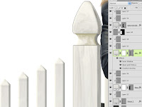
Our last step is to finish up the fence and gate by painting them to match the rest of the image. It shouldn't take long, so let's get to it. Paint on a new layer clipped to the base vector Shape layer. Use darker cool greys. Paint PMS 126 on the top layer in Multiply mode to blend the bottom edge into the background color a bit. All the fence posts will be painted in this way. Very loose, simple strokes will hint at the wood texture and weathering from the elements. The Gradient Overlay is 123 to transparent in Screen mode. This lightens the top of the fence and brings in a bit of the background color. Tying all the elements together is important in order to have an image that works as a coherent whole.
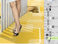
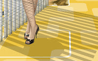
Some cast shadows will attach the main post and the feet to the ground plane. Fore the fence shadows, you can use a different vanishing point than the one you used for the sides of the slats. Use the Polygonal Lasso tool to make the selections and fill them with 418. Use the Elliptical Marquee to make some ovals under the feet. Right+click on the layer and choose Convert to Smart Object. Change the layer's Blend mode to Multiply and lower the Opacity to 40%. Add a layer mask and put a black-to-transparent linear gradient to fade away the edges. Then put a 10-pixel Gaussian Blur on the layer. Since it's a Smart Object, you can add a mask to the filter. Put a gradient on this mask to fade away the effects of the blur at the shadow's origin: the gate. Shadows will get softer, blurrier, and less dense the farther away from the source they get. You can accomplish this with the mask on the layer and the mask on the Smart Filter. Use the Masks panel to lower its Density to 50%. Now the origin of the shadow has a bit of blur. This great feature was introduced in CS4. There is slightly more accurate way to do this, but it takes a lot of steps. Maybe we'll cover it some other time.

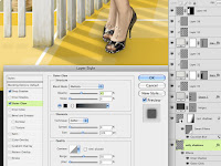
To really connect the shoes to the ground, make a new layer and use the Polygonal Lasso tool to create selections for where the bottoms of the shoes contact the ground. Fill it with a color and use Layer Styles to give it a hint of drop shadow and an Outer glow in Multiply mode. Use 433, the same base color as the shoes to add some scatter shadow. These effects will really help the shoes look like they are making contact with the ground and not just floating in the air. You can also put a hint of soft shadow under the fence slats, but since they are farther away from the ground, it's not that necessary. The illustration is now complete.

26 September 2010

Painting the clothing (4 of 5)

Now it's time to move on to finishing the clothes. There is a bit of a challenge here because she is wearing black and white, but this can be overcome if you remember this simple axiom: Black isn't really black and white isn't really white. These are the absolute extremes in value and you should stay away from them in most circumstances. White usually represents the brightest level of illumination and black is the darkest possible shadow, neither of which is really the general value of clothing (or anything else, for that matter).

To show you how this works, paint the flat overall jacket shape with PMS 433. Using Pantone grey colors is really helpful because there are a wide variety of greys from which to choose. In real life, there is rarely anything that is completely greyscale; most greys have some color in them. 433 is the darkest value in its color ramp, but it's not quite black. That's what we are looking for here. Pick colors that are a step or two lighter from this same ramp and paint in the highlights on a separate layer clipped to the 433 layer. Use a light touch and don't paint anything too bright. This is black, after all.

To finish it off, make a new layer for shadows and change its Blend mode to Multiply. Use 433 to paint the shadow areas on this layer. You might be surprised, but it is darker than the 433 on the underlying layer. That's because any color multiplied against itself will get darker (except for white, which can't be multiplied). Some parts on this layer may end up being close to pure black. If the jacket needs a little something more, make a new layer in Screen mode and paint in a few highlights with 123. Just like before, we are bringing in some background color to tie things together. That should do it; because the jacket is so dark, it doesn't need much in the way of painted detail.

Let's not forget the buttons. They are a nice little detail and should be fun to paint. Paint them with 432, one step lighter than the base jacket color. You could use the Ellipse tool to build vector shapes for them, but painting them would be quicker and we are going for a loose, painted look here, not crisp perfection. Paint the details on a new layer, using the bottom one as a clipping mask. All you need to do is just suggest some shapes. You can pick colors directly from the image. Make sure to put in a few points of specular highlights to show the shininess of the buttons, just not too bright.

Finding the base color for the white skirt was trickier because it needed to be a  very light cool grey with a hint of blue. I eventually settled on 7541. The shadows where painted on a separate layer with 441, but since it needs even lighter greys than that, you will need to paint very lightly and then start picking colors directly from your image. Notice how the bottom strip was left unpainted to suggest the hem of the skirt. The highlights were painted on a new layer in (you guessed it) Screen mode. Use Cool Grey 3 or 4, painting very lightly. Painting highlights with just a bit of color yields much better results than just using white. Keep the details loose and just try to hint at the pleats and seams. It doesn't need much more.

The shoes need to look smooth, dark, and shiny. Paint the base layer with 412. Even though they are black, their color and texture need to look sufficiently different from those of the jacket. As always, paint the detail on a new layer. Shiny shoes will mainly just need some intense highlights. Because the ground plane is yellow, pick some colors from it and lightly paint into the bottoms to show that they are reflective. The top highlights should be painted with a light cool grey. On a new layer in Screen mode, paint over the highlights with 123 to put some yellow back in. Color Dodge might seem like a good idea here, but that Blend mode won't be visible over black or very dark colors. Finally, paint some shadows on a new layer in Multiply mode. You can use 412 or some other dark color; it will probably end up being black anyway. Now we are done painting the black jacket and the white skirt, but there is probably very little pure black or white in the image, aside from the background. That's the way it should be; reserve those extreme values for the few places that really need it. 

25 September 2010

Painting the hair (3 of 5)

This lady obviously spent a good deal of time (or money) getting her hair done for this shot, so we need to make it look nice. It's red hair, so the color can be a bit tricky, but we can make it work.  The best way is to start with a medium value and then paint darks and lights on top of it. This is a good technique for painting in general. In this instance, PMS 730 was a good choice. To add a bit of red, use a range from 4695 to 4755 to paint in the light and dark values. You can use the same brush for all of this, but some areas on the hair might need a bit of a softer edge. Photoshop has a great selection of chalk and pencil brush shapes that should work. The key here is to paint with very light pressure, gradually building up the color. After a bit of painting, you can pick colors right from the image (hold down ALT/OPT to temporarily get the Eye Dropper) instead of going back to the PMS library. For the highlights, use 123 as before and change that layer's Blend mode to Screen.

It's looking good, but something is still missing. In the photo, there are some really intense highlights on the top of her hair that really give it a golden sheen. We need to try and replicate that. Use PMS 471 for some intense, reddish-orange color. Blend modes can help give the look we need, but Screen just doesn't quite cut it here. If you really want some intense  highlights or luminosity, a good mode to try is Color Dodge; it's like Screen on steroids. That's a bit better, but too intense. Try lowering the Opacity and Fill to tone it down. For some reason, Fill works a bit differently from Opacity here. It tends to give some saturated color as it gets more transparent. I ended up with an Opacity of 80% and a Fill of 70%. As a final step, one which I almost forgot as I was working on this illustration, she needs a suggestion of ears and hair right next to the face. Work on a layer behind the skin and paint a hint of an earlobe on the left (her right) side of the face and some darker shadows.

You may have noticed that I didn't quite finish the neck area, but there is a necklace that needs to be painted in. Make a new layer above the skin layers and paint the overall shape in PMS 428. Add some Inner and Outer Glows and a Drop Shadow to make it stand out. They should all be using Multiply mode and the Outer Glow should be quite subtle. Paint the details on a new layer clipped to this base layer. For the little specular highlights, work on a new layer in Color Dodge mode. Paint with a light cool grey to add that little sparkle of light. These are the fun things to paint; we artists love stuff like this. Tune in next time when we turn our attention to the clothes.

23 September 2010

Painting the skin (2 of 5)

With the basic shapes laid in, it's time to start painting. This woman has red hair and a light, yet ruddy, complexion, so the coloration is a bit tricky. A good choice for the base skin tone is PMS 475. Start painting the details on a new layer that is clipped to the main skin layer. Use the same brush and settings as you used on the flat basic shapes. For the facial features, pick colors from the 475-469 ramp. For some variation, you can try some other browns as well. The 483-489 ramp has some nice warm reds that work well for lips and cheeks. Notice how I am following along with my source photo, but I decided to minimize her double chin. I doubt she really wants to see it and I suspect that it's more a product of how she is smiling than anything else. The darker colors are painted on a separate layer and the eyes and mouth are painted on a layer above that. So far, everything has been done in Normal mode with a light touch on the stylus to get lots of transparency to the painting when needed.

To finish things off, let's add some highlights. Since the background is yellow, pick a light value from the same PMS ramp. In this case, it's 123. That may seem a bit strange, but change this layer's Blend mode to Screen and you'll see how light the color gets. It works nicely as a highlight and it brings a subtle hint of the background color into the figure. That will help to tie everything together. This is an area where you can have some fun and punch up the highlights even more than what is in the photo.

One more thing: our subject has freckles. You can choose to include something like this or not, but since I was going for personality and a good likeness, I decided to keep them. We don't want to have to hand-paint every one, but Photoshop's brushes should provide a good shortcut. I used my favorite Pencil - Thin brush, but I made a duplicate of it with a lot of jitter in the Shape Dynamics categories, but the most important here is Scatter. Make the brush size quite small and paint lightly on a new layer with PMS 484. Change the layer's Blend mode to Multiply and lower the Opacity to 40%. You can also add a layer mask and put some black radial gradients on it to fade them out around the center of the face. Now they are concentrated on the edges and the neck. I think it's a nice look, and hey, I like freckles.

In case you're wondering if I had forgotten about the legs, well I haven't. The face and legs use the main base 475 layer, so all the leg details are painted on the same layers (except for the eyes and teeth layer, of course). Here is what the painting progress on the legs looks like. As I was working on them, I was a bit worried, but for some reason, the freckles layer seemed to make them look finished.

Last but not least, the hands: one of the trickier parts of human anatomy to draw. The other skin layers are underneath the clothes layers, but the hands' base is painted on a new layer above the jacket. Other than that, they are done in the same way as the rest of the skin, with detail, highlight, and freckles layers clipped to the main 475 base layer. The selection shows how I masked out where the hand are covered up by the jacket. Now that the skin is done, in the next tutorial, we will work on the hair.

22 September 2010

Creating the background (1 of 5)

This illustration is one of a series I am currently working on. The people and props will change, but the background will remain constant. It needs a ground plane receding into the distance, so you obviously know that you will start with a straight-on image with right-angle corners. You will use your own, but here is mine. Now for the important step: Once the image is created with all its layers, convert it to a Smart Object. This is so that any transformations or filters you apply will be non-destructive.

Transform the layer with Scale and Perspective. You can see that for this view, the object you need to transform must be much, much wider. Also, remember to Scale it down a bit vertically. Most people forget, but when things turn away so that their parallel lines converge, they are also getting foreshortened and need to be shorter. As a final step, add a simple linear gradient on a layer mask to fade toward the horizon. Even with this extreme transformation, all you have to do is double-click on the Smart Object's layer thumbnail to edit the original version. Just save the PSB and your original  image updates. That is so cool.

Now it's time to start painting the figure. To do this well, you will need a good source photo. Why not just use the photo, then? I have been asked that. Well, with a digital illustration, I can work at the size I want, fix any problems (we'll see that later), and the image has greater flexibility for changes in the future or use across multiple media. Plus, illustration is just intrinsically cooler. For a digital painting, you might think that you just make a new layer and start painting away. Well, there's more to it than that. Photoshop allows a great deal of flexibility, so we want to take advantage of that.

Start by giving each basic shape of the figure its own layer. Put the hair on its own layer, the skin on its own layer, and so on. For this painting, each distinct color is on a separate layer. As usual, start with PMS colors. You could make these flat shapes with selection tools or the Pen, but I like painting them out by hand; it gives the edges a more natural feel and we're going for a painterly approach here. No surprise, I used my favorite Photoshop brush (Pencil - Thin pressure) with the Opacity jitter set to Pen Pressure and I adjusted the size as needed while I was painting. You can do what you want.

For this concept, she had to be standing at an open gate. You could paint this as well, but it seems like a perfect job for Photoshop's vector tools. Use the Line or Rectangle tool to make a thin, vertical bar on a new Shape layer. It's supposed to be white, but use cool grey 1. White isn't really white, anyway. Select it with the Path Selection tool, then click the top with the Pen tool to give it an extra point. You have to use the Convert Point tool to make it a corner point, because Photoshop still always gives you curved points with this method. Then select the new point with the Direct Selection tool (the white arrow) and move it up a bit. Presto! Now you have a fence section that would be uncomfortable to sit on. Duplicate this shape as many times as you need, select them all, then click the Distribute horizontal centers button to space them out evenly. You can then use the Direct Selection tool to select the top three points and move them up incrementally to create the curve at the top.

After that, the rest of the fence should be easy. Use vector Shape layers and add some layer styles: a bit of Inner Glow in Multiply mode and some Bevel and Emboss and Inner shadow to give them a bit of depth and highlight.

For the open gate, create the vertical pieces using the same techniques as the fence. Use a darker cool grey, since it is turned away from the light. Make some perspective lines that converge at the horizon, then Skew it into position, using your lines as guides. Remember to Scale it down a bit horizontally to account for foreshortening.

It looks good, but quite flat, since it's only the front face of the gate and now we need the sides. You'll have to do this on a new layer and you'll need a lot of perspective lines. The Pen tool is probably the easiest way to make this shape. Use cool grey 2 and build a vector shape that zig-zags at the top and bottom to match your perspective lines. After it's built, you may need to zoom in and do some fine adjustment with the Direct Selection tool. Now that the solid shapes are done, it's time to start painting. We'll cover that in the next tutorials.

20 September 2010

Painting a figure tutorial

For this month's tutorial, we will go in a different direction. If you have looked at my blog or portfolios at all, you will see a lot of architectural and industrial illustration. But as illustrators, we need to be able to tackle anything that comes our way. Here is an image where I had to paint a person. Not only that, but it was a specific likeness, so it's a portrait, if you will. Even worse (here it comes) it was of a woman. Why do I say that? Well, women are harder to paint than men. Generally, they need to look beautiful, feminine, and soft. This requires a different and more subtle approach than what you would do for a man. And please, don't shoot the messenger, but women seem to be a bit more sensitive about how they are depicted; maybe it's just our culture. Anyway, This is the image I painted that was used as part of a series in a magazine ad campaign.

In my next post, I'll start breaking the file down and show you how it was done.

11 September 2010

Speaking at the North Bay Adobe Users Group

I will be the featured presenter at the North Bay Adobe Users Group's monthly meeting. It will be held on the last Monday of the month (as usual) at Santa Rosa Junior College. I will be talking about using Photoshop for digital illustration and demonstrating a couple of the projects that are on my blog. I will also go over a few new features of CS5 that may be of interest to artists.

If you happen to be in the San Francisco North Bay area that Monday afternoon, I invite you to drop by; it's always fun. Click here for details, times, and directions.

01 September 2010

Good news, everyone!

This comes as quite a surprise to me, but tomorrow I begin teaching at the Academy of Art University in San Francisco. They were looking for a Photoshop expert to teach some classes this fall, so I interviewed with them on Friday and now I start working. I'll be teaching four sections of Digital Imaging 2, an undergrad class. Hopefully, some of the tutorials on this blog will make their way into my classroom.