It's finally time to take a look and see what I accomplished in the previous year. As it stacks up, it doesn't seem like a lot, but I did a lot of image prep, production, and video work that doesn't show well for an illustration blog. I also did a lot of work on product development that I can't quite show yet and I have some personal work that's still in progress. But here's what I have done.
Okay, so it's not very exciting, but this is a frame from an animation showing another ground cutaway. In this case, the machinery is rendered, but instead of a realistic background, a schematic of the different soil types is shown. This was partially a stylistic decision and partly to keep the cost down.
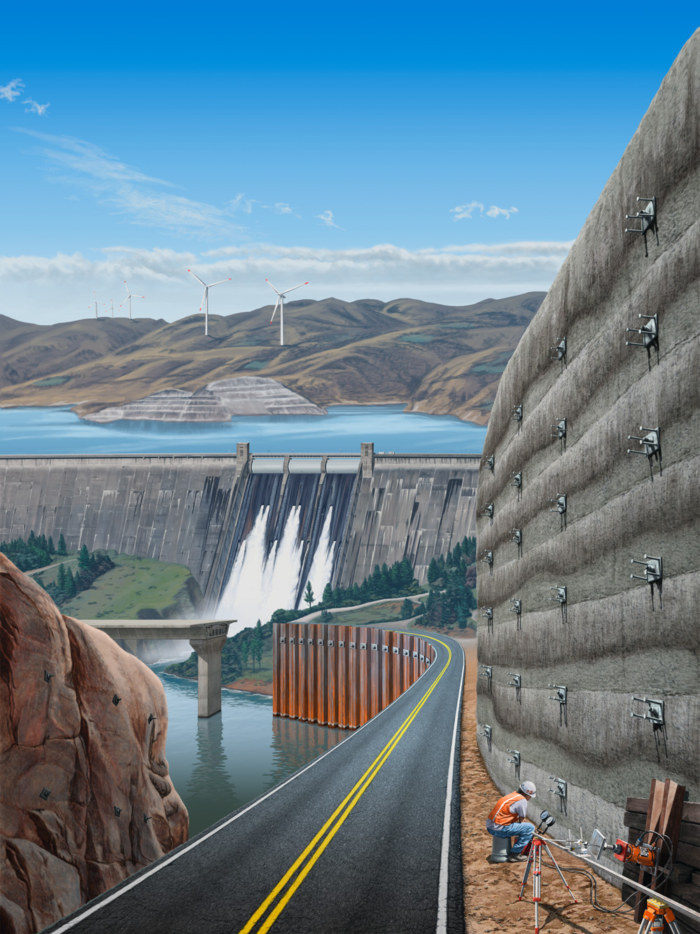
I guess this one is my big illustration of the year. As usual, it's showing geotechnical onsite applications. This one was for an anniversary publication for this company. The problem here is that I had to cram a whole bunch of different applications into one image. This one needed a dam with a lake in the background, windmills in the distance, a bridge, sheet piling along a road, rock anchors on a cliff face across the river, a shotcrete wall with soil anchors, and measuring equipment in the foreground. It's obvious that no one image could ever include all of this in reality, so I have to try and fit it in as best I can. I did what I could. It won't win any awards, but it does what it needs to and the client liked it. I like specific areas of it. For example, I like how the dam turned out. The guy and testing equipment near the bottom look pretty good as well, but the whole thing just doesn't come together. In this case, the whole is definitely not greater than the sum of its parts.
Here's a screenshot from another animation. I was working on some of these for a long time, not because they took so long to do, but because there were pauses in the process and it took the client a long time go make decisions and answer questions. There was government funding somewhere along the way and that just makes things much more complicated. This one shows a seismic process where these hammers and devices are put down boreholes to measure soil density or something. I just remember it took a long time to get our questions answered about what they actually did and how to depict it.
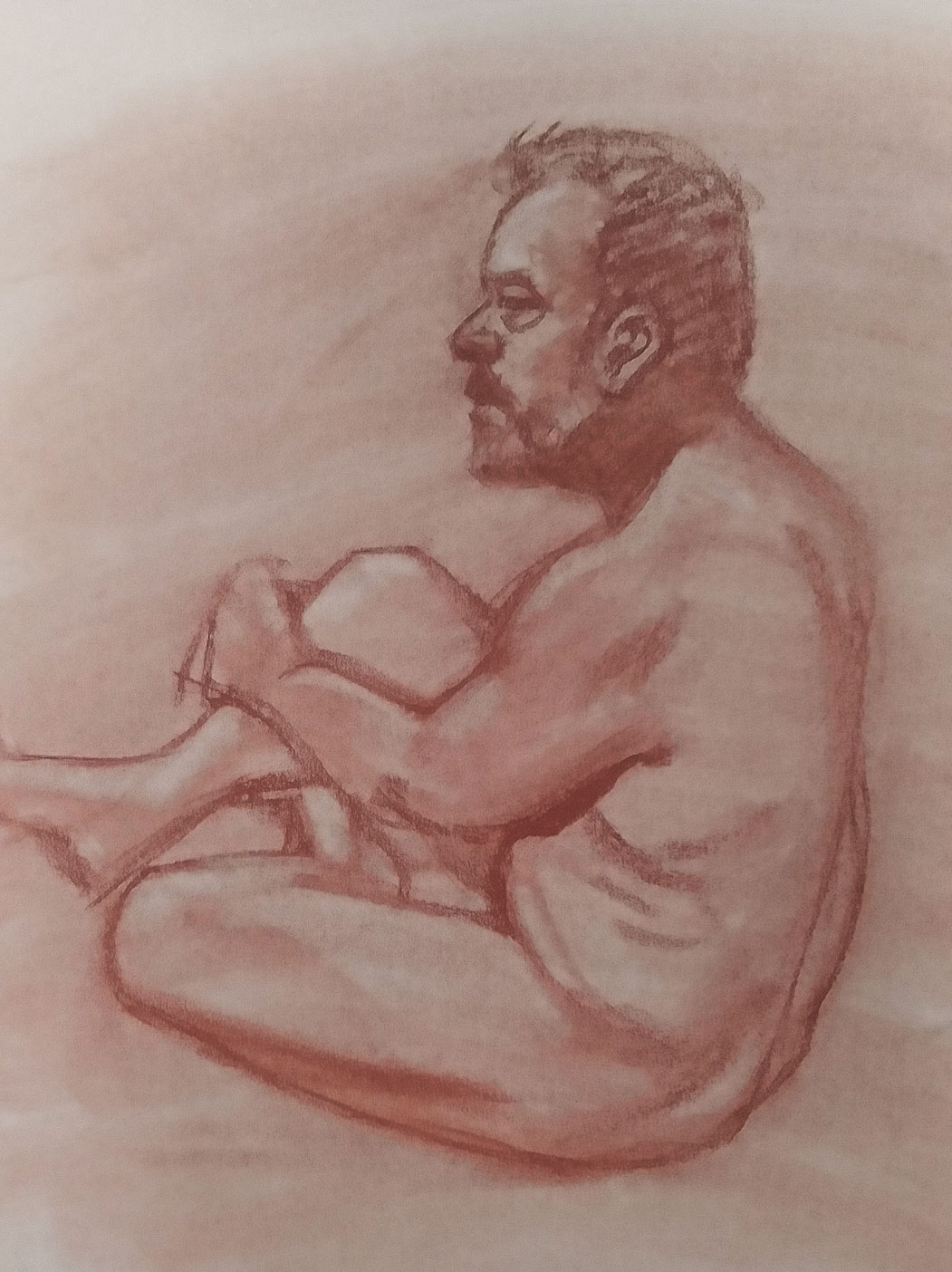
Once again, I taught Life Drawing over the summer. In addition to teaching, my responsibility has also come to include keeping a roster of models current and finding new ones to replenish our list. I worked with some new models this time and they did great. This is one of our new models. She was fun and exciting to work with. This is a sketch I did in class with the students. Like all drawings from life, it's a bit rough as I'm trying to put a lot into a limited time. Often, I'm trying to get the likeness correct, but I'm working hard and fast to do so. These are just simple charcoal drawings done on newsprint.
Another new model for our class. I always try to end each session on a long pose, at least an hour, sometimes a bit more. That's actually not very long (for me anyway) to try and get in a full figure or a good likeness of someone. I think this one turned out fairly well. For these longer poses, I try to get a good lighting setup and find an interesting angle.
This is a model I've worked with for a number of years now. He's always been great. This one is just a quick sketch, but I liked how it turned out. The students were surprised at how much it looked like him. A likeness can be accomplished with very little drawn on the paper. As you can see, the figure is only briefly roughed in and I spent most of my short time on the face. This one is still on newsprint, but it's done with Nupastel for a bit of color. It's nice to mix it up once in a while.
Here's one that might resemble something from the previous year. That's because I started on it back then. I had been working on this one and then paused for quite a while for the client to figure stuff out. I was finally able to get back to it and finish it up. I had to solve some issues to get this final result to work. Real 3D artists might scoff at this and they're probably right. I'm not great with my 3D work, but I do what I can. For each project, especially animation, I try to learn one new tool or technique that I hadn't used before. This one isn't great, but I do kind of like it.
Another big illustration to end out the year. If you recognize part of this as something I've done before, you would be right. With my primary client, we often reuse artwork to save cost for the final end client. I had illustrated the bottom rig before and we used it as the base of this illustration for a large exhibit. The other two pieces of machinery were illustrated anew for this project. It was tough to fit everything together, bit I came up with something that worked. This was the central panel in a three-piece exhibit. It was quite big; exhibit graphics are usually six to eight feel tall. The dark parts at the top and bottom are essentially bleeds. Those sections roll up into the hardware that holds the whole thing up.

And finally, a personal piece. I like to keep up with my traditional drawing just to make sure I can still do it. If I can improve any along the way, that's a bonus. Since I teach this kind of work over the summer, I like to make sure that I'm able to do what I expect my students to do. This was a concept I had for a while. The last element I needed was a skull, so I used one that we have in our drawing studio at the university. They aren't real, but they are realistic. My idea was to add some color to make it stand out, but how do you do bone in a black and white drawing? I did an Internet search for real human skulls to get an idea of what the color should be and used Nupastel for it to contrast with the rest of the drawing, which is charcoal and white Conté crayon. This image is my take on the theme of Death and the Maiden. What you mostly see is death in a position of power, often seducing the weak or innocent young women. In my version, the maiden has the upper hand, as she is contemplating and even smiling at Death, symbolized by the skull. I spent a long time on this one and I'm quite pleased with the result.
So that's what I have for 2022. I had hoped to have more professional illustration work, but that's how it is. I'm trying to get more side work, but it's hard to predict. Teaching and all the associated duties, especially as I work toward tenure, does take a lot of time.