26 November 2018

Speaking at UNG

Earlier this month, I spoke at the University of North Georgia Symposium on Innovation, Research, and Engagement (SOIRE). They were looking for instructors from our department that could share topics at this one-day conference to showcase faculty and staff achievements.

Having just a few minutes, I spoke about techniques I first taught earlier in the year in my Digital Visual Effects class. As an example, I showed footage I created as demos for the class and I had a couple of my digital paintings on display as well. It was a good event to attend and I made some good contacts. There is some interesting and innovative work being done here. I look forward to seeing what else I can get involved in as time goes by.

Click here to read about this year's SOIRE.

18 September 2018

Good news, everyone!


Something surprising has happened recently. Before last school year ended, I was offered the chance to go onto tenure track at the University of North Georgia. This is what I was hoping for, but it came along much sooner than I had expected. Even though the position was offered, I still had to apply (while I was in Vancouver, Canada no less) and meet with the hiring committee. But the official offer letter has come and now I am an assistant professor. The teaching is about the same, but now I have to get involved in service opportunities, outside professional accomplishments, and other projects that would benefit the department or school. I'm already working on some right now, so I'll keep everyone updated if anything happens. But needless to say, this is quite exciting. The track lasts five years, with a review after three, so that's the road I'm on for a while.

03 August 2018

Work from this summer

I taught a class this summer, and for the first time ever, it was a figure drawing class. I have taken many as a student in the past, and had various teachers. There were some classes where I thought that perhaps I could do a better job. Well, I finally got my chance. It was an interesting experience, different from my point of view as a teacher as opposed to a student. Enrollment was small, but I think we had a good time and I tried to get a lot across in this short but intensive class. We worked with a variety of good models and I was able to get some nice sketches and drawings in, which is one of the best parts of having a class like this. Even as a digital artist, you need to keep up the traditional drawing skills. Here is one of my favorites from one of our longer drawing sessions.

15 June 2018

A warning to freelancers

I'm teaching a life drawing class this summer. It's quick and intense; next week is our last week. I'll post some of my drawings that turned out okay. But I'm always looking for freelance or remote work, so I'll share a recent negative experience in hopes of keeping others from my same fate.

I found a remote job working for Vimeo posted on my local Craigslist. Maybe that should have been my first red flag. I was selected for an interview, and went through a fairly intensive online set of questions. After a bit, I was told I had the job. They were going to provide the hardware and software, but as a freelancer, I had to purchase it in my name. Vimeo would send me the funds to do this. Maybe you can see where this is going. Unfortunately, I didn't.

Anyway, the end result is that it was all a scam. Vimeo doesn't hire like this. I have lost thousands of dollars through a loophole in banking regulations that lets you purchase secured funds (a cashier's check) with unsecured funds (a questionable check that has been deposited). So a warning to all of you out there: don't do it. Don't send anyone (a client, new employer, business partner) a cashier's check. You can't stop payment on it and if you are the victim of a scam, you are on the hook for whatever has been stolen from you. Your bank probably won't help you out.

07 April 2018

New in-class demo

I am currently teaching a digital illustration class at UNG and a recent assignment was to paint or create a digital portrait. Making a good likeness was a key requirement. To demonstrate some possible techniques for painting a face in Photoshop, I found a random photographic portrait to use as source material. It just turned out to be Brian Cranston. I worked on this in class a few times to answer questions about how to start such an assignment. It was mostly done, but I decided to put a few more hours into it and finish it up at home.

29 January 2018

My illustration work from 2017

As you might guess, it's been a big year. The move across the country and starting up a new, long-term job have taken much of my time and attention. But I still have other work to do and I'm continuing my freelance work. Much of what I did in the previous year was for animation, but there always is illustration. So here it is:

This is actually test frame from a long animation I worked on. Most of the textures were created procedurally in Cinema 4D. Another artist built most of the crane and then I had to fine-tune it and texture it. I also built the geometry of the items hanging in front.

Here is another test render. Thankfully, the tank model was provided by the end client and I didn't have to build it. I did, however, have to spend a lot of time organizing the pieces. I then textured it and built the scene around it. This is how animations start.

Another 3D render. Again, this was a model provided by the client, since it's their product and it has to be perfectly represented. I just had to texture, light, and render it so it looked pretty.

Here's a simple one, mainly vector shapes that I put together. It was created in Photoshop, using its great vector tools and layer styles. It was supposed to be the background for an ad or something like that, but sadly, I hear that the client didn't like it and I don't think it was used for anything.

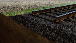
You may remember other illustrations similar to this one. I end up doing a lot like this. I'm almost becoming an expert in heavy machinery of this sort. It's demonstrating a process of building a geotechnical retaining wall. The rather plain sky was designed to be the background for the text of the final ad. I do like how this one came out.

Now, here's something different, for a different agency. Apparently, another artist had been hired to illustrate a lion head for a package. What he really did was steal the lion image from the poster for the movie The Lion, the Witch, and the Wardrobe, pick half the face, copy and mirror it, then apply some quick Photoshop filters to it. I was hired to paint it from scratch. But all my initial sketches were turned down until it finally looked like the image I was supposed to replace. So I basically ended up copying the original image anyway, down to the (inaccurate) color of the eyes. But at least I actually painted it. Every pixel is my own.

A very different piece. This is mainly a photo, but demonstrating a new product that is in development. Part of the problem was to illustrate luminous elements. This is always a tricky proposition, but it eventually worked. I did have fun working on the reflected elements.

Another piece for the same client as the previous image. This one included various photographic elements composited together to create a hopefully realistic and believable image. It also included 3D rendered elements that had to fit into the scene as though they were present.

These tanks may look familiar. It's a frame from the final animation. The whole thing took a lot longer than I had expected, but I do like the end result.


Another frame from a 3D animation. I ended up doing a lot of this work during the year. There were a number of items I had to animate in the final clip. Much of this work is based on photographic textures, as the animation needed to look quite realistic. It's also a good way to speed up the work flow.

Yet another frame from an animation. Another artist started it and did much of the initial work. I just had to finalize it, improve the textures, and make sure all the elements came together.

Here are two separate images that were put together for a company's holiday animation. I guess it turned out okay and it was well received, but it's not my best work. You may notice that the lighting is a bit off. Painting snow is hard, especially at night. I didn't have much time and no source material provided, so I guess it's okay for what it is.