28 November 2010

Painting the windows (4 of 4)

The last step is to paint in the reflections on the windows. This will probably need to be done with a stylus and tablet. The thing to remember is that you don't need to do much; simply suggesting shapes and colors in an abstract way can get across the idea of reflected sky, buildings, and so on. As you can see, what I have actually painted is very loose and light on details. Even though not much is really there, it works because this layer also uses the windows Shape layer as a clipping mask and 'inherits' its effects.

For the ground level displays, make a new Shape layer with the Rectangle tool and PMS 410. Give this layer a little Bevel and Emboss and an Inner Glow in Color Dodge. Paint the window displays on a separate layer that is clipped to the Shape layer. Do this in a loose and free style like the window reflections. Using warm colors will help to differentiate the interior scenes from the exterior windows. That should do it. These last freehand painted details contrast nicely with the hard, angular details created by Pattern Overlays and vector shapes and give a sense of realism and randomness that the textures require. They also provide a much-needed splash of color that makes the building much more interesting to look at. If at this point you needed bump, reflection, luminosity, or other maps for texturing in a 3D program, these would be easy to make from your layers.

16 November 2010

Creating filtered streaks (3 of 4)

Now it's time for one of my favorite effects. I showed this technique back in the very first tutorial on this blog, but I like it so much, I'll share it again. Even if they are not visible in the photo, most structures that are out in the elements will have some weathering. This is often cause by dirt or rust that collects in recessed areas, combined with rainwater dripping down from those areas. The result is streaks from windowsills, cornices, and other architectural features.

You could paint these in by hand, but there is an effective way to do this with a filter. The first thing we need to do is make selections of all the elements we want to use as sources for the streaks. In this case, it's the windows and the signs that are mounted to the buildings wall, as well as the top edge of the building. Hold down CTRL (PC) or CMD (Mac) and click on the main building layer's thumbnail image. Make sure the holes at the top get included. Next, we need to subtract from this selection. To do this, keep holding down CTRL or CMD, press ALT/OPT as well, and click the other layers' thumbnails. Go to the Channels panel and make a new alpha channel. Invert the selection and fill with white. We are working with the channels because we need to end up with a selection. The white areas will create our selections when we are done. Also, the filter we have to use will only work on existing pixels, not on empty ones.

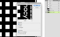
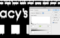
You may want to duplicate this channel just to be safe. With your alpha channel ready, it's filtering time. This effect requires the Wind filter, but in Adobeland, wind apparently only blows horizontally and we need vertical streaks, so we need to rotate the image 90º clockwise. Now you can go to Filter> Stylize> Wind... For Method, choose Wind and for Direction, choose From the Right. Click OK, but you're not done yet. We have the beginning of streaks, but they need a bit more, so apply the filter again. You can use this handy shortcut: CTRL (PC)/CMD (Mac)+F. Keep doing this until you get the amount you want. When you are done, rotate the image 90º counterclockwise.

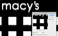
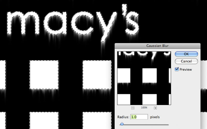
These are streaks, but they are rather thin and harsh. If that's what you want, I won't judge, but you can adjust them further. Load a selection from your original, unWinded(?) channel and invert the selection. This is so that we affect just the streak areas. Add a Gaussian Blur; this needs just a small amount. Now you have smoother, softer streaks. If you need to make them more substantial, do a Levels adjustment. As you bring the white and black sliders in, the edges sharpen up and the streaks get denser. Adjust the midtone slider to to give more or less streaks as you need. As you can see,  by adjusting the amount of blur and Levels adjustment, you can create  all different sorts of streaks. When you like them, load a selection from this channel.

Go back to the layers and make a new layer above the building texture. It will be clipped to the main building Shape layer. Fill the selection with a warm grey.  Change the layer's Blend mode to Multiply and lower the Opacity until you like the look. That's it! This is a great way to add a bit of realism to architectural structures. In the next tutorial, we will finish off the windows with some painting.

12 November 2010

Adding building details and signage (2 of 4)

Upon closer inspection of the photo, some lines or seams become visible. To make these, use the Line tool to make a new vector Shape layer. Set the Weight to 1 pixel and use Warm Grey 11. Hold down Shift to add additional lines to the same layer and constrain them vertically or horizontally. For their effects, you can copy them from the windows layer. Right+click on that layer and choose Copy Layer Style, then right+click on this lines layer and choose Paste Layer Style. All we need here are the Outer Glow and Bevel and Emboss, so turn off the other styles. Lower the layer's Fill to 40%, make sure the lines layer is using the main building layer as a clipping mask, and they're done.

For the doors and display windows, use the Rectangle tool to make a new Shape layer. Use PMS 419. Since there are only two sizes of rectangles, make one of each, select them with the Path Selection tool, then duplicate them and slide them over. Line them up with your guides or select them all and click the Distribute horizontal centers button to space them out evenly. Copy, then Paste the Layer Style from the lines to this layer.

To make the signs attached to the building, use the Type tool. I don't know for sure the typeface that Louis Vuitton uses for their logo, but Century Gothic regular looked like a close match. It needs a dark Outer Glow, similar to what is on the lines and windows. It also needs a bit of Drop Shadow. Set the Size to 0 so that it is nice and sharp. A hint of Bevel and Emboss will help out as well, but it needs to be very small. As you can see, you can set the Size to 0 and there is still a bit there. For the illuminated signs, use the same typeface, but this time in bold. Give them a bit of Outer Glow, this time in the default Screen mode. A little Inner Shadow gives them a look that matches the photo.

Century Gothic also seemed to match the Macy's logo. Use PMS 4515. We need to make this sign look like it's metallic, shiny, and standing out from the building wall a bit. Layer Styles should do that for us. Use the Drop Shadow settings as shown. Taking the Spread up to 100% will keep the edge sharp, so if you take the Size up a bit, the shadow widens out and attaches better to the shape. Just like the other elements, this sign needs a dark Outer Glow and a little bit of Bevel and Emboss. For the shiny, metallic look, use a Gradient Overlay. Try a light Cool Grey in Color Dodge as shown. It looks pretty good, so I'd say this part is done. What's really cool about what we have done so far is that since it's all done with vector shapes and Layer Styles, this image is pretty much resolution independent. If you use Image Size to scale the image up and make sure the Scale Styles option is checked, everything should be fine. 

10 November 2010

Building with shapes (1 of 4)

To start out, we'll need a photo of the building; this isn't the kind of stuff you can just make up. For this project, we'll use the corner Macy's building. The photo isn't great quality, but it will do. The first thing to do is to Transform the photo so that all the lines are horizontal and vertical, at least as much as is possible. Guides will really help out with this task. In fact, you will probably need lots of them before this image is done. I have been ridiculed by co-workers for the amount of guides I use, but in cases like this, they are really important.

Start by using the Rectangle tool to make a vector Shape layer with Warm Grey 3. You can build it right on top of the photo. Try to work in increments of 10, 20, 50, 100, and so on. It will make things easier later on. Much of the work here is going to be done with Layer Styles. As you can see, I am using a lot here, much like I have done on earlier projects. There is a grey Inner Glow in Multiply mode, a subtle Gradient Overlay in Multiply mode to darken the bottom half of the building, a small Bevel and Emboss, a Pattern Overlay of just thin lines that make a grid, but the surprise here is the Drop Shadow. It's being used to create a bit of the side of the building. If the Size is set to 0, the Blend mode to Normal, and the Opacity to 100%, you get a nice hard edge. Since this view will be from the bottom and the right, adjust the Angle so you can see the bottom and right edges.

If you are wondering how to make the holes at the top, use the Rectangle tool again, make sure the Shape layer is selected and the path visible, then hold down ALT/OPT. You should see a little minus sign (-) next to your cursor. Make a small rectangle and presto! You have cut a hole out of the building. Use the Path Selection tool (that's the black arrow) to select the rectangle. You can either Copy and Paste it, or you can ALT/OPT + drag it to make a copy. When you have all the holes you need, select them all with the Path Selection tool, then use Photoshop's Align and Distribute buttons to align all these small rectangles to the same baseline and distribute their horizontal centers. What could be easier?

To add a bit more texture to the wall's surface, make a new layer and clip it to the vector Shape layer. Fill it with a color; any color will do. Take the Fill down to 0%, then add some kind of brick Pattern Overlay. I chose one that has randomly-sized bricks. Experiment with Opacity and Blend mode until it looks good. The idea here is just to add a subtle hint of texture.

For the windows, use the Rectangle again with PMS Black 4. Hold down Shift to make a square. Make the duplicates and align them in the same way you did the holes at the top. Once you have the top row in, click the Combine button to make them a compound path. Now you can easily select the row of windows as one element. Make the duplicate rows. For architectural images, it's crucial to keep things perfectly centered and aligned. Make sure the margin to the left and right edges of the buildings is the same. Using the guides becomes almost necessary at this point. For the taller windows at the bottom, you can Scale them vertically. Now, it's time for the effects. That will really pull things together. Dark Inner and Outer Glows in Multiply mode should be standard. A small outer Bevel and Emboss helps to inset the windows a bit, but the real surprise is a 2-pixel inner Stroke in Black 4 to suggest a bit of the frame. To top it off, add a cool grey foreground-to-transparent Gradient Overlay from the upper left in Screen mode to show a bit of sky reflection. Make sure this window layer is not clipped to the main building shape layer; it will need to act as a clipping mask for other layers later on.

This is a good start, but now we need to work on the details. Tune in next time for that.

09 November 2010

More advanced archtectural textures tutorial

This month, we will work on a project that shares some techniques with the previous one. Making building textures is very useful for both implementing into 2D illustrations and texturing 3D models. Here is a detail of a very large illustration I did a while back of Union Square in San Francisco. Even though most of the buildings are in some sort of a foreshortened view in perspective, they need to be created straight-on with parallel lines and right angles. In the next post, we'll begin this tutorial on how to make building textures. Our primary tools will be vector Shape layers and Layer Styles.

08 November 2010

My student work

Last month I visited my alma mater, BYU, to speak to the illustration students. I talked about my time there, then shared my student work with them. It's interesting to see how different my work was then, compared to work as a professional. What I liked doing then and what I thought I would do after school are nothing like what I ended up doing. I think that's probably not that unusual.

If you are curious about what I was doing as an illustration student, you can download a screen-res PDF that I showed to the BYU students. It has some of my best or most interesting student work, along with my musings about working on the pieces.

Click here to download the PDF.