30 December 2010

Adding foreground elements (7 of 7)

At this point, the image could be considered done, but something in the foreground would tie the scene together and add some depth. A rustic fence would be a nice touch. For this, we need some long, thin vector rectangles. You could use the Rectangle tool, but the Line tool set to a very high Weight might be a better way to go. Make a new Shape layer using PMS 418. Use your perspective lines as guides so that the fence looks correct. To make the vertical posts look round, hold down SHIFT and put some ovals on top with the Ellipse tool. You may need to select them and rotate them slightly. Add Layer Styles similar to what you have been using. The Highlight of the Bevel and Emboss should be in Color Dodge Mode. The Gradient Overlay should be using Multiply and a blue from the background to add more shadow the the right edge.  An Inner Shadow with the settings shown will show some rimlight on the right edge, reflected from the snow. Use this layer as a clipping mask for a new layer above it and paint in some details like the rough would grand and the edges of the boards. You can see how using vector shapes here is better than pixel-based shapes because the fence edges can extend past the canvas size. That way the Layer Styles won't stop at the edge of the image.

Make a cord wrapping around the fence using the same steps that you used for the light cords on the barn. Copy the Layer Style from the barn cords and paste it on this layer. That way you get the effects and the blend options. Load the fence shapes as a selection for the layer mask. Add new layers for snow and paint it on the top areas of the fence using the same colors and technique as on the barn's roof. For the Christmas lights wrapped around the fence, follow the same steps as on the barn's lights. For contrast, I decided to make this lights a different color. The settings are the same as on the other lights, but the color and Outer Glow were changed to a warm yellow. I used the Path Selection tool (the black arrow) to position each vector circle precisely on the cord. When these details are in place, your holiday illustration is complete. Now your next Christmas card is all done.

29 December 2010

Putting on the Christmas lights (6 of 7)

To really make the barn stand out and give it the right holiday look, it needs to have some Christmas lights. Shape layers will really help out here. Start by making the lights' cord with the Pen tool. Remember that Photoshop doesn't like open paths, so you will need to close your shape. Set the Fill to 0% and give the shape a small, black stroke with Layer Styles. You can also give it a little Bevel and Emboss, with the Style set to Stroke Emboss. Make a layer mask to mask out the cord as it cuts in front of the barn. The selected area shown is the masked area. Here's the important part: make sure you check Layer Mask Hides Effects so that the stroke disappears where you mask it off, instead of just updating to follow it. Now you have just a thin wire for the lights to hang on and you can change it if you want by simply editing the path with the Direct Selection tool. Make a new Shape layer with the Pen tool for the vertical cords at each corner.

For the light bulbs, use the Circle tool to make a new vector Shape layer. Hold down ALT(PC)/OPT(Mac) and use the Path Selection tool to drag a duplicate of the circle. Keep doing this until you have the number of lights you want. If you want different colored lights, you will need a different Shape layer for each color. The nice thing about doing this with vector shapes is that you can easily reposition them if needed. I started with blue lights. Use bright, fully saturated colors. For a luminous appearance, use an Outer Glow in Linear Dodge mode. give them an Inner Glow as shown. Set the Source to Center and make the color a bright yellow, almost white. This gives the actual bulbs a warm glow. Use the same Inner Glow settings for each color of light, but change the Outer Glow to a color that matches the light. You may also want to give the layer a drop shadow as shown to increase the glow's intensity. The combination of Linear Dodge over Color Dodge will really make them look like they are glowing.

This looks good, but the bulbs would probably be casting a bit of light and reflecting on the barn. This can also be accomplished with Layer Styles. Duplicate the light layers and move them to the right and down a bit. Lower the layers' Opacity to 70% and their Fill to 20%. Turn off all the Layer Styles except the Outer Glow. You will need to adjust the position of some of the glows so that they land in the right spot. Because they are still vector shapes, you can easily move them where you want with the Path Selection tool. You may also need to make a mask for this layer so that none of the reflections are floating out in the sky; that just wouldn't do. Load a selection from the barn's vector Shape layers.  The barn is now decorated and ready for the holidays.

28 December 2010

Making icicles (5 of 7)

What the barn really needs now are some icicles hanging down from the edges of the roof. There is a great way to make them that uses some of the same steps I have used in previous tutorials for streaks. Refer back to them if you need a review. Start by making a new Alpha channel, make a tall selection with the Rectangular Marquee tool, and fill it with white. Run the Wind filter on it with the options shown. You will have to run it a few times to get long, thin streaks. Transform the channel and rotate it 90ยบ counter-clockwise. Adjust the levels to get a very hard edge with just a bit of anti-aliasing. This is about the same way you would make architectural streaks, except we didn't blur them before the Levels. For icicles, we need longer and sharper shapes than we would need for most streaks and stains you would find on exterior surfaces. 

Since icicles aren't perfectly smooth, we need to roughen them up a bit. There are several filters that could do the job: Sprayed Strokes, Spatter, Ocean Ripple, and perhaps others. I have chosen Sprayed Strokes with very low settings, as you see here. Do some experimenting to see which ones you like best. You may need to run another Levels adjustment on it when you are through, just to sharpen up the edges.

Load this channel as a selection, make a new layer under the rooftop snow layers, and fill it with a light color. Transform it to match the perspective of the scene. Set the layer's Fill to 5% and add some Layer Styles. The look we are trying to achieve here is translucent  and very shiny ice. Give it a Bevel and Emboss as shown. To accentuate the edges, check the Contour option and choose the Ring - Double shape. To really punch up the highlight edges, add an Inner Shadow as you see here. The combination of Screen and Linear Dodge in the same place results in some really bright highlights. I wish I could say that I came up with this technique, but I found it by searching the Internet for Photoshop tutorials long ago. I have modified it a bit to suit my needs, but I don't think I could have figured it out all on my own. Whoever did that initially is a Photoshop genius.

A bit of Gradient Overlay in Linear Dodge will brighten up the icicles just a bit to suggest that they are catching more light the farther away they get from the solid, shadow-casting roof. They look pretty good and it's obvious that they are icicles. Of course, the other side of the barn needs them too, so follow the same steps to add them on a new layer underneath the barn front layers. Since the icicles on this side are not in shadow and more directly affected by the sun, increase the Opacity of the Inner Shadow to pump up the highlights on that side. Now that nature's winter decorations are complete, it's time to turn our attention to the artificial ones.  

27 December 2010

Completing the barn (4 of 7)

To finish up the barn, let's start with eaves. Make a vector Shape layer with the Pen tool and use PMS 447. Give it a Color Overlay of 5404 in Multiply mode to put it in shadow and an Inner Shadow as shown to create a nice highlight edge. Make a new layer to paint some details on and clip it to the Shape layer.

Turn on the perspective lines as guides and use the Pen tool again to make the side of the barn. Use something like PMS 4695 and add the usual Layer Styles. Add an Inner Shadow as Shown to suggest the overhang of the roof. The same Color Overlay as on the eaves will put the whole side in shadow. Add a layer mask and paint out a bit of the bottom to show the snow around it. Just like on the front, put the same wood texture on a new layer, using the Shape layer as a clipping mask. Change its Blend mode to Overlay and the Opacity to 50%. Add another clipped layer and paint some rough stains and streaks on it to complete the look.

With your perspective lines as guides again, use the Pen tool to make a new vector Shape layer with 447 as the color. Copy the Inner Shadow from the far eaves layer to this one to give it the same edge highlight. Add a Bevel and Emboss and maybe a Gradient Overlay in Color mode with a blue from the ramp of PMS colors you are using for the snow to put a nice, snowy feel in there. For the roof texture, I must have been feeling a bit lazy, or perhaps it was because of a tight deadline, but I used a photo of old corrugated metal instead of painting it on. To make it look less like a photo, I used Color Dodge mode to bring out just the highlights and then lowered the Opacity.  It ended up looking nice and frosty. Depending on the photo you have, you might need to try other Blend modes. I ended up using other photos of old wall textures in Multiply mode to create a look that was a composite image. This is a good way to go beyond just simple photos and create unique textures. Remember to Transform them into position so that they match the perspective of the scene. You may need to add a final layer of painted details to tie everything together. All of these layers should be clipped to the vector Shape layer of the roof.

What we really need now is some snow on the roof. Use a simple Brush to paint on a new layer with PMS 5415. To get the look of snow, add a large Bevel and Emboss as shown. Take the Opacity of the Shadow down to 0%, since we don't need it. To complete the look, a bit of Inner Shadow along the bottom in Screen mode will give a nice feel of reflected light. You may wonder why not just use the Shadow of the Bevel and change it to Screen, but we need a much smaller shape here, and the Bevel and Emboss' shadow would be just as large as the Highlight. Inner Shadow gives just the amount of control here that is needed. Use this layer as a clipping mask for some new layers where you paint on the light of the setting sun. Pick colors from the highlight areas of the snow on the ground. Load the snow layer and the roof layer as a selection and use that as a mask for a new layer on top of it all. Put a foreground-to-transparent gradient on it, using a blue from the shadow areas of the snow. Change its Blend mode to Multiply and lower the Opacity as needed. This will make the far edge of the barn recede further into shadow. Don't forget to use the same steps to make some snow under the far eaves layer. Also, paint some black on a new layer behind the open hayloft door so that it looks really dark in there. Now the barn is finished and ready for decorations!

24 December 2010

Starting the barn (3 of 7)

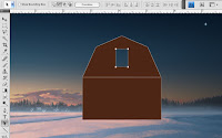
Now, it's time to get started on the barn. Working with vector shapes is a good way to go. You could make this shape in Illustrator, but I like doing it all in Photoshop if possible. Start with the Rectangle tool set to the Shape layers option. Hold down Shift to make a second rectangle right above the first one. Select the top rectangle with the Path Selection tool (that's the black arrow) and then use the Pen tool to add an additional point in the middle of the top side. You will then need to click that new point with the Convert Point tool to turn it into a corner. You can then select it with the Direct Selection tool (that's the white arrow) to move it up. Use the same to select the top corner points and move them in to make the peaked roof shape. To make the doorway, just make a new rectangle on the same shape layer, but hold down ALT(PC)/OPT(Mac) to subtract from instead of add to the existing paths. Just so you know, if you were doing this in Illustrator, you would be doing just about the same thing.

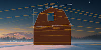
If for some reason you are making this shape in Illustrator, Copy it, then Paste it into Photoshop as a Shape layer. To put it into perspective we'll use the Transform tool. But first, it's a good idea to set up your perspective with vanishing points. Use the Line tool to make a new Shape layer and add as many lines as you need. This is a two-point perspective image and the vanishing points should be outside of the image area. Transform and use Skew to match the barn shape to the right view, using your lines as guides. It's always best to build things flat-on first, getting all your dimensions right, then Transform them into place.

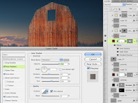
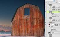
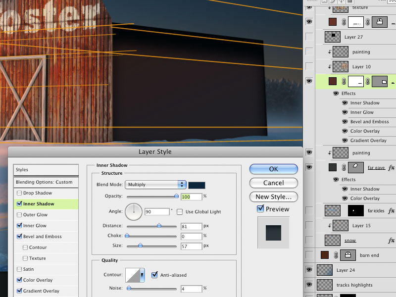
Use PMS 483 as the fill for this Shape layer. As usual, put some Layer Styles on this layer to liven it up. If you have been following along with previous tutorials, you know what to do. To save some time, I used a photo of old planks of wood as the barn texture. This layer was clipped to the Shape layer and set to Hard Light Blend mode at 70% Opacity. Transform it with Scale and Skew so that it matches the perspective of the vector shape. For a special trick on this one, I used an Inner Shadow of grey set to Saturation to make the wood look bleached and faded at the upper edges and sides of the barn front and beneath the door. Using photos and effects can save a lot of time over painting in all the details, but it can't do everything. I added a new layer to paint in what I couldn't achieve otherwise. You can also add layers for seams in the planks and a cast shadow for the roof overhang. These all work best in Multiply mode. Adjust their Opacity as needed and make sure all of these extra layers are using the barn Shape layer as a clipping mask.

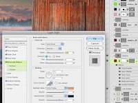
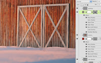
Every barn needs doors, right? Make them with the Rectangle tool on a new Shape layer, but don't clip this one along with the other barn layers. Use the same color and Layer Styles as on the main barn layer, but the doors need a bit more. Add a dark Outer Glow in Multiply mode, a bit of Drop Shadow, and a Bevel and Emboss to show that it sticks out a bit. Copy the wood texture from the barn face and give it the same Blend mode and Opacity. Clip this layer to the doors Shape layer. To make the traditional crossed slats, use the Line tool with PMS 409 to make thick lines on a new Shape layer. Paste the Layer Styles from the barn layer to this layer. Scale these effects down a bit and turn off the Inner Shadow, since you don't need it here. Add a layer mask and paint with black along the bottom to make the slats look like they are behind the snow. Make a new layer to paint some details on and clip it to the main slats Shape layer. Use the same steps to build the small door up in the hayloft, but reverse the Gradient Overlay to brighten the right side of the door. This makes it look like it's sticking out from the building and catching more light.

As an added bonus, you can put some kind of messaging or image, painted onto the barn front. Since I initially did this as a corporate Christmas card, I used a company logo, but you could use whatever you want. Place the art or type the message and Transform it into position. At this point, we need it to look like it's painted onto old wood, so it should show gaps and bare areas where the paint has peeled away. An easy way to do this is to use the Blend feature. This extremely powerful but perhaps little used feature of Photoshop is the perfect choice here. Double-click the layer to bring up the Blending Options. In addition to the usual Blend mode, Opacity, and so one, there is a section at the bottom labeled Blend If. This is Photoshopspeak and it really means "make transparent if." Instead of using channels to make a static layer mask, you can do basically the same thing by adjusting these sliders. You can make parts of a layer transparent based on either the pixels on its layer or the pixels on layers underneath. In this case, we want to fade away parts of this layer that are over the darkest parts of the underlying layers to suggest shadows and gaps in the wood. To do this, move the Underlying Layer's black slider to the right and you will see parts of this layer drop away. Pretty cool, huh? The only problem is that the transparency is quite harsh; it's either 0% or 100% and looks extremely jaggy. The solution is to use what has to be one of the least document Photoshop features. Hold down ALT(PC)/OPT(Mac) and move the black slider again. You are now splitting the triangle and anti-aliasing the transition from transparent to opaque. The farther apart you slide the two halves, the softer the transition becomes. This is a great way to make painted signs on old wood, stone, brick, or anything with enough contrast. The best part is that you can move the signage around and the transparency updates.   

19 December 2010

Painting the ground (2 of 7)

If you know where the horizon is, it's easy to paint in background elements like forests or mountains, because they should pretty much just sit right on it. For the tree-covered hills, start with PMS 5477 as a base. You can choose the lighter and darker swatches in this same strip as needed. Notice how the painting is loose and not very detailed. These colors are way too dark and saturated, but they are good evergreen tree colors. We can take care of this with layer styles. Effects like Color Overlay, Gradient Overlay, and Bevel and Emboss will give the look we need. The idea is to push it back with atmospheric perspective. Photoshop's effects can really help with this. You can also add additional layers in Color mode, clipped to the base layer, to tint it further.

The little village is painted with very simple shapes. Remember that the rooftops should be covered with snow. The Bevel and Emboss' highlight in Linear Dodge adds a nice highlight along the edges to suggest the setting sun. The shadow's Opacity is set to 0% because we don't need it here. Clip this layer along with the others to the tree/hill layer. Paint the windows on a separate layer so you can give them a bit of Outer Glow. Don't include them with the clipping mask layers because we don't want them to be affected by the atmospheric perspective as much as the other layers. The windows' luminosity will cut through the haze more than the buildings or trees. Paint a large field of PMS 5415 on a new layer for the snow. This range of greyish-blue is great to use for snow, especially in shadow.  The key here is to remember that snow isn't white. A bit of light blue Outer Glow completes the look of the frosty haze.

Use the snow layer as a clipping mask for the details painted on other layers. A 535-to-transparent Linear gradient on a new layer will lighten the background. Keep the greatest contrast of dark to light in the foreground area. The highlights from the setting sun are painted on yet another layer, also clipped to the 5415 snow layer. The colors used here are quite pink, but that's okay. Strong colors can work in situations like this. I mostly used my favorite basic brushes here, but some scatter brushes were also used, as you can see.

Use PMS 5405 or 5395 to paint the shadow layers. Don't forget to set the layers' Blend mode to Multiply. For the sled tracks, I ended up using Overlay for the main portion, then Multiply for the shadow areas. The highlights are painted on a layer in Normal mode to make them look more dense and substantial. Just pick colors from the highlight areas you have already painted. Now zoom out and see how it all looks. We are trying to get a luminous feel on the left side of the image. Darkening the right side may help to achieve this. If necessary, add a gradient on another layer in Multiply mode and play around with the Opacity until you like it. Something like this should work.

17 December 2010

Painting the sky (1 of 7)

Since this was to be used as a Christmas card, I created the image at 8.25"x5.5" at 300 ppi. Of course, you can use whatever size and resolution you want. The place to start is the sky. If you have been following along with previous tutorials of mine, you know that I create skies with separate gradients. Each one is a foreground-to-transparent Linear gradient on its own layer. The benefit to this is that you can easily change each color, or its Opacity and Blend mode. The PMS color I used is on each layer's label. For the final Radial gradient, use Color Dodge to increase the feeling of luminosity. This is to suggest the sun, which has just set in this region of the sky.

Paint the clouds on a separate layer using a simple brush and PMS 437. Add a black Linear gradient on a layer mask to fade away the bottom of the clouds as they approach the horizon. When I originally created this image, I had to use Fade to lighten the gradient, but now you can use the Masks panel to lower the mask's Density for the same effect. For the cloud details and highlights, paint on new layers that use the main clouds layer as a Clipping Mask. The painting should be a bit loose and free; you just need to suggest these other colors.

This is supposed to be a night scene, so we need some dark areas. On new layers in Multiply mode, add some gradients using 539 to transparent. Adjust the Opacity as needed. This is a great way to get in all the subtle gradients of the sky at dusk that you just can't get by making a custom gradient with many colors. For the star, use the Line tool to make two intersecting lines on a vector Shape layer. Add a layer mask and use a white-to-black Radial gradient on the mask to fade away the star's edges. Add Inner and Outer glows to complete the effect. The Inner Glow should be set to Center so that the center of the star is the brightest. Make sure Layer Mask Hides Effect is checked. For convenience sake, you can group all these layers into one folder to keep your file organized. In the next tutorial, we will start on painting the ground.

15 December 2010

Holiday illustration tutorial for December

I've been really busy with crazy client deadlines and getting ready to grade class finals, but I figured I should get this month's tutorial going. Since it's December, I thought about using one of my corporate holiday (I can't really say Christmas, can I?) cards. 

I have a few from which to choose and I just finished another one a couple of days ago, but I do like this one. It turned out nice and is a good example of a holiday painting and has some very useful techniques. Originally, I created it in 2007 for a large construction and infrastructure company. The subject matter was picked for me, but I was able to put a lot of my own creativity into it. In the next post, we'll start breaking it down and see what I did.