
Recently, I was asked to serve on a panel of jurors for Open, the latest photography and digital art competition at Exhibitions Without Walls. All of the work was really good and it was a bit hard to narrow things down, but luckily all the jurors had to do was evaluate each one for points in various categories. The winners were then calculated from the totals. As I said, all of the entries were high quality, so it was tough. Most of the entries were photographic, but there were a few illustrations, so I always like that.
19 December 2011
16 December 2011
My latest work

I recently completed an illustration of the Brooklyn Bridge. The end client is a construction and infrastructure company and it will be used as the header image of their calendar for next year. The final image was 26" long, but not so tall, so it's a hard format to show, but here is a detailed section of it. As you can see, it ended up being very detailed and I had a deadline I was working to hit, but it all worked out. The illustration was painted from scratch in Photoshop and took just over a week of full-time work to complete.
You can see a full-length version of the image on my portfolio site here.
You can see a full-length version of the image on my portfolio site here.
01 December 2011
My artwork on a shirt

Remember the very first tutorial I posted? If not, you can see it here. Recently, I was asked to build it into a T-shirt design. I've done this sort of thing before, but not always with the most exciting art. This was one of my favorite images and the final output actually looks pretty good. This doesn't always happen. They've promised to send me my own shirt, but I haven't seen it yet.
30 November 2011
Some recognition for my work
My contact at the Directory of Illustration has a blog about her work and other commercial art topics. She put up a post about my large exhibit image I did a couple of months ago. It's always nice to have someone else want to show my work. I recently decided to advertise in the Directory for next year. It's a big commitment because of the cost, but I'm serious about finding new work and bigger clients.
Click here to read the post.
09 November 2011
Online recording of the NBAUG presentation

23 October 2011
I'm giving a presentation this month
It's been in the works for a while, but now I know I'm giving the presentation at the North Bay Adobe Users Group meeting this month. The topic I have chosen is Vectors and Effects: from Photoshop to Illustrator and Back Again. I know it's a long title, but I wanted to be accurate. And I can pretty much guarantee you won't see anyone else teaching these kinds of techniques.
The NBAUG (as it's called) meets once a month at the Santa Rosa Junior College campus. It starts at 7:00 in the evening and since it just happens to be Hallowe'en, costumes are encouraged. I'll be in one, so come and join in the fun. You just might learn something. Click here for more info.
11 October 2011
Greenscreen spill correction

There are many ways to remove the green spill, so let's start simple and work our way up. A good technique is to see what an adjustment layer will do. Add a Hue/Saturation adjustment layer above the photo. Clip it down so the photo is acting as a clipping mask. You can do this by OPT (Mac)/ALT (PC) + clicking between the two layers, or just click the clipping button at the bottom of the Adjustments panel. We need to try and affect just the green areas, not the whole photo. To do this, try a little-used option on this panel. Click the Master drop-down and choose Greens instead. Now slide the Saturation slider all the way to -100. If the Master option had been left on, the photo would be greyscale, but since Greens are chosen, they are the only colors affected. The green hasn't been removed completely, but the spill's intensity has been reduced somewhat and any overall green cast to the photo has been lessened.
 It's a bit better, but it's not there yet. The next step is to try and directly adjust the color of the green spill. Add a new layer above the adjustment layer and fill it with an average color sample from the photo that will counteract the green. In this case, I chose a reddish-brown taken from the hair. Change the layer's Blend mode to either Hue or Color and clip it down with the rest of the layers. I chose Hue for this example, but they are really quite similar. Currently, the Opacity is 100% and it is tinting the entire layer. The next step is to restrict this effect to just the edges and then adjust the Opacity as needed.
 To do this, we need another mask. Load a selection from the alpha channel originally created by Calculations by CMD (Mac)/CTRL (PC) + clicking on its thumbnail. With the selection active, add a mask to the Hue or Color layer. Now, do a Levels adjustment, sliding the white slider almost all the way to the left. This will expand out the white portions of the mask so that this brown tint extends farther into the photo.
 The next step is to expand out the mask so that more of the green spill is covered. There are a number of ways this could be done, but let's try some of the newer tools in Photoshop. With the mask active, click the Mask Edge... button on the Masks panel. Take the Shift Edge slider up to +100% and then increase the Feather amount until the green disappears. Make sure Output To: is set to Layer Mask and click OK. Now the masking is pretty much complete.
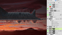
 You still may need to fine-tune the edge, but it might be a good idea to pop in a new background first. That way, you'll more accurately see what adjustments need to be made. The foreground will also probably need some adjustments like Color Balance and Curves or Levels to match the background. Once you have added these adjustment layers and clipped them down to the masked photo layer, you can see what needs to be done to the mask edge, if anything. Some options to consider: lowering the Opacity of the Hue/Color layer, expanding the sliders in the green area on the Hue/Saturation adjustment layer, or doing another Levels adjustment on the original mask, as you see here. If any haloing or fringing still appears around the edges, moving the midtone slider to the right will darken up those greys and hide more of the image. Use restraint here, because you don't want to lose too much hair detail. You could also try Shift Edge in the Refine Mask options; it does about the same thing.
 Now zoom out and admire your work Check to see if the shadows of the background match the shadows of the subject. You may need to mirror one or the other as I've done here. For really good photo compositing, the images need to match in terms of noise, grain, and blur. These can easily be added in with filters, especially if you convert the photos to Smart Objects.
That's it! This is the process for extracting greenscreens. You could even automate the process of combining channels and making the initial mask. Other tutorials out there use Extract (which isn't even automatically installed with Photoshop anymore) or modifying a selection with Refine Edge, but these tools really aren't designed for greenscreens. They are more appropriate for other backgrounds. This is really the way to do it and mastering these skills will open up many doors of Photoshop goodness.


That's it! This is the process for extracting greenscreens. You could even automate the process of combining channels and making the initial mask. Other tutorials out there use Extract (which isn't even automatically installed with Photoshop anymore) or modifying a selection with Refine Edge, but these tools really aren't designed for greenscreens. They are more appropriate for other backgrounds. This is really the way to do it and mastering these skills will open up many doors of Photoshop goodness.
10 October 2011
Fixing the mask

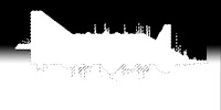
 With a few quick steps, we can fix the mask. The information is there; we just need to pull it out. Layer masks are simply greyscale images that can be adjusted like any color photo with Levels or Curves. To see the mask directly while you are working on it, OPT (Mac)/ALT (PC) + click on its thumbnail. Since these kinds of adjustments are pretty simple, use a Levels adjustment. The histogram shows where the dark and light values are. The mask needs to be mostly pure black and pure white with some greys for anti-aliasing. You can either drag the sliders inward manually or use the eyedroppers. Choose the white eyedropper and click in the mask in areas that aren't quite white but should be. Choose the black eyedropper and click in the dark areas that aren't quite black but should be. The trick here is to get enough black and white, but not lose the detail around the hair which comes from the greys and fine detail in the mask. It's a trick because in keeping this detail, a lot of green from the background still comes through. Add a solid color layer behind the masked image to get a better idea of your edge quality. If you don't know what the new background will be, use 50% grey as I have done here. As you can see, soft edges like hair pose the greatest challenge. This is compounded by what is called 'spill,' where light bounces off the greenscreen and illuminates the edges of the subject. For good greenscreen extraction, we need to remove spill as well. That will be covered in the next tutorial.
08 October 2011
Green screen removal

 |
| copyright Lucasfilm Ltd. |


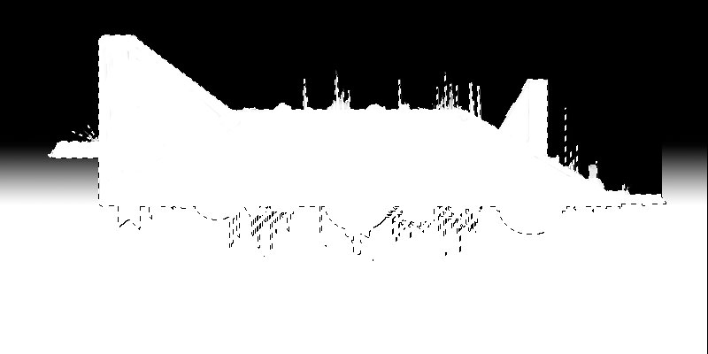
 The reason that so many effects shots are done with greenscreen these days has to do with how this color affects the Red and Green channels specifically. Obviously, digital compositing is done with footage using AfterEffects, Nuke, or other specialized software, but the concept is the same as what we see in Photoshop. We'll need to use an RGB image with the color profile set to sRGB. Since this is a greenscreen, let's start with the Green channel first. It has good separation of the darker areas from the background, but that's about it. The Red channel has good separation of highlights and skintones, but the darker areas fade into the background. The best way to make a mask from a photographic source is to do it procedurally (letting Photoshop do all the hard work) in the channels, but I've seen many tutorials give up here and go for some other tool because no single channel has all the necessary information. However, the best masks come from a multi-step process and the usefulness of greenscreen is how the Red and Green channels combine. Taking another look at the Red channel of any greenscreen image, you will see that if it were inverted, it would have just the right dark information that the Green channel is missing. If we could then just get its dark parts (Multiply) into the Green channel, that would work. What we want here is an easy way to combine what we need from each channel into a new channel and Photoshop has just that: Calculations.
 Go to Image >Calculations... You will see the options for combining two channels. Choose Red and Green. It doesn't matter which one is Source 1 or 2. Be sure to check Invert on the Red channel, since we need the opposite of its information. By default, the Blending will probably be Multiply. Already, this looks pretty good. The background is noticeably lighter than the foreground and the highlights have been replaced with darker values. But there is still some definition inside the figure and it could be better. Change the Blend mode to Color Burn; it's much stronger, like Multiply on steroids. The background appears to lighten up just a bit, but the foreground gets almost black. It's almost a mask with practically no effort! However, if your foreground has any pure white in the highlights, it might not get turned to black. That's because Color Burn won't appear over white, just like Color Dodge won't appear over black. I see some blocky white specks in my black areas. If that's the case, try Linear Burn. It's very much like Color Burn, but it will cover white. The background darkens up a bit, but now the white specks are gone. Make sure the Result is New Channel and click OK.

 If you have followed all the steps exactly, you should end up with something like this. The problem is that it's just the opposite of what we need. Actually, it's not a problem. It's easy to invert a mask, or selection, either before or after you make it; there's no loss of information. With the mask active, you could press CMD (Mac)/CTRL (PC) + I for Invert, or you could just press the Invert button on the Masks panel. Now you see the foreground and the greenscreen is masked out. Well, almost. In my example, there is still a fair amount of green back there because that part of the mask is not completely black. There may also be a little transparency in the foreground as well. Be that can all easily be corrected as we fine-tune the mask. Tune in next time for that.
 30 September 2011
Painting in the energy beam

 To make the image a bit more exciting and tell more of a story, we need something to happen. It's all set to fire some kind of beam down into the ground. Because the background is so warm with a red/orange color palette, let's use a cool color for contrast. I chose a green color, leaning a bit toward blue. Take the color straight from the Color Picker with a B value of 100%. For a color that is so bright like a laser beam, this is better than choosing a PMS color, because they don't tend to have the brightness or saturation necessary. Paint it with a simple brush and have the size set to pen pressure. This beam needs to be opaque all the way through, but taper off at the ends, so this is a rare instance where using the pen pressure to control opacity won't work. The color should be flat and solid, because the glows will be taken care of with Layer Styles. Use the settings shown here. The major part to remember is that the Inner Glow is set to Center; that gives you the nice, white-hot center of the beam.
 The glowing beam looks good, but to really get the effect of luminosity, the ground right below it should be lit as well. Use a radial gradient in the same green as the beam down with the previously-completed ground layers. Change the Blend mode to Screen and scale the gradient down a bit vertically to follow the perspective of the ground. To create a more interesting ground and give the light something to do, you could paint some features like rocks. These are done in a solid dark color with the help of a scatter brush, then touched up a bit with a normal brush. Use this rocks layer as a clipping mask for layers above it, upon which to paint the highlights. Layer Styles won't work here because the rocks encircle the light source. Paint an orange highlight from the setting sun on the tops of the rocks. Having the highlights on separate layers allows you to adjust their Opacity and Blend modes if necessary.
 To really make this work, the rocks need to cast shadows against the ground. The first thing to do here is to figure out where they should be cast. A trick from perspective drawing class will help out here. Use the Line tool. Make sure it's set to create a vector shape layer. After you make the first line, hold down Shift for each additional one to add them to the same shape layer instead of making new ones. Start where the beam hits the ground and draw lines out to the rocks. Now, make a mask on the green gradient layer. With the lines as guides, paint black on the mask to simulate the shadows cast by the rocks. They don't have to be exact, just close enough to be convincing. Now this is starting to look really cool, but there's one more thing to do.
21 September 2011
Painting the spaceship

Even though the ship is basically black, you don't want to start with a color that absolute. It's best to avoid pure black (0, 0, 0) or pure white (255, 255, 255). Using a very dark grey is a better way to go, so you can go darker if you need. I chose PMS 440. Paint the spaceship on a new layer and use just this color to paint what amounts to a flat silhouette. An easy way to paint perfectly horizontal or vertical lines with a brush tool is to hold down Shift as you paint your line. This may seem obvious, but I painted in Photoshop for years before I figured this out. To paint a straight line at an angle, click once with the brush, then hold down Shift and click again. This one I knew. I find that it's better to use a mouse for this technique, because it's hard to get fully opaque on one click when using the stylus set to pressure, which is how you want to do most of your painting.
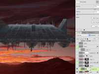 For the surface detail, paint on a new layer and clip it to the main spaceship layer. Notice how I have used cool greys for the top and warmer, rusty colors for the bottom. This helps with the image's color scheme. I'm trying to suggest that the warm sunlight is reflecting on the bottom of the ship. Speaking of the bottom, notice how the gradual highlights on the edges of the round parts make them look hemispherical and not flat. Painting on a new layer is great because you can adjust your details if they are too much. In this case, I wanted to tone them down toward the bottom edge, so I added a mask to this layer with a linear gradient. But now, it lost too much detail in the black part of the mask. That's why the Masks panel is so great. Notice how I've pulled the Density down a bit to bring the detail back in somewhat. This panel was introduced in CS4 and is something I've been wanting for a long time.
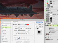
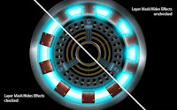
 Instead of painting in some highlights from the sun, let's try it with layer effects. Bevel and Emboss works, but an Inner Shadow using these setting adds a nice look to the underside. A Gradient Overly in Multiply mode darkens the texture painting of the upper layer. To get a bit of an unearthly glow from the bottom, I added an orange Drop Shadow in Screen mode. The problem is that with the settings to get the right look, the shadow extends past the bottom and over to the sides and top. Currently, there is no way to mask off effects directly, but in this case, a layer mask will do the trick. CMD+click the main spaceship layer to load the pixels as a selection and add a layer mask. At first, you won't see any difference. Double+click the layer to open up Layer Styles. Under Advanced Blending, check the Layer Mask Hides Effects box. Now the outer effects disappear. Add a white-to-transparent linear gradient to the mask from the bottom upward. Now the Drop Shadow is visible at the bottom and fades away at the sides. This image shows the relationship of the original selection to the final mask.
 The rest of the spaceship details are painted in on separate layers not clipped to the main spaceship layer. To further illuminate the bottom areas of the ship, use a rusty color on a new layer in Color Dodge mode. Lower the Opacity until it looks right. The finishing touches are the cables that hang down. They might not look very practical, but this is a common sci-fi element. They have their own Bevel and Emboss and other effects, similar to the main spaceship layer.
The ship looks done now. For the last tutorial, we'll work on the energy beam fired from the ship. Not only will it tell an exciting story, but it will add some visual interest.


 Instead of painting in some highlights from the sun, let's try it with layer effects. Bevel and Emboss works, but an Inner Shadow using these setting adds a nice look to the underside. A Gradient Overly in Multiply mode darkens the texture painting of the upper layer. To get a bit of an unearthly glow from the bottom, I added an orange Drop Shadow in Screen mode. The problem is that with the settings to get the right look, the shadow extends past the bottom and over to the sides and top. Currently, there is no way to mask off effects directly, but in this case, a layer mask will do the trick. CMD+click the main spaceship layer to load the pixels as a selection and add a layer mask. At first, you won't see any difference. Double+click the layer to open up Layer Styles. Under Advanced Blending, check the Layer Mask Hides Effects box. Now the outer effects disappear. Add a white-to-transparent linear gradient to the mask from the bottom upward. Now the Drop Shadow is visible at the bottom and fades away at the sides. This image shows the relationship of the original selection to the final mask.
The ship looks done now. For the last tutorial, we'll work on the energy beam fired from the ship. Not only will it tell an exciting story, but it will add some visual interest.
20 September 2011
Painting the ground

The ground and mountain range were quickly sketched in using dark colors, all on the same layer. To get a hint of the sun's glow peeking over the mountains, load a selection from this layer, make a new layer, and fill it with a color, any color. The important step now is to lower the Fill to 0% and check the Layer Mask Hides Effects option in the layer's Blending Options. Add an Inner Shadow as shown, then use a radial gradient on a mask to reduce this effect to just where the sun is. I have used this same technique over and over in my work, as you can see from previous tutorials.
 A second row of more distant mountains will make things a bit more interesting, so I painted some on a layer under the existing mountains. This was done with lighter colors, and a Color Overlay was added to brighten them up even more. I used the same Inner Shadow technique as on the closer mountains to add a bit more of the setting sun's glow peeking over the top. I told you I used this trick a lot.
 To get some more glow happening, add a bright, reddish-orange radian gradient on a new layer. Change the Blend mode to Screen and lower the Opacity until you like it. This layer, like the others, gets clipped down so that it uses the mountains layer as a clipping mask. Do the same thing for the foreground mountains. At this point, if the far mountains near the right edge of the image look too bright, add a dark linear gradient on a new layer, also clipped with the rest. Usually, I would change this layer to Multiply mode, but that was a bit too dark and I was wanting to obscure detail, not enhance it, so I just used Normal mode.
 Just for fun, I painted in a hint of some sort of structures at the peak of one of the mountains. There was no other reason than to try and make the background look interesting. The flat ground looks a little dull, but we'll take care of that later. On top of all these layers, make a new layer with some dark orange linear gradients on each side of the image. Change this layer's Blend mode to Multiply and lower as desired. The sun's glow stands out even more and the look simulates a camera lens vignette. Now the scene is ready for the spaceship to come.


16 September 2011
Starting the background
For this little painting, I decided to use standard HD size (1920x1080). As you should know, if you are dealing just in pixels, resolution doesn't matter. I chose this size for a good width to height ratio and it's good for a quick painting: not too big, not too small. If you have followed my previous tutorials, you know that I start skies with a solid color on the bottommost layer and make each gradient as foreground to transparent on a separate layer. This allows me to have the most control over them in terms of Opacity and Blend mode.

To help me along with my dramatic, sunset sky, I chose a picture from my source library and used it as a guide to paint the sky. I picked colors directly from it since I was working quickly. Having each gradient on its on layer was especially useful here, because I could add a layer mask as shown in the screenshot to suggest where the sun was going down. Notice that the layer is set to Color Dodge and the Fill has been lowered. This is a great way to simulate luminosity, especially with gradients. Usually, I add a darker gradient at the top in Multiply mode, as I've done here.

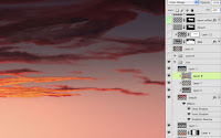 Next come the clouds. They were roughed in quickly with a softer, natural brush. I added some layer effects to give them a bit more depth. You can see here what I've done with the Inner Shadow to be more of a lit edge. This layer became a clipping mask for layers above it. Highlights were painted on one layer, shadows on another. The highlights' layer was changed to Color Dodge mode. A foreground-to-transparent radial gradient was added above that to represent the glow of the setting sun, reflecting on the clouds. Its Blend mode was also Color Dodge and the Fill was lowered as shown. Finally, A dark gradient in Multiply mode was added to the top above all the clouds, but not clipped with the other cloud layers.
In the next tutorial, we'll cover the ground and mountains for the landscape and tie them together with the sky.
15 September 2011
New painting tutorial

Finally, as promised, here is a new tutorial based on a digital painting I did earlier this year. This was just a quick little sketch, just something I had in my head that I wanted to see if I could put down in pixels. What made this image a bit unusual is that it's very much a sci-fi theme, something I really admire, but don't do much myself.

Just to show you how things can start out, I scanned the little sketch I did in a page of my planner. It's not much, but sometimes it's a good idea to manually draw out your ideas before creating them digitally. Old fashioned drawing is a skill that is still relative, no matter how things progress technologically. This is a good way to solve problems like composition and value. Once I got the idea out of my head and onto paper, I was ready for the next step of trying to paint it in Photoshop.
14 September 2011
The results of all my hard work lately
The past few weeks have been very busy for me around here. In addition to my new fall classes, I had a large exhibit graphic to paint and prepare for printing in a very short amount of time. The tight deadline was mainly because the client delayed giving approval and sending final details until very late. The graphic backdrop had to be done and ready for an exhibit in a tradeshow, so that was a firm date.
But the real problem was the size of the file. The final image was to be over 19 feet long. Even reducing the resolution (which is common in large images), the initial file was over 4 Gb, and I hadn't done much painting yet. So I decided to split it in half. Even with that, each half was so large that I had a hard time working on them, due to the way they slowed down my computer. All in all, the final composite, layered image would probably be about 5 Gb. Photoshop won't save a PSD over 2 Gb; for that you have to use a PSB, the large document format.

17 August 2011
New teaching gig
You may know that most of my work is as a freelance illustrator, but I always try to supplement it with a regular paycheck by teaching. As an adjunct or part-time instructor, I never know from semester to semester what I will get, if anything. This fall, I found out at the last minute about an opening at the College of Marin. They did what they call an emergency hire and I am now teaching a design class, focusing on Illustrator and Photoshop. Also, I was offered Photoshop imaging classes at the Academy of Art University in San Francisco, the same ones I taught last year. This means that I can depend on at least some money each month.
You may have noticed that my posts have been very infrequent for the past few months. I have been really busy with the end of summer classes and other very big, high-pressure projects. I'm on one of those right now. But I do have a new tutorial planned next month on a personal painting I did recently.
You may have noticed that my posts have been very infrequent for the past few months. I have been really busy with the end of summer classes and other very big, high-pressure projects. I'm on one of those right now. But I do have a new tutorial planned next month on a personal painting I did recently.
26 June 2011
Flash certified
Good news, everyone! I had been putting it off, but at the last minute, I decided to take the Adobe Flash recertification exam. I won't embarrass myself by giving you my score, but I did pass, so I am now an Adobe Certified Expert and Instructor in Flash. I am up to date in all my certifications. Now let's see if I ever get the chance to teach Flash again.
In other not so good news, for much of May and the first half of June, I was involved in interviewing for an onsite 3D illustrator position at Apple. I did several art test for them and went down to the Apple campus in Cupertino for a grueling 4-hour session of interviews. They liked my work and felt I would be a good match for the team, but for some reason, they won't be hiring me this quarter. What does that mean for the future? I'm not sure. But I am back teaching this summer: Photoshop 1 at Santa Rosa Junior College. Things have been busy, but I hope to get another tutorial up soon.
In other not so good news, for much of May and the first half of June, I was involved in interviewing for an onsite 3D illustrator position at Apple. I did several art test for them and went down to the Apple campus in Cupertino for a grueling 4-hour session of interviews. They liked my work and felt I would be a good match for the team, but for some reason, they won't be hiring me this quarter. What does that mean for the future? I'm not sure. But I am back teaching this summer: Photoshop 1 at Santa Rosa Junior College. Things have been busy, but I hope to get another tutorial up soon.
25 April 2011
Speaking at an illustration class tonight
It has been a while since I made any posts. I guess after finishing up a year's worth of tutorials, I took some time off to concentrate on work. I did a new personal painting recently, so I plan on putting that one up and going through my steps for all of you.
But I do want to let everyone out there know that I will be giving a presentation to the Digital Illustration class, GD56 taught by Jesse Bilyeu at Santa Rosa Junior College tonight. It will be at the Santa Rosa campus in Maggini Hall on the 3rd floor. I can't remember which classroom it is, but it shouldn't be hard to find. The class runs from 7-9 pm, so if you are in the area and are interested, drop on by.
27 February 2011
Photoshop and Illustrator CS5 certified

The deadline for taking the shorter recert tests is tomorrow. If I had missed that, I would have to do the full proctored exams, and that's something I never want to do again. Yeah, I know, I waited until the last minute, but it's been a busy month and I don't like tests. I still need to recertify in Flash, but that one isn't even out yet. So as of this moment, I am current in my status as an Adobe Certified Instructor.
24 January 2011
Creating the final glows (4 of 4)

For the glowing ring underneath the ten coils, make a circle on a new Shape layer with the Ellipse tool. I am using a bright blue with a Hue of 188. If you want a different color, adjust the hue of this shape and all of the associated Layer Styles. Hold down ALT/OPT to make an additional circle that cuts out the middle. Do this again for the little wires along the top of this wide ring. Refer to earlier posts of this tutorial if you need to remind yourself of the various ways to do this. In order to see the coils underneath this ring, load a selection from that Shape layer and may a new mask on this layer. Invert the mask so that it looks like the example shown here. You may wonder why this ring is above the coils, and we'll see why in a moment.

 Add an Outer Glow of the same blue color. Adjust the Size and Opacity to your liking, but keep the Blend mode at Screen. For the Inner Glow, use the settings shown. The key element here is to change the Source to Center. You can keep it at the default light yellow; it may warm the interior a bit, but with Screen, it will be pretty much white anyway. Now you see why we have this shape on top of everything else. Luminous glows will always appear to be above solid items around or even above them. Make sure you don't check the Layer Mask Hides Effects option on Advance Blending. If you do, you can see what happens: the glows around the masked areas disappear completely. Here you can see the difference between having this option checked and unchecked. This is a great example of why this option is here. It is very powerful and can do a lot for you if you understand it.
 The one possible negative effect of this technique is that because of how the mask affects the Inner Glows, it now looks like we have ten individual lights instead of one lighted ring. If this isn't what you want, duplicate this layer, turn off its Outer Glow, and check the Layer Mask Hides Effects option. You can see the bright central glow going all the way around the ring. Now one layer is giving you the Outer Glow you need, and another is giving the Inner Glow. Lower the Opacity if you would like to reduce this and delineate the ring sections somewhat; it's all a matter of personal taste. I won't judge.

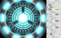 For the central light, make a circle on a new Shape layer, using the same color and effects as on the ring. I added Photoshop's Herringbone pattern on this layer's mask to suggest a wire mesh or grill over the light, but it will probably get blown out after the final layers are added. To increase the amount of light wrap around the solid elements and extend the glow behind everything, make a new layer and add a foreground-to-transparent Radial gradient with your bright blue color. Give it the same Outer Glow as on the previous layers and add a layer mask based on a selection loaded from the solid interior elements. Make sure that Layer Mask Hides Effects is not checked and set the layer's Blend mode to Screen. Use this layer as a Clipping Mask for a new layer above it and fill that with a Radial gradient of white to transparent. Now the center looks really luminous, with light spilling out in all directions and fading away from the center. The reflected glows we put on parts like the coils and brackets are finally starting to make sense.
 It looks good and we could call it done at this point, but there is just a bit more to do that would really take the image to the next level. It might not be completely accurate, but to really show the effects of luminosity, we could lighten the black background. Go all the way down to the bottom layer and make a new one right above it. Use a dark grey of your choice and make a Radial foreground-to-transparent gradient from the center of the arc. I suggest using the next to the darkest slot from one of the PMS grey ramps. The one you choose depends on what color cast you want to give the background. Then go to the outer ring Shape layer and give it a Drop Shadow as shown. If the Distance is set to 0, the shadow extends out evenly from the shape, similar to an Outer Glow. This suggests that the ring is raised up a bit from the background and casts a small shadow from the reactor's lights.
That's it! Now you have a realistic and accurate depiction of Tony Stark's arc reactor to decorate any item or device you wish. If only it could power it as well...

 Add an Outer Glow of the same blue color. Adjust the Size and Opacity to your liking, but keep the Blend mode at Screen. For the Inner Glow, use the settings shown. The key element here is to change the Source to Center. You can keep it at the default light yellow; it may warm the interior a bit, but with Screen, it will be pretty much white anyway. Now you see why we have this shape on top of everything else. Luminous glows will always appear to be above solid items around or even above them. Make sure you don't check the Layer Mask Hides Effects option on Advance Blending. If you do, you can see what happens: the glows around the masked areas disappear completely. Here you can see the difference between having this option checked and unchecked. This is a great example of why this option is here. It is very powerful and can do a lot for you if you understand it.

 For the central light, make a circle on a new Shape layer, using the same color and effects as on the ring. I added Photoshop's Herringbone pattern on this layer's mask to suggest a wire mesh or grill over the light, but it will probably get blown out after the final layers are added. To increase the amount of light wrap around the solid elements and extend the glow behind everything, make a new layer and add a foreground-to-transparent Radial gradient with your bright blue color. Give it the same Outer Glow as on the previous layers and add a layer mask based on a selection loaded from the solid interior elements. Make sure that Layer Mask Hides Effects is not checked and set the layer's Blend mode to Screen. Use this layer as a Clipping Mask for a new layer above it and fill that with a Radial gradient of white to transparent. Now the center looks really luminous, with light spilling out in all directions and fading away from the center. The reflected glows we put on parts like the coils and brackets are finally starting to make sense.
That's it! Now you have a realistic and accurate depiction of Tony Stark's arc reactor to decorate any item or device you wish. If only it could power it as well...
Subscribe to:
Posts (Atom)


