31 July 2010

Final color corrections (6 of 6)

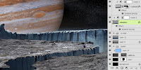
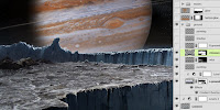
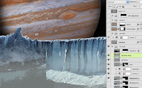
The last step is to do some color correction to get the lighting just right. My original photo is barren and rocky. Since Europa is covered in ice, we need to make it a bit bluer, especially in the lighter areas. To create a mask for this, duplicate the red channel. Perform a Levels adjustment and pull in the shadow and highlight sliders to increase the contrast. Load this channel as a mask by CTRL(PC)/CMD(Mac)+clicking on its thumbnail. Create a new layer, add a mask, and fill it with dark blue. Experiment with Blend modes and Opacity to find an effect you like. I ended up with Vivid Light at 40% Opacity. Now the ground highlights are tinted blue, but they should be orange in the middle because they are lit by Jupiter's light. Add a vertical reflected gradient of black-to-transparent on the mask to hide the blue tint in this areas. We'll add some color back in with the next step.

Create a new layer and load a selection from the channel  (not the layer mask) used in the last step. With the selection active, add a layer mask. Pick a bright orange from Jupiter and create a vertical reflected gradient on this layer in about the same spot as the black gradient on the mask of the underlying layer. Change the Blend mode to Hard Light and reduce the Opacity to 70%. Now, Jupiter is casting its light on the reflective surface of the icy ground.

Add a new layer, put a dark linear gradient on the left side, and change the layer's Blend mode to Multiply. Make a Levels adjustment layer and adjust the midtone slider as shown. Add a vertical black-to-transparent reflected gradient on the adjustment layer's mask, in the middle like on the previous layers with gradients. The idea is to darken the edges to make the middle seem more luminous.

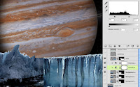
Add a new layer in Screen mode and hand paint in some highlights along the ground as needed. Put all of these color correction layers in a layers group. You can do this by Shift+clicking to highlight the layers, then click CTRL(PC)/ CMD(Mac)+G. Load a selection from the far ice wall layer masks and add a mask to this group. Now all of the layers in the group will affect only the ground layers of the image and not the sky.

As a final step, add one more layer on top of everything else and put some dark linear gradients along the sides and bottom. Change the Blend mode to Multiply and lower the Opacity to 50%. This darkening of the edges mimics the vignette that can appear in photographic images. It's not entirely necessary, but it is a nice look and is similar to techniques used by the famous matte painter Yanick Dusseault, so it must be good.

30 July 2010

Adding lighting effects and moons (5 of 6)

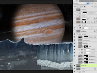
The image looks pretty good, but a few final touches will pull everything together. Since Jupiter is acting as a light source in the sky, some light wrap around the edges of the background ice will help to suggest its luminosity and make the ice look translucent. Load a selection from the ice wall masks, create a new layer, and fill it. The color doesn't matter. 

Add Inner and Outer Glows to this new layer. For once, keep them in Screen mode. Pick some orangey-pink colors from the background. Now Reduce the Fill of this layer to 0% so that only the glows are visible. The glowing edge and light wrap should be concentrated on the ice in front of Jupiter, so add a mask to this layer and put black linear gradients on the edges to hide the effects there. Make sure the Layer Mask Hides Effects option is checked. Now the glows are only visible in the middle, where the mask fades to white. To further complete the lighting effect, Jupiter itself needs a glow. But an Outer Glow using all the pixels on the planet's layer won't work, because the left side is in shadow. We need to make a selection from just light lit areas.

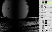
Turn off the ground layers and go to the channels. Duplicate the red channel, since it has the greatest contrast between Jupiter and the sky. Use a Levels adjustment and move the highlight slider to the left to make it mostly white. Move the shadow slider to the right to make sure the sky is entirely black. Load a selection from this channel and feather the edges by going to Select >Modify >Feather. Enter a large number to give the selection a very soft, blurred edge. Create a new layer and fill it with a rust color picked from Jupiter. Change the layer's Blend mode to Color Dodge and lower the Fill to 60%. Give it a large Outer Glow in Screen mode, using an orange picked from Jupiter. Load a selection from the ice wall's mask, add a mask to the new planet glow layer, and fill it with black. This time, leave Layer Mask Hides Effects unchecked so that the glow follows the edges of the jagged ice wall.

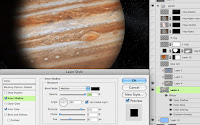
A couple of moons orbiting Jupiter is really what this image needs. Astronomers may disagree with the placement, but they will look cool. I used photos of Io and Ganymede. To tie them into the scene, add some Layer Styles. A little dark Inner Glow in Multiply mode should do the trick. Give them an Inner Shadow using the settings shown. You also may want to add a Bevel and Emboss and Color Overlay. Create a layer in Multiply mode for the shadow that Io casts against Jupiter. For a hint of reflected light on the moons from Jupiter, load selections from the moon layers, create a new layer, and fill it with a color. Again, what color you use doesn't matter. Set the Fill to 0%. Use an Inner Shadow with these settings to give the moons a rimlight coming from Jupiter. At this point, the image is just about complete.

26 July 2010

Creating the foreground (4 of 6)

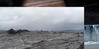
What this image is lacking now is a foreground. The idea is to create an icy expanse to suggest the frozen surface of the moon. I chose this photo of a barren, bleak landscape. It doesn't look too frosty right now, but we will take care of that later. You may notice one big problem: the ground photo isn't large enough to stretch all the way across my new image. Since I really liked this photo, I decided to make a ragged selection with the Polygonal Lasso tool, then copy and paste that area to a new layer. I moved it to the right edge of the image and used the original selection to mask out that same are on the original ground photo and just like that, instant crevasse! It's a bit of a cheat, but it works. Use the same channel techniques shown in the last entry to create a mask to drop out the sky. Finally, put a dark blue-to-transparent Gradient Overlay in Multiply mode to darken the left side of the ground. Now Europa's surface is really coming together.

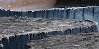
Obviously, the gap has to be filled, so use another ice wall photo for the side of the crevasse. Put a dark Gradient Overlay on the left side, similar to the one on the ground, to darken the interior of the crevasse and suggest more light entering in from the right side where it opens up. The final step is to paint in the missing details and extend the ground. In my case, I also have to cover up the hiker from the original photo. To pull things together, paint a bit of a highlight edge along the tops of the rocks that stick up. Remember that the light is coming from behind, so we need a backlit look. Use a small brush to paint in these details. As usual, I used one of my favorites: Photoshop's own Pencil - Thin brush.

To make the near edge of the crevasse stand out a bit more, add a dark linear gradient over it on a new layer in Multiply mode to darken it even more. Put a reflected gradient going horizontally over the far edge of the ground to soften it and blend it up into the ice wall. Keep its layer in Multiply mode, but reduce the Opacity to 50%.

The ground is almost done, but the right edge of the crevasse needs a bit of hand painting to finish off the edge and add any necessary details. Also, the rocks that are sticking up from the ground should probably cast a bit of shadow. Paint the shadows on a new layer in Multiply mode, using a dark color. Try a brush with a softer edge for this. Reduce the Opacity as needed, and the foreground is finished.

25 July 2010

Creating the horizon (3 of 6)

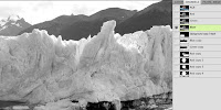
Since the background is pretty much done, it's time to turn to the foreground, which is supposed to be on the surface of Europa, an icy moon of Jupiter. The far edge of the surface up to the horizon will be an ice wall backlit by Jupiter. Start with photos of ice walls. Antarctica is a good source. Since I didn't have one that was large enough to stretch all the way across, I used two photos. 

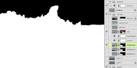
Once they are sized and placed, their backgrounds need to be removed. If you were about to reach for the Tragic Wand or other manual selection tools, that's strike one. Put it back. The best way to do this is to make a mask  procedurally from the channels. Find the channel that has the most contrast between the area you want to keep against the area you want to remove. In this case, it's the blue channel. Duplicate that channel and perform a Levels adjustment. Slide the highlight and shadow sliders in to increase the contrast of these areas. Move the midtone slider as needed. What you want is pure black against pure white, with a bit of midtone to anti-alias the edge, so your sliders should end up quite close to each other. You may need to paint in black and white by hand above and below the dividing line. CMD(Mac) or CTRL(PC)+click the channel's thumbnail to load the white area as a selection. With the selection active, add a mask to this layer.

If your photos don't quite match each other (like mine didn't), add the necessary adjustment layers and clip them to the photo layer. I used Levels and Hue/Saturation adjustment layers on the left ice wall to darken it, grey it down, and warm the hue just a bit. The edge of the photos is still quite obvious, so it's time to do some hand painting. Even working with photo-realistic images, some painting like this is usually necessary. Use a small brush and pick colors directly from your image. Paint on a new layer the details needed to seamlessly join the images. I also painted out the highlights along the wall's face, since the lighting in this scene should come from behind and to the right. Then, I added a linear gradient on a new layer above all the ice wall layers using a light grey-blue picked from the image to suggest an icy mist floating in the canyon and lowered that layer's Opacity to 60%. It may not be astronomically accurate, but overall mood is my primary objective here.

To further enhance the icy feel of the moon's surface, add some layers behind the ice wall and put linear gradients on them, using dark blue and rust colors. Set their Blend mode to Screen and adjust the Opacity as needed. The moon probably doesn't have an atmosphere for ice crystals to be suspended in, but it looks cool. Just don't show this image to many of your astronomer friends.

24 July 2010

Finishing the planet (2 of 6)

To finish up Jupiter, we need a softening of the planet's edge on the lit side to suggest the atmosphere. This effect will probably be a bit exaggerated, but it's commonly done on planet paintings and it will look cool. The best way to do this is with Layer Styles. Load a selection from Jupiter, create a new layer, and fill that layer. It doesn't matter what color you use, because the Fill will be set to 0%. Add a small Inner and Outer Glow in Screen mode, using a reddish brown. Now there is a soft glow around the planet's edge. In order to have it fade away along the dark edge of Jupiter, make a mask on this layer and put a linear gradient on it. In order to avoid strange transitions along this gradient edge, be sure to check the Layer Mask Hides Effects option.

Did you know that Jupiter has rings? I don't know if they would be visible from one of its moons, but it seems like a cool element to add. If you can find an astronomical image of some rings that will work, put it in an alpha channel and load a selection from it. You can see my selection here. With the selection active, make a new layer and fill it with a light color picked from the planet. Add a subtle Outer Glow in Screen mode and a Color Overlay if you need to adjust the color. If you want, you can put the left and right rings on separate layers and give the left side of the rings less glow because they are in shadow. Lower the rings' Opacity so that they don't stand out too much. I used 50%.

This looks good, but to make them look rounder and less flat, create some new layers to darken the edges and brighten the middle. Use a reflected gradient with a bright color for the middle of the planet and a linear gradient with a darker color for the edges on a separate layer set to Multiply mode. Adjust the layers' Opacities as necessary. You will need a mask on these layers, so load a selection from the ring layers and use it as a layer mask for these layers. Here you can see the mask I used. The rings are now complete, but something is still missing. They should probably be casting a shadow against Jupiter, given the current lighting setup. This shadow will also help make the planet look more spherical.

Use the Pen tool to create a gentle curve that cuts across the planet. It should follow the rings quite closely around the middle and curve away toward the edges. Set the Fill to 0% and make a stroke with Layer Styles. Pick a dark color from the image for the stroke color, set the size to 3 pixels, and use the Center position. So that the stroke is only visible across Jupiter, load a selection from the planet layer and use it to create a layer mask on this layer. Check the Layer Mask Hides Effects option. The  shadow layer should be set to Multiply mode and the Opacity lowered. I used 60%. Now you too can see Jupiter's rings.

23 July 2010

Creating the background sky and planet (1 of 6)

This started out as a concept painting, but quickly evolved into a photo-realistic background image. Before I started out, I did a quick sketch from scratch in Photoshop to work out composition, lighting, color, mood, and so on. Dylan Cole, a great matte painter working professionally right now, starts out with a painting, even if the final will be done using photos. Here is my painted study for this image.

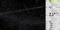
I made some changes in the final, but this gave me a good idea of what I was shooting for. I made a new document at 1920x1080 pixels. This is HD resolution and I would normally work at twice that size if HD was my final goal, but since this was really just concept art, working at a smaller size seemed okay. The first thing I needed was a starry sky for the background. There are some good tutorials out there on how to make a star field using the Add Noise filter on various layers, or you can pull some good images from NASA and similar websites. I did that just to save some time.

These stars looked a bit too bright, so lower the layer's Opacity to 60%. Then to add some denser clusters, create a new layer, fill it with black, and add Gaussian Noise with Monochromatic unchecked. This is to give some color to the stars, but it is a bit too much, so perform a Hue/Saturation adjustment to the layer and lower its Saturation down quite a bit. Normally, I would use an adjustment layer to make non-destructive edits, but this is a situation that requires the direct approach. The end result should look about like this.

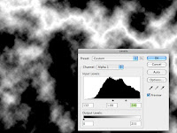
Change the layer's Blend mode to Screen and lower the Opacity to 40%. Now the black drops away and the stars on the layer beneath will show through. To add a random, cloudlike pattern, make a layer mask for this layer and add a black-to-white linear gradient at a bit of a horizontal angle. Then run a Difference Clouds filter on the mask. You should see something like this. The wavy black line running through the clouds texture is created by the interaction of this filter with the gradient ramp. Now, invert the mask so that you get a negative of this image. Do a Layers adjustment and pull the black and midtone sliders to the right so that you get more black in the image. The white areas of the mask will reveal the noise texture on this layer and the black will conceal it. Just so you know, this technique is great for bolts of lightning and electricity.

As a final touch, add a new layer and fill it with a light blue, clip it to the noise layer, and change its Blend mode to Color. Lower the Opacity to that it looks good. The idea here is to add a bit of blue tint to the background stars. Adjust all of these layers to get just the effect you want. Here is what I ended up with.

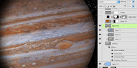
Now for Jupiter. The best thing to do is find a nice, high-res astronomical photo of the planet. Again, NASA or other image banks are a good source. Scale and rotate the image as needed and remove it from its background with the Elliptical Marquee. This is a nice photo of Jupiter, but it looks a bit flat. To take it to the next level and heighten the drama, use some Layer Styles. The effect we are looking for here is Jupiter as a light source in the night sky, reflecting light from the sun, but we also want to see the shadow's edge along the planet. The Layer Style includes an orange-to-transparent radial Gradient Overlay in Multiply mode to give the planet some roundness, a Color Overlay of rust in Overlay at 40%, an Inner Glow of dark grey in Multiply to curve the edges away a bit, and an Inner Shadow. Use these settings for a realistic shadow. Quite the difference, no?

To further darken the edges, create some new layers and clip them to the bottom Jupiter layer. Add some linear gradients using a medium greyish-blue-to-transparent linear gradient from top to bottom and right to left. Use darkening Blend modes on these layers like Color Burn or Multiply and adjust the Opacity as needed. To punch up the white bands across the planet a bit, make a new layer and change its Blend mode to Color. Paint some light blue over the white bands where you would like to bring some white and grey back. Don't clip it along with the other layers or the Color Overlay will override this one as well. Jupiter looks about done at this point, so in the next tutorial, we will finish it off and add the final details.
22 July 2010

My work at the BYU alumni show

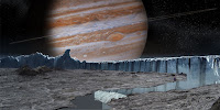
Last month, I submitted a piece for BYU's 30-year Alumni Illustration show. Since my work now is digital and of subjects that most people would not necessarily want to see hanging in a gallery, my options were a bit limited. But I had a nice print of a concept matte painting I did for a project in the Pixel Corps a couple of years back. It's a view of Jupiter, as seen from Europa, one of its moons. The print was large enough to get framed, so I did that quickly and sent it off. 

Earlier this month, I was actually passing through Utah, so I stopped by the campus to see the show. The work was just amazing and I felt humbled to have my work in the same exhibit. Of course, commercial art and illustration are extremely diverse, serving very different needs. My work serves its purpose. You may recognize this painting as one of the images on the site. Since the month is slipping away, I decided to do July's tutorial on this image.