31 August 2010

The finishing touches (7 of 7)

Just a few more steps and this illustration will be complete. The red platform needs some shadow in the water, just like the other one. Go back to the shadows layer in the waters group and paint some more 5535 for this shadow. You can give it some reflections on the reflections layer if you want, but it doesn't need much.

This platform is an intense red, so if you want to make it really sit in the scene, you can adjust the color a bit. Load a selection of the entire platform. You can do this by Shift + CTRL (PC)/CMD (Mac) + clicking on its Shape layers. Make a new layer above everything and fill it with a color. It doesn't matter what the color is, because you will take the Fill down to 0%. Give this layer a Color Overlay of PMS 292 at a very low Opacity. Next, make a Gradient Overlay of 292 to transparent and add a Linear gradient so that the left side gets the color. Adjust the Opacity to your liking. Now the rig is tinted with the overall blue of the scene. The left side, which is farther away, gets a bit more blue as it recedes in the distance. The effect is subtle, but it's there.

Now, let's turn our attention back to the yellow rig. Use the same Layer Styles trick to fade it into the background as well. You can even copy and paste the Layer Style you just made. But since this structure is farther in the distance, double the Opacity of the Color Overlay. Make the Gradient Overlay vertical, so that more of the color goes at the top against the sky. This is an easy way to add atmospheric perspective.

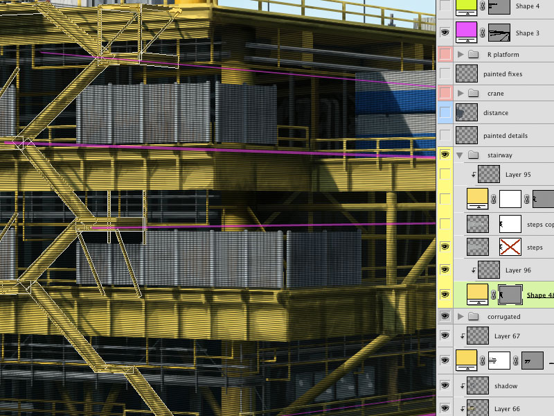
This rig has a lot of yellow and could use a bit of color to give it more interest. Also, in the photo I was using as reference, there was a big red and white boom sticking out at the corner. By now, it should be second nature to build something like this, right? Use the Line tool to make vector Shape layers. Build the ladder with perpendicular lines, then duplicate the paths and Transform them into position. Inner Shadow and Bevel and Emboss effects will help to give it roundness. Paint on clipped layers. To tie things together, pick a red from the other platform. Since you added atmospheric perspective to knock the rig into the background a bit, do the same for this tower. Make the Color Overlay's Opacity half of what you used for the yellow rig. I used 10%, so this structure will be 5%. Adjust the Gradient Overlay so that the color is at the bottom of the boom and fades away toward the top. This will help it to come forward and stand out from the background. Do any needed painting touch-ups on a new layer and the image is done.

29 August 2010

Building the red platform (6 of 7)

This image also has another kind of platform that is more in the foreground. The same techniques as on the previous one were used for this one, so I won't go into as much detail. I will show you the steps, but it's going to be very similar to how the yellow rig was built. Start with the Rectangle tool to make a Shape layer. Use PMS 484 as the base color. Add a linear Gradient Overlay of 296 to transparent in Multiply mode to add a nice shadow to the column. Use an Inner Shadow of 290 in Color Dodge to give the left edge a bit of highlight. Sometimes I use this method instead of Bevel and Emboss because Inner Shadow gives you a bit more control. Add a layer mask and paint out in black where the column meets the water. Check Layer Mask Hides Effects in the Blending Options section of the Layer Style so that the layer's effects won't follow the new edge created by your mask.

I'll assume that by now, you know you will paint the details on a new layer that uses the Shape layer as a clipping mask and put the shadows on a layer in Multiply mode that is also clipped. Use a vanishing point on the horizon and draw perspective lines from it with the Line tool. This should be on a Shape layer near the top of your layers stack and will be the guides for this platform. The main shapes were made with the Pen, Rectangle, Rounded Rectangle, and Line tools as vector shapes all on one Shape layer using 419 as the color. I rarely use pure black or white. The ranges of greys in the PMS library are really more versatile. Here's how it looks with some details painted in. I chose colors directly from my photographic source material. All the details were painted on one layer with a shadow layer on top, this time at 100% Opacity for some really dark and drastic shadows. Foreground objects can have more contrast and extreme values than objects farther back.

Use as many layers as you need to add all the detail. Again, start with vector shapes and use them as clipping masks for your painted layers. This rig has a yellow railing, but it's a bit more of a mustard color than the yellow platform, so use PMS 458. Make sure all lines that are parallel to the ocean or ground plane converge at the horizon somewhere. You can see how much the perspective guides help here. If you want to paint a straight line that isn't vertical or horizontal, you can make a selection with the Polygonal Lasso tool, fill it with a color, then keep painting on top of it.

This rig has some interesting vertical pipes mounted on the outside. Use the Rounded Rectangle tool to make the main shapes, then use the Ellipse tool to add in the round areas. The Inner Shadow is 290 in Color Dodge mode, so it's acting as a highlight, just like on the big column. It also has Bevel and Emboss for the shadow on the right edge. You can use this technique if you want the highlight and shadow to have different sizes or edge sharpness. If you do them both with Bevel and Emboss, they will look the same. There is also a 296 Gradient Overlay in Multiply mode to darken the bottom of the pipes.

This collection of tubes, ducts, and whatnot was made in the same way with PMS 416. The Shape layer has an Inner Glow of 411 in Multiply mode to give it a dark, rusty feel. The pipe with the elbow bend can be made with the Pen tool and carefully adjusting your curves, or by subtracting one rounded rectangle from another. Hopefully, you can see that the painting is quite loose. It was all done with the Chalk 11 pixel and Pencil - Thin brushes, two of my favorites and some of Photoshop's most useful. Their Opacity  Jitter is set to Pen Pressure, and the size is adjusted as needed. That's about it; the platform almost looks done. In the next tutorial, we will wrap up the entire image.

28 August 2010

Finishing the yellow platform (5 of 7)

The last major pieces still missing are the different levels of the platform. Build these as Shape layers, just like you have done on the others. Use PMS 123 and the Line, Rectangle, or Pen tool. Be sure to follow your vanishing point guides. You can Copy and Paste the initial railings from previous layers. That's why it's good to keep the untransformed versions of these shapes. If the transformed railing sticks out past where you need it, hold down Shift and create a new rectangle or similar shape on this layer. Then, select it with the Path Selection tool and click the Subtract from shape area (-) button. That selected shape now acts as a vector mask, hiding the paths it intersects. As with earlier steps, create  a new layer for painted details and one in Multiply mode for the shadows. It shouldn't take many more layers to finish this section off.

Next are some walls of corrugated metal. Again, make them as vector Shape layers using PMS 428. Use the Line tool and hold down Shift to make the vertical beams that stick up a bit. Use the Rectangle tool and hold down ALT (PC)/OPT (Mac) to cut out that open area in the middle. Use the same vertical lined texture in Luminosity mode as on the cargo containers and clipped layers for painted details and shadows.

Build the outer stairway with (you guessed it) the Line tool on a Shape layer. for the little stairs, make a pattern of thin, horizontal white and black lines and fill a new layer with it. Change its Blend mode to Multiply and lower the opacity a bit. Use Transform >Skew to make the pattern match up with your perspective lines. Clip it down to your Shape layer and mask out any areas where you don't want to see the stairs. Add the usual detail and shadow layers.

This rig is almost done, but it needs just a few more details and doodads. These can all be painted on one layer above everything else. You can add poles, lamps, pipes, tubing, lifesaving rings (at least, I think that's what they are) on the railing, and so on. That does it! Now, there's the other platform...

25 August 2010

Adding more detail to the rig (4 of 7)

It's time to start thinking about perspective. Actually, perspective needs to be taken into account when starting the illustration. For architectural subjects, having accurate vanishing points is crucial. The Line tool is an obvious choice, but try using it to make a vector Shape layer. That way, you can extend the ends far beyond the canvas size of the image. You can also reposition them once they are down. I like to use a different layer and color for each dimension. Remember that parallel lines converge at the horizon.

Most of the necessary detail consists of pipes, beams, girders, and so on. As on the other parts of the base, use the Line tool in varying weights to make vector shapes. Use PMS 447 for these ones and then paint on a clipped layer. Follow the vanishing point lines as guides and move them as needed. For railings that have evenly-spaced vertical pieces, create them straight on with the Line tool. Hold down Shift as you make the lines so that they will be perfectly vertical or horizontal. With the Path Selection tool, select all the vertical bars, then use the Distribute horizontal centers button to space them out evenly. Duplicate these shapes by ALT (PC)/OPT (Mac) + dragging them or just Copy and Paste. If you like, click the Combine button to join all the shapes into one compound path. Transform the duplicates using Skew so that they match up with the perspective lines. Not only do the horizontal lines converge, but the vertical ones get smaller and closer together as they recede into the distance. How cool is that? The only way to efficiently do this is with Shape layers. Aren't they great?

Keep building up the different parts of the platform. So far, the only colors you need for the Shape layers are 123 for the yellow and 447 for the grey. Use the Line, Rectangle, and maybe the Pen tools to make the shapes. For this image, Layer Styles are minimal; most of the detail comes from painting. You can see that the painted details are really loose. Just suggesting the details they represent will be enough. Organize related sections of the oil rig into Layer Groups to keep things tidy. Naming and color coding them helps, too.

For this corner tower, these same simple Shape tools will do the job, except this one also requires the Ellipse. Just eyeballing it should do okay. When you break it down, there's not much to it. Hold down Shift to add paths to the current Shape layer. Here you can see the three Shape layers that combine to make the basic shapes of the tower. Since its color is a bit more orange than the rest of the rig, use PMS 1235. Each shape layer has a layer with painted details clipped to it. For the final details, you can paint those on a new layer on top of it all. Painting them instead of building them with vector shapes will be okay, because it allows you to work a little more freely. To make these thin lines, use a small, simple brush and a mouse. This is one instance where a stylus isn't the preferred tool. Click with the Brush on a starting point, then Shift + click on the end and you get a perfectly straight line between the two points.

This rig has some cargo containers mounted on the side. These are basically big boxes, so you can make them with the Rectangle tool. Use the vanishing point lines as guides. Create the main shapes as vector Shape layers in white and add a black Gradient Overlay in Multiply mode with very low Opacity. Create the blue and red shapes as separate Shape layers using the same techniques and clip them to the white base layer. Now to texture them. The containers are made of corrugated metal, so they will need a pattern of light and dark vertical lines. This pattern is in a layer in Luminosity mode and low Opacity and clipped along with the rest of the layers. You could probably also do this with a Pattern Overlay. Create a new layer to paint in some dark details like streaks, dirt, and grime, then create another new layer in Multiply mode for the shadows and paint them with PMS 296. Adjust the Opacity as needed. As you can see, all these layers are using the bottom Shape layer as a clipping mask. Where would I be without this technique? 

23 August 2010

Building the base (3 of 7)

For the base of the oil rig or platform sitting in the water, we'll need the Line tool. Make sure it's set to make a Shape layer and start putting in the columns with thick lines. Use PMS 123 as the color. Hold done the Shift key as you make each new line so that they are all on the same layer. Use smaller lines for the railing. The left and right bracket keys are a handy way to make your lines lighter and heavier, respectively. Since these columns are on the far side, add a Color Overlay of 296 in Multiply mode to show that they are in shadow. A bit of an Inner Shadow is nice, too. Add a layer mask and paint out where the columns go into the water. Then, on a new layer clipped to the Shape layer, do some random dark painting to suggest grime, rust, oil, corrosion, and so on. This is the pattern we will follow for most of this rig. On a new layer, build some thinner vertical pipes with the Line tool. Use the same colors and Layer Styles as on the first set. To create the curved pipes, you can draw the line first, then use Transform >Warp to curve them. You could also click on a line with the Path Selection tool, then use the Pen tool to add anchor points, then use the Direct Selection tool (the white arrow) to move points and adjust the curves. Once you have a curved pipe that you like, select it with the Path Selection tool (the black arrow), copy, and paste it to create duplicates. The idea here is to keep all of them on one Shape layer. To keep things simple, I mentally divided the base into back-, mid-, and foreground components. Each has its own layer. This one is the mid layer.

Now, create the foreground parts of the base structure using the same tools, colors, and techniques. Use the Direct Selection tool to click on corner points and move them out to widen the bases of the columns. Remember that Photoshop doesn't really make lines; even the smallest of these are actually rectangles. This Shape layer won't need the Color Overlay, because it's not in shadow. See how the depth is created here? As you are working, keep in mind where the sun is and where the core and cast shadows will be.

In between the front column and middle pipe layers, make a new layer and paint the interior levels of the platform. This can be done loosely. Just try and suggest pipes, beams, control panels, and so on. An easy way to paint perfectly vertical or horizontal lines with the Brush tool is to hold down Shift as you are painting. Then, make a new layer above the front columns and clip it to that layer, just like on the mid and back layers of the base. Paint shadows, grime, and other details on it, using the vector Shape layer as a Clipping Mask.

This part of the rig is done, so it's time to turn our attention back to the water. Make a new layer in Multiply mode and 70% Opacity above all the other water layers and paint the shadows in with 5535. I used my favorite Pencil -Thin brush, but I used the Brush Tip Shape section of the Brushes panel to rotate it so that it was horizontal instead of vertical. 

Paint the reflections of the structure on a new layer. Use a larger brush and pick colors right from the platform base. Paint the reflections very loosely; there's no need for detail here. The reflections will only show up on the lighter areas of the waves, the part that faces upward to the sky. Where the water surface faces away from the sky or the oil rig, there will be no reflection. These are the darker areas. So, make a mask on the reflections layer, load a selection from your painted shadows or other dark parts of your water, and fill the mask with black to block out the painted reflection from these areas. The result should look about like this. Notice how you really don't end up seeing much reflection at all. This is because the sea is choppy and much of the water surface faces away from the sky or whatever is sitting in the water. On calmer water without waves, you would see more reflection.

22 August 2010

How to not paint the water (2 of 7)

I have painted water by hand before, and I have also used a combination of filters to try and get a water effect. Both have their place, but usually neither one looks realistic enough and both can be time consuming. For this water, we will start with a photo.

This is the photo of water that I chose. It has a nice expanse of empty ocean. I don't want to just use it as is, but it can help to create some nice photo-based textures. What we need is a selection made from the highlight areas of the water. The best way to make selections from photos is procedurally, with the channels. See which one has the most contrast between the lighter wave tops and the darker areas. In this case, that turned out to be the green channel.

Duplicate the channel and apply a Levels command. Pull in the highlight and shadow sliders to increase the contrast so that the tops of the waves turn white and the shadow areas turn black. Then, load a selection of the alpha channel by CMD (Mac)/CTRL (PC)+clicking its thumbnail.

With the selection active, create a new layer on the illustration and fill it with PMS 291. Change the Blend mode to Screen and the Opacity to 50%. Clip it to the 5395 Shape layer. The result looks pretty good, but in this photo, the sun's reflection on the water was blown out and is now a solid color. It needs some shadow areas to make it blend in with the rest of the water surface. This is best handled with a mask. Add a mask to this layer and paint black wave shapes back in with a small brush. Try to mimic the surrounding water texture. Incidentally, the lightest part of the water faces upward to reflect the sky. That's why it's blue. The darker part faces more to the side and can contain more colors like green and brown. That's because you are looking through the water and seeing what's below.

To add some shadows back into the water, look at the photo's channels again and see which one has the most contrast in the darker areas. This time, it was the blue channel. Duplicate it and Invert it so that you have a negative image. Now, perform the same kind of Levels adjustment to get enough contrast and make a selection. Make a new layer under the highlights layer and with the selection active, fill it with 296. Change the layer's Blend mode to Multiply. If it isn't dark enough (mine wasn't) you can always duplicate the layer. Make a new layer in Color mode and add a foreground-to-transparent gradient of PMS 5535. This will add a nice touch of green as the water gets closer. To finish things off, make a new layer above the highlights. Make sure it is not clipped along with the rest and change its Blend mode to Screen. Put a Reflected gradient of medium blue to transparent along the horizon to really fade it into the distance. Lower the Opacity if you like and that's it! You've got a great ocean that's not quite a photo and it didn't take all day to paint.    

21 August 2010

Starting the oil rigs illustration (1 of 7)

This is the image we'll take apart for this month's tutorial. As with much of my professional work for print, the original image was created 9x12 inches at a resolution of 300 ppi. The final image was vertical  with foreground details and some other images vignetted on top. But this tutorial will just concentrate on the back image; that will be plenty to do.

Fill the background layer with PMS 2905 for the main sky color. Make a new layer above that and add a vertical gradient of 285 to transparent. Change the Blend mode to Multiply and lower the Opacity as desired. I chose 40%. Paint some clouds on a new layer using a simple brush and Cool Grey 2. I used one of my standard favorites. Paint just the lighter part of the clouds. Since they are in the distance, the shadow areas won't be any darker than the sky.

On a new layer, paint the cloud highlights with a smaller brush using white. You are looking to make some sharper edges here. Now, add some gradients above the clouds. This will help them fade away as they approach the horizon. As always, the gradients will be foreground to transparent. The first one uses PMS 290. Lower the layer's Opacity a bit. The next gradient will be 2905 again, but change its layer's Blend mode to Screen. Lower the Opacity if necessary.

For the ocean, use the Rectangle tool to make a vector Shape layer. with 5395 as the color. This dark greenish-blue will give some shadow areas to the water. To make the horizon a bit more exciting, curve the top of the rectangle by selecting it with the Path Selection tool, then clicking in the middle with the Pen or Add Anchor Point tool. Then click that new point with the Direct Selection tool (that's the white arrow) and move it up a little bit. Now you have a curved horizon.

Add some Layer Styles to give the water some depth. A medium blue Gradient Overlay in Screen mode brightens the water as it approaches the horizon. A soft Inner Shadow with Cool Grey 1 in Screen mode and Outer Glow of 290 in Normal mode will fade the water's edge at the horizon. Adjust Opacities until the edge looks sufficiently distant and fading away. In the next tutorial, we will cover how to not paint the water texture.

13 August 2010

My page in the Directory of Illustration

Last year, I decided to advertise in the Directory of Illustration. It's something we all talked about in school. Now that I am concentrating on my freelance work, I figured it might be a good idea. Recently, I finished my first big project for a new client since having a portfolio page on the Directory's website. I don't know if there was any connection, but it is a good sign. The published directory will be out later this year and I will have one page in it. Here it is, combining several industrial illustrations I have done over the last couple of years. You can download a PDF of it by clicking here.

This month's tutorial will be based on the illustration of the oil rigs at the top of my Directory page. I'll take you through all the steps I took to create it.

12 August 2010

Writing a column on another website

I have been asked to do some writing periodically for Zero2Illo, A Blog for Aspiring Illustrators. They have an Ask the Expert section and for some crazy reason, I was given a list of questions to answer. The topics include how to transition from traditional to digital artwork and getting consistent color. You can read all of the questions with my answers here.