28 February 2010

Texturing with painting and layer styles tutorial

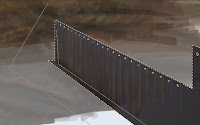
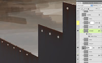
To finish this up, let's start with the Layer Style. This one uses Inner Shadow and Gradient Overlay. I use gradients so often because even if an item is just one color, it will never be consistent. One part will invariably be darker or lighter than another. Put a dark gradient in Multiply mode to darken the bottom right corner of the wall. Since the light source is the sky above, the top of the wall should be a bit lighter than the bottom. also, corners tend to be darker than the rest of a structure because the walls come together and throw more shadow there. Add an Inner Shadow to suggest the thickness of the wall. An important concept to get down here is that shadows don't have to be dark and glows don't have to be light; it all depends on the color and blending mode you choose. To show the inner width of the wall reflecting the light from above, change the blend mode to Normal and choose PMS 413, a light warm grey. Set the Size to 0 so that it will have a sharp edge and adjust the angle to match the light source. Now it's a width instead of an inner shadow. Remember to uncheck the Use Global Light feature so that other light-based effects won't change with this adjustment.

Add a new layer above this base layer and clip it so that it uses it as a clipping mask. Notice how many layers will be clipped to the flat, solid color wall layer (labeled 'M'). Paint some loose, scribbly texture with rust and dark grey colors on this layer. The edge layer above it  is set to Screen mode at 50% Opacity. Paint some light vertical lines here with a 1-pixel Line tool. It was set to raster, but it could have easily been vector. The layer is set to Screen mode to suggest highlights along these edges.

To show the seams and joins between the separate pieces of piling, use the Line tool to make thin, dark vertical lines. Add a layer effect to suggest the curving edges. I chose Drop Shadow, Outer Glow, and Bevel and Emboss. Remember to change blending modes if needed. It's best to work from photos and refer closely to your source material to match it closely with these effects. For the final touch, I added some spray-painted marks like measurements and a letter at the end, using a soft round brush and bright saturated colors to mimic fluorescent spray paint. It's good that this was on its own layer, because the client didn't want the marks there, even though they were in the photo. I like the bit of color they add, so I turned them back on for my version to show. That does it. Now we have a nice rusty textured wall made of metal sheet piling, just what you always wanted!

27 February 2010

Creating streaks with a filter tutorial

Now we will begin to create what are called the tail walls of this piling construction. I began with a simple, flat raster shape filled with PMS 446, which is a dark, steely grey. I transformed it into position using Skew and Scale using the techniques I showed in the very first tutorial for this image. When the perspective looks right, it's time to start adding textures for realism.

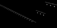
The wall needs some rusty streaks running down from the top edge and the holes. There is a great way to do this, but it requires a few steps. You'll need a selection of the holes and the top of the wall and an Alpha channel. Select the pixels of the bottom wall layer. A great way to do this is to CMD (Mac)/CTRL (PC)+click the thumbnail image in the Layers panel. Now you have a selection based on the visible pixels on that layer. But we need the empty areas selected. Invert the selection, then use a Lasso tool to to remove all the selection except for the holes. Holding down ALT/OPT will subtract from your current selection. I have the top profile of the wall as a shape on another layer higher up in the Layers panel. To add a selection from its pixels to the holes selection, hold down SHIFT along with CMD/CTRL and click on its layer thumbnail. Now go to the Channels and add a new channel. The background should be black, so fill the selection with white. This will be used to make a new selection, but we need to add the streaks. Wind is a great filter for this. As with many Photoshop filters, it's not so good for what it was designed for, but it's good at other things.

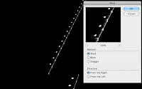
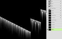
The problem is that in Adobeland, wind apparently only blows left and right, but we need it to blow down. Maybe someday Adobe will figure this out, but until then, you'll have to rotate your canvas to get this to work. Select Image>Image Rotation>90º CW. Now go to Filter>Stylize>Wind... Choose Wind as the Method and From the Right. It's a neat effect, but it's not quite enough yet. The filter will need to be run a few more times. An easy way to do this is to press CMD (Mac)/CTRL(PC)+F to run the most recent filter. Do this a few more times until the streaks are as long as you want, then rotate the canvas 90º CCW. This is a great way to make many kinds of streaks, but it has other uses. From here, you can make them softer,  fatter, blobbier, and run all sorts of filters on them, but that will be for another tutorial.  For our needs, these will work fine as they are. Load a selection from this channel, make a new layer and and fill it with a rust color.

I suppose you could hand paint something like this, but this filter is great at creating that randomness that is so hard to do manually. Usually Multiply mode is best for streaks like this, but since the wall was already dark, the rusty streaks need to be lighter than the background. After a bit of experimentation, I chose Hard Light as the blending mode. I also gave them an Outer Glow effect with a rusty brown in Multiply mode and added Noise. Remember that glows don't have to be bright. The streaks look good, but they are a bit too prominent. Reducing the layer's Opacity would also take down any layer styles, so lower the Fill instead. This reduces the opacity of the pixels on that layer, but leaves any layer styles intact. The effect is subtle, but sometimes that's exactly what you need. Tune in for the next tutorial to see how the wall gets finished. 

21 February 2010

Drawing a background city tutorial

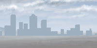
Here is my horizon so far. The ground and mountains are little more than quick scribbles at this point. You can also see some of the remnants of a rough city sketch from earlier in the process. I need to create a more structured, architectural shape for the final city. To do that, I'm going to use a technique I learned from the great matte painter Dylan Cole. He starts with a basic silhouette made quickly with the Rectangular Marquee tool. I've gone one step beyond that by using the Polygonal Lasso to add some angles. Then make a new layer and fill it with a bluish grey with the selection active. If you want to paint the spire white for some reason, go ahead. I did this image a few years ago. When I do this kind of thing now, I use a vector Shape layer because it allows greater flexibility and control in editing the shapes and their color.

Next, add a layer effect. At the very least, you need a Gradient Overlay. Take a look at distant mountains and cityscapes; they get progressively lighter as they approach the horizon. You can simulate this with a vertical gradient that fades up to transparent. The easiest (not the only) way to use a custom gradient is to pick the color you want as your foreground color before opening the Layer Style options. When you click on your gradient options, it's already there. I almost always exclusively use foreground to transparent gradients. Depending on your lighting situation, you may also want to try an Inner Glow, Inner Shadow, or Bevel and Emboss. Picking the sky color as a Color Overlay effect is an easy way to push it back in perspective.

Make a new layer and clip it to the city layer. This upper layer will hold the building textures and details. If the city is far away in the distance or does not need to look photo-realistic, it's easy enough to hand paint the details with a small, simple brush. Have some fun and be a little loose; all you really need to do here is hint at the architecture. Hold down the Shift key as you paint to get perfectly straight horizontal or vertical lines. I also added some crisp 1-pixel rules with the Line tool set to raster mode. Even though the real colors of these buildings have white, grey, black, tan, brick red, and others, you'll see that all the colors I've painted here are quite blue. This is because of their distance from the viewer. You could also paint them more accurately or use photo textures and use the Color Overlay effect on the clipping mask layer to knock them back as much as you want. How does this work when the layer style is just on the bottom layer and you are painting or texturing on layers above it? The answer is the clipping mask. As one past student of mine put it, all the clipped layers 'inherit' the settings of the clipping mask layer. This includes Opacity, Fill, blending mode, Blend If settings, and Layer Styles. That's why, generally speaking, the clipping mask layer should be Normal blending mode and 100% Opacity and Fill. Notice that the fading gradient of the city silhouette also affects the painted building textures, even though they are on a layer above it.This would be the same for other interior effects like Inner Shadow, Inner Glow, Inner Bevel, Pattern Overlay, and so on.

The city looks okay, but I'd like it to have a bit more depth, so I have added another set of building silhouette and texture layers. You'll see that these colors are a little brighter and more saturated to bring them forward just a bit more. You could keep doing this to create additional depth if needed, but for my purposes, these two levels did the trick.

The last thing to do is to attach the city sitting on the horizon to the dirt in the foreground. This is done by continuing the city elements along the ground. Try some very loose painting here; all you need to do is suggest things like trees, houses, roads, parks, and other suburban buildings. You can also increase the saturation and value of the colors to bring them forward even more. All I have done is hint at what might be here in the outskirts of the city. Your brain fills in the rest and you probably think you are seeing more detail than is actually there, especially when it gets zoomed out. That's it; the city is now built. In the next tutorial, I'll cover texturing closeup items with more detail.

20 February 2010

Painting clouds tutorial

In the previous tutorial, we made a custom cloud brush, but you can also find some great free ones on the Internet. Once you have them saved or loaded, use a stylus and start painting. Try several different ones. Look at cloud photos and try to duplicate the patterns and shapes in nature. Create a new layer to work on. I chose cool grey 3 from the Pantone library for the base color of these clouds.  Another good brush for this kind of work is the 11 pixel chalk brush that comes as one of Photoshop's defaults. It's great for soft natural edges like these where you need a bit more control than a scatter brush. You will need to set the Opacity Jitter to Pen Pressure and if you want, add some Scattering as well. The great thing is that you can size custom brushes up and down; it hasn't always been that way with earlier versions of Photoshop. The left and right bracket keys to the right of the P are a very handy way to do this while you are painting.

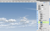
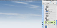
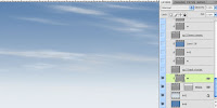
Create a new layer on top of this base layer. Use the bottom cloud layer as a Clipping Mask (OPT/ALT+click between the layers). Then paint white on the upper layer with various brushes to make the cloud highlights. I usually avoid pure white unless I'm simulating luminosity, but it seems to work well for clouds. You can always adjust the layer's opacity later if necessary. Now you need a shadow layer. I used PMS 443, which is a very bluish grey. Usually, I use Multiply mode for shadows, but on bright sunny days, distant cloud shadows are fairly light, so Normal mode works just fine. Then create yet another layer and put a gradient of the main sky color (in this case, PMS 646) to transparent. Set this layer's blending mode to Color and the Opacity to 40% to simulate some extra blue tint that comes from looking through more atmosphere at the horizon.

We did the farthest clouds with the Clouds filter in the last tutorial. Now we have the middle clouds and we still need the foreground clouds. Follow the same sequence as the mid clouds and create new base, highlight, and shadow layers for the foreground clouds. Paint on each one using the same colors as you used on the mid clouds. They all should be clipped to the base layer of cool grey 3. Now add one more layer on top of your shadow layer for the foreground clouds. This will be for darker shadows, since the nearer the clouds are, the darker their shadows will be. I used the same shadow color to paint with, but I made this layer Multiply mode at 50% Opacity. 

That should do it. Having three sets of clouds for foreground, mid, and background adds to the illusion of depth. Remember that as clouds get farther away, they should get smaller, lighter, and bluer (if the sky is blue). The topmost layer has a light bluish-grey gradient with Screen mode at 50% Opacity. This is to obscure the faraway clouds a bit more and make them look really distant. Also, in urban areas, the air tends to be filled with more particulate matter, so it's denser and more opaque at the horizon. We'll be putting a city back there, so we can't forget about the pollution. But the sky is done!

17 February 2010

Making cloud brushes tutorial

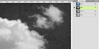
Now we are going to create a custom brush for painting clouds. A great way to do this is to start with a photo. Look for one that has nice edges against a flat blue background. Then look at the channels to find the one that has the most contrast between the cloud and sky. In this case, that is the red channel, but it also has a lot of noise, so the green channel might be a better choice. It has a decent amount of contrast and is much better than the blue.

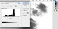
Duplicate the channel. There are several ways to do this, but I prefer dragging the channel down to the Create new channel icon at the bottom of the panel. This will make an alpha channel. If you have been paying attention to previous tutorials, you'll know that alpha means transparency. In making a new brush, the white will be transparent areas and black will put down 100% of your foreground color. Greys will be varying degrees of opacity based on their value. Since in our new channel the sky is dark and the cloud light, it needs to be inverted. You can choose Image>Adjustments>Invert, or simply press CMD (Mac)/CTRL (PC)+I. Now do a Levels adjustment on the channel. Click the little white eyedropper and click on the open sky. This makes the color you pick and anything lighter pure white. If you want  part of the cloud to be 100% opaque, select the black eyedropper and click. You can use the grey eyedropper to adjust the cloud density. When it looks good, use a Lasso tool to make a selection around the part you want to include in the brush. Then select Edit>Define Brush Preset... Name it whatever you like. I named mine big cloud.

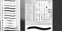
You now have a new brush, but you need to customize it in order for it to be useful for painting clouds. I like to use the Stroke Thumbnail option on the Brush flyout menu. You access it by that little triangle button at the top right corner. It shows you what a stroke with each brush would look like. Now open the Brushes panel. We need to give this brush some randomization.

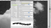
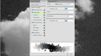
Click on the Shape Dynamics controls. Crank the Size and Angle Jitter up. Make sure the Control option is set to Off. Experiment with the other settings if you want, but you do need high jitter values in Size and Angle. Jitter is the amount of randomness in each of these settings. Now click on the Scattering controls. Check the Both Axes option. Now your brush will scatter along both the X and Y axes. Adjust the Scatter and Count sliders. Watch how the stroke example changes. Higher Scatter gives you clouds that spread out more. A higher Count makes denser clouds by adding more brush instances. Adjust the sliders until you like the stroke preview. Again, make sure the Control options are set to Off. The final thing to do is to click on the Other Dynamics control and set the Opacity Jitter to Pen Pressure. It's odd that one of the most important controls is hidden in this nondescript category, but so it goes. Keep the Flow at 0%. You will need a pressure sensitive tablet to do any real painting.

That's about it! You will need to save this brush in order to keep all of these customized settings. Click the little New icon just under the triangle button in the Brushes flyout to save this new brush as a preset. Try this with different cloud photos and custom settings to build up a library of different cloud brushes. Some can be soft, scattered, and foggy; some can be more distinct with less randomization. Do some test painting to see which ones you like. That's what we will do in the next tutorial

13 February 2010

Layers magazine article

Layers magazine has a designers showcase for their subscribers to show off their work. In 2008, I contacted them about being included and sent some samples. They responded by asking if I would like to be the spotlighted designer for the upcoming issue they were working on. In addition, there was a bit of money involved, plus I got a free subscription for a year. Sounded good to me. They asked for lots of samples and interviewed me for a nice article. The image for these tutorials ended up on the cover. Recently, I just happened to find a link to the article. To see that issue or read the article, click here.

11 February 2010

Making clouds with filters tutorial

As with skies, the best way to paint good clouds is to start by observing them. Keep a library of source photos. I'm not good enough to paint clouds out of my head, so I always use photos as reference. It also helps to be able to recognize the various cloud types. We'll begin with some thin clouds, maybe Cirrus or Stratus. They are often long and wispy, appearing near the horizon. To get this look, you can try the Clouds filter. It actually can make clouds, but you need to take a few steps that are not so obvious. I owe this technique to Jack Davis, as found in his incredible Photoshop WOW! books.

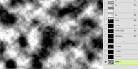
First, create a new alpha channel in the Channels panel (say that ten times fast). Make sure your foreground/background colors are the default black and white, and apply Filters>Render>Clouds. A little-known trick is to hold down the OPT or ALT key while doing this; it will give you greater densities of your foreground and background colors. This is what you want because you are working in an alpha channel. The blacks will be transparent and the whites will be opaque. In other words, you are building a selection. White will be 100% selected, black will be 0% selected (or deselected), and the greys will be the various strengths in-between, based on their brightness.

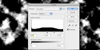
With this in mind, apply a Levels adjustment to the alpha channel. Click Image>Adjustments>Levels... Black will be your sky and white will be your clouds, so adjust it as you see fit. Move the black slider to the right to create more sky by increasing black. Move the white slider to the left to create denser clouds by increasing white. The grey slider adjust the value of midtones. The ratio of cloud to sky is up to you, but generally, you want more sky (black) for these kinds of clouds. The closer the sliders are to each other, the harder the edge of your clouds will be.

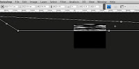
Now you will transform the channel to create the right cloud shape. It helps to choose the Full Screen Mode with Menu Bar screen mode because you will be stretching the channel far beyond the edges of the canvas. In Photoshop CS3 and earlier, you could make this change while you were transforming, but in CS4, you can't. You must switch modes before you transform. Thanks for the new feature, Adobe. Free Transform with Scale, Skew, Distort, and maybe even Perspective. What you want is to make it long and skinny. Skew the bottom corners closer together to give the illusion of the clouds' receding overhead. You will have to zoom way out to have enough room to work.

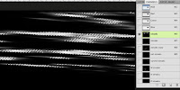
You should end up with something like this. It won't be exact, but that's the great thing about this method: you get random, natural results. You can also paint on the channel with a soft brush if you need more sky (black) or clouds (white). Now you want to load this channel as a selection. CMD+click (Mac) or CTRL+click (PC) the channel thumbnail or just click on the Load Channel as Selection icon. It's the leftmost one at the bottom of the Channels panel.

With the selection loaded, go back to your layers and create a new layer above your sky gradients. Fill it with an appropriate color. I chose a light Cool Grey from the Pantone solid coated library. It has a great selection of greys right in the middle of the colors. You can then move it around or transform it again if needed. I lowered its opacity to 70% and named the layer 'wispy.' I even added a layer mask with a gradient to simulate the density of the air around the clouds near the horizon. The will start to fade away, so a linear gradient on the mask does the trick. This mask also affects all layers clipped to this layer, so it's like having multiple masks!

It looks pretty good, but the clouds could use a little highlight. You could try using the Bevel & Emboss effect with the shadow turned down, but it doesn't always work well for clouds. A better option is to paint the highlights on another layer that uses the clouds layer as a clipping mask. Make a new layer directly above the wispy layer and OPT/ALT+click between the two. This will make the lower layer a clipping mask for all upper layers that are clipped to it. That means that the pixels on the bottom layer will act as a mask for the upper layers. Where the bottom layer is transparent, nothing will be seen on the upper layers, even if they they have opaque pixels there. It's exactly like loading a selection from the bottom layer's opacity and using that to make masks on the upper layers. But this way is much more flexible, plus the clipped layers inherit the opacity, blending mode, and layer effects of the bottom masking layer. On the W layer, I painted white with a soft scatter brush. Using a tablet and stylus like a Wacom is essential for this kind of work. Next we need some big, puffy Cumulus clouds, but that will take hand-painting with custom brushes and that's another tutorial. Stay tuned.

10 February 2010

Creating a sky gradient tutorial

The secret to getting realistic skies is to spend some time looking at sky photos to figure out what is really going on. I get to paint lots of skies with the work I do, so I have come up with a technique that seems to work and is easily repeatable. All skies require gradients, but the best way to do it is to put each color on its own layer. To do this, set your gradient to the foreground to transparent option. It's the gradient swatch just to the right of the top left one (foreground to background). This is the only gradient I use. In a moment, you'll see the control and flexibility this method will give you.

The next thing is to choose the right colors. First, always work in RGB mode, even if your image will end up being printed with the CMYK process. Photoshop works natively in RGB and some features don't work at all in CMYK. Getting consistent color is a tricky thing, going far beyond this simple tutorial. Just choosing colors at random from the Color Picker only adds to problem. What I do is choose colors from a Pantone library as much as I can. Click the Color Libraries button in the Color Picker. From here, you can choose the library you want. I use the Pantone solid coated library because it matches the PMS book I have. If I am working for print, I pick the PMS color based on the corresponding CMYK swatch in my book. This method may seem strange if you aren't working with spot colors, but it is a great way to keep consistent with your color and it gives you a nice range of dark to light to pick from. If your image will be printed, this method should give you less surprises with color.

Now the first thing to do is pick the major color of the sky. For this one, I chose PMS 646 and filled the bottom layer with it. A handy keyboard shortcut to fill with the foreground color is OPT+DEL(Mac) or ALT+Backspace(PC). To fill with the background color, do the same thing, except use CMD instead of OPT(Mac) or CTRL instead of ALT(PC). It's also a good idea to label each layer with the the color you used on it. That makes it easy to come back and make changes or pick the same color for something else. Then create a new layer above the solid color layer and use the gradient tool on it. Hold Shift while you drag up in order to get a perfectly vertical gradient. I chose 642, a lighter color from the same group as 646. Now, if it's not quite right, you have a lot of options. You could move the gradient on its own layer up or down, change its opacity, or even its blending mode. You could check the Lock transparent pixels option for that layer and fill it with an entirely new color. You can use as many gradient layers like this as you need to get just the right effect. For this sky, I used only three layers. Notice that I changed both the blending mode and opacity of the topmost layer. Skies always get lighter as they approach the horizon because you are looking through more atmosphere. That's why items in the distance look lighter and bluer. I often use a grey gradient on a layer in Screen mode on top of all the other sky gradients to simulate this effect near the horizon.

That's it! With this technique, you can create any sky you want, even sunsets, stormy, smoggy, and so on. A good practice is to get various sky photos and try to duplicate them. Add as many layers as you need. Use Multiply to darken and Screen to lighten. Next time, we'll tackle those clouds.

08 February 2010

Using vector art in Photoshop tutorial

As promised, here is a little tutorial on one technique I used for the Open Cell illustration: working with vector objects. The schematics were provided by the client as DWG files. The first thing to do is open them up in Illustrator. Often, CAD files like these will have labels, text, and other diagrams you don't need. If you need to, close any open paths and outline strokes if you want them. Select the shapes you do need with the Selection tool (that's the black arrow) and just do a Copy from the Edit menu. Go into Photoshop and Paste. You will get the Paste options dialog, asking if you want to paste as a Smart Object, Pixels, Path, or Shape Layer. Choose Shape Layer as it will give you a filled vector object on its own layer. This is the most editable way to bring Illustrator art in.

In this screenshot you will see several vector shape layers (also called Fill Layers) brought in this way. Only the paths from Illustrator will be pasted into Photoshop. You will lose all fills, strokes, or effects. The fill color of the new Shape Layer will be your current foreground color in Photoshop and you will only have one fill color per layer, even though it can have many separate paths. Remember that unlike Illustrator, Photoshop does not like open paths. You can easily change the color of the Shape layer by double-clicking on its color swatch, which opens up the color picker. What you really have here is a layer filled with that one color and the vector shapes are acting like masks. From here, you can edit the paths just as you would in Illustrator. You will find the same black arrow (now called the Path Selection tool) that allows you to select and move entire paths. If you need to, you can use the Direct Selection tool (the white arrow) to edit individual points and curves on your path. You can select, copy, paste, delete, and move paths around, all on one Shape Layer.

Create empty layers above your painting and use the Line tool on them to set up vanishing points. This image uses simple 2-point perspective. As you can see, the actual vanishing points are outside the canvas area of the image. Choose bright, fully saturated colors for your perspective lines, as they will stand out from your image. It helps to use different colors and layers for each dimension: height, width, and depth.

Now it's time to transform. Make sure the Shape Layer you want is selected and use the Free Transform tool (Cmd+T or Ctrl+T). Choose Skew if you need to move a point or line in just one direction or Distort if you need to do more. Since this is 2-point perspective and no sides will end up being horizontal or vertical, choose Distort. Move the points of the bounding box so that they match up with the intersections of your perspective lines. Once you have done that, you can choose Scale to move or size the shape into position by grabbing its sides. Right-clicking is a great way to access the menu with all of these transformations. You may be tempted to try the Perspective option, but don't; it's very limited. Also, don't grab and move your shape; you will lose the correct perspective you have set up. Always do it with Scale. When you are done, accept the transformation. What is great about this method is that since you are working with vector shapes, you can scale and distort as much as you want without losing any edge quality and Photoshop's Transform tools are much better and more precise than Illustrator's.

Once you have the top edge in place, it is easy to create the rest of the shape going down on a layer underneath it. You now have a complex shape receding in the distance with correct perspective that would not otherwise be possible in a 2D application. Since it is done with vector shapes, you have the best of both worlds: crisp, smooth edges and all the Photoshop options of blending modes, opacity, layer masks, clipping masks, layer effects, and so on. One more point to remember: if you have the Move tool selected, the transformations will be applied to the entire layer; that means all the paths on it. If you just want to transform individual paths on the Shape Layer, use the Path Selection tool to select the one(s) you want to transform first. Sadly, you can't transform paths on different layers at the same time.

My first illustration for the February tutorials

Every endeavor has to start somewhere. I chose to begin this blog with an image I did a few years ago. I felt it was quite successful and nailed all the points I was trying to hit. The purpose was to show the construction of an open cell sheet piling application. I work from photos as much as I can, but construction jobsite photos are usually not the nicest things to look at, so often my job is to make what is intrinsically dirty, muddy, and completely chaotic look cool and dramatic. It seemed to work this time.

I attended the NAPP's 2007 PhotoshopWorld in Boston and submitted this image for the Illustration category of their Guru awards. To my surprise, it was chosen as the winner that year. Even though a few years have gone by since I painted the image, it is still one of my favorites. The illustration was entirely hand-painted in Photoshop using many layers. The original size was 12.25"x9.25" at 300 ppi. Most of what you see was painted with a Wacom stylus and tablet with a limited assortment of brushes. In order to get the shape of the piling 'cells,' I started with an overhead CAD schematic provided by the client, brought it into Photoshop as a vector shape, then used Photoshop's great transform tools to skew it into the correct perspective. This was done for the top and bottom, which then served as a guide for the connecting pieces.

Click here to see a Flash animation that shows the developmental process.
Click here to see it as my featured project at the Directory of Illustration.