31 May 2010

Creating a bread loaf with vector shapes and Layer Styles tutorial

For the last step in this illustration, the table needs a loaf of bread sitting on it. Since the rest of the image was done with vector shapes and Layer Styles, the bread should be done in the same way to create a slightly stylized look and make it fit in with the rest of the image. Start out with the Pen tool to create a flat slice of bread. This can be done in either Illustrator or Photoshop; the result will be the same. To make a symmetrical shape like this, try making one half, then duplicate and mirror the shape. This is the best way to get the two sides to match up. In Photoshop, make a closed path on a new Shape layer. Select it with the Path Selection tool, duplicate it and transform the path, then Flip Horizontal. Move the two shapes together and with both selected, click the Combine button in the Options bar. Your shape should look about like this.

Duplicate this layer and transform the duplicate so that it matches up with your perspective lines. Then ALT/OPT drag with the Path Selection to make a copy of the shape on the same layer. Move it into position along the perspective lines, then use the Pen tool with the Add to shape area button selected to join the two profiles. This creates the overall loaf shape. You may want to round the far edge a bit, since it is not sliced. You can combine the shapes on this layer if you want. Double-click the Shape layer's color swatch and set it to PMS 4635. A dark brown Gradient Overlay in Multiply mode darkens the far edge of the loaf. Give it some Bevel and Emboss and a large Inner Glow of 464 in Multiply mode with a Noise of 7%. A dark Inner Shadow darkens the bottom edge of the bread where it's resting on the table. The line curving through the loaf is a new vector Shape layer created with the Pen tool and clipped to the main loaf layer. Give it a Fill of 0% so that only its Layer Styles are visible and Multiply Inner and Outer Glows as usual. A bit of Drop Shadow helps to bring it forward a bit. The highlight is an Inner Shadow. Use PMS 464 set to Screen mode with the Cone Contour. Set the Distance to 17 and the Size to 22 and give it a Noise of 11%.  The clipping mask of the bottom layer will hide all exterior effects that are outside the main loaf shape.

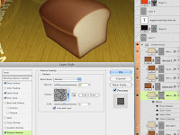
Make a new Shape layer with a copy of the transformed slice shape and use PMS 7501 as its color fill. Clip it to the bottom loaf layer. Give it a Drop Shadow of 4655 in Screen mode and high Distance and Size values to create a soft, light edge along the top of the loaf. The Inner Glow is 471 in Multiply mode with a Noise of 14%. Use Precise as the Technique to make it conform to the edge more closely. The high Noise value breaks up the edge and blends it into the lighter interior color. For the Pattern Overlay, use Wrinkles, a default Photoshop pattern, set to Overlay at 15% Opacity so that you just get the darks and lights.

To make the slice, start with a duplicate of the original flat bread slice profile. Transform it into position and use the same Layer Styles as on the parts of the loaf. You will need two layers: one in PMS 4635 for the thickness with the front and back slice shapes with a connecting path in-between, and one in 7501 for the lighter interior bread color. You can right+click on the main loaf and slice layers and select Copy Layer Style from their drop-down menus, then right+click on the new layers and choose Paste Layer Style. Clip the top slice layer to the bottom one.

Duplicate these two layers and offset them a bit for the second slice of bread. The drop shadow of the top slice on the bottom slice is created by making a new Shape layer from the bottom path of the top slice and clipping it to the bottom slice layer (on top of the 7501 layer). Then  you can give it a Drop Shadow and it will only show up over the bottom slice and not outside of its path. I hope you could follow all that; it sounded a bit confusing.

Now the bread is almost done. It looks good, but it appears to be floating above the table and we need it to look like it's actually sitting on it. You can't use a Drop Shadow or Outer Glow on the loaf and slice layers, because that would tend to make it look like it's a flat bread image floating in front of a vertical backdrop. So, create a new Shape layer underneath all the bread layers. Use the Pen tool to make a shape that corresponds with the base of the bread that's touching the table. You can select the bottom path from the bottom slice layer with the Path Selection tool, copy, then paste it on this bottom shadow layer. Use a small Drop Shadow in PMS 4485 in Multiply mode and a very large Outer Glow in 4495 and Multiply mode (of course). Now it looks like the bread is really sitting on the table and you are done. If only you could eat it!

19 May 2010

Making the table with vector shapes tutorial

Now it's time to build the table. This turned out to be kind of fun and it is a cool effect. This table is circular, so start with the Ellipse tool to make a Shape layer with PMS 4495. Hold down SHIFT to make a perfect circle. Then transform the circle with Perspective or Skew to make the far end look like it's receding in the distance. I created some perspective lines on a top layer to help out with this. The best way to do transformations like this is to use Full Screen Mode With Menu Bar so that you can work on transformation points outside of your image. You used to be able to switch screen modes back and forth while transforming, but with the release of Photoshop CS4, that feature is now gone for some reason. Thanks so much, Adobe.

Since the table has some thickness to it, we need to show a bit of the side. Use the Path Selection tool (black arrow), select the tabletop so that you see the vector path, then copy and paste. You won't see anything new, but a new vector shape has been pasted in place above the original on the same Shape layer. Nudge it down with the arrow key and then scale it down a bit. I am using my vertical perspective lines as a guide. You may also need to create a little piece to bridge the gap between the two circles. Make sure the layer is selected with the paths visible, choose the Pen tool, and click the Add to shape area button in the tool options. You need to make sure this new shape stays on this layer and doesn't make a new one.

The next step is to copy the tabletop to a new Shape layer. You can just duplicate the layer, select the paths you don't want on the new layer with the Path Selection tool, and delete them. Or you could Select the top circle, copy and paste the path, then choose Layer> New Fill Layer> Solid Color... This will make a new Shape layer using the path you just pasted. Choose the same fill color: 4495. What you want is the tabletop to be in exactly the same position on this new layer. Clip it to the bottom one. On the bottom layer that has the top and side shapes, add a Layer Style. I chose a standard Bevel and Emboss and used Inner Glow in Multiply mode with a dark brown. To show the edge of the table, use an Inner Shadow of 4495 in Multiply mode. Set the Angle to about 90ยบ. Taking the Size up will give you a softer edge, suggesting a more gradual turn at the corner. A crisper edge suggests a sharper, less rounded corner.  On the top layer, add an Inner Shadow, but choose a light color and select the Cone Contour to add a glint of highlight around the edge. I chose Color Dodge to give it that extra kick of specularity.  This is a great effect and I never get tired of how cool it looks.

The texture is the one part that has to be raster. I used two different wood photos: one with the grain and one with the plank edges to get just the look I wanted, which was a rustic table. The wood grain layer was set to Soft Light and the planks layer was set to Multiply at 20%. Transform them into position using the same perspective you used for the tabletop shape. You can SHIFT+select both layers to transform them at the same time. The last step is to load a selection from just the tabletop shape and create a layer mask on both texture layers. That way the texture doesn't extend down the side of the table. We'll take care of that in the next step.

Use a copy of the wood grain texture for the table's edge. Transform it into position using the bottom vanishing point. Don't worry about the plank lines; that would be too hard to match up with the photo texture. Use the Line tool to make another Shape layer with 1px vector lines. Hold down SHIFT to add lines to the same layer and pull them up from the vanishing point to meet the plank lines on the tabletop. For the final step, both of these layers need a mask that is the inverse of the mask on the tabletop layers. CMD(Mac)/CTRL(PC)+click the tabletop layer's mask to load it as a selection. Make sure you have one of the table side's layers selected and click the Add layer mask button. Now you have a mask, but it's the opposite of what you need. Open the Masks panel and click the Invert button. Pretty neat, huh? Do the same for the other side layer and you are done with the table.

For the text, I used Illustrator because of its nice Type on a Path tool. Create a circle in Illustrator and put the type along its path. Then convert the text to outlines, copy, and paste into Photoshop. Choose Shape Layer as your option. You might be tempted to choose Smart Object, but this is a vector Smart Object and you won't be able to use Skew or Perspective, so the Shape layer is the best way to go. Transform it into position just like you did for the tabletop shape and the wood textures. When the angles match up, scale it in a bit by pulling in the edges so that it's not right on the edge of the table.

The perspective is good, but the text looks like it's sort of floating above the table and we want to make it look like it's painted on. Change the Blend mode to Screen. That's better, but we really want the texture and gaps between the planks to show through. Double+click this layer and change the Blend If options of the Layer Style. This little-used option is really useful, but it's not obvious what it does. Blend If basically means "make transparent if." Grab the black slider of the underlying layer and move it to the right until the grain and gaps show through. What you are doing is making the text layer transparent over the darker areas of layers underneath it. The only problem is that the opacity is either 100% or 0% and we need a bit of fading. For what must be the most hidden feature of Photoshop, hold down ALT/OPT and drag the black slider a bit more. This splits the slider in two. The farther apart these two halves are, the softer the transition between opaque and transparent. How about that?

The last step is the reflection on the table to bring it all together. The more reflective a surface is, the sharper and stronger the reflection will be. For a diffuse surface, the reflection will be fainter and softer. Create a new layer in Multiply mode and add a black to transparent gradient. Add a layer mask, load selections from the chairs, transform the selections, and Flip Vertical. Move them around so that they match up where the chair reflections should be and fill the mask with black with the selection still active. The problem is that the reflection is too sharp and strong. In the past, you would need to fade your fill, then apply a Gaussian Blur to the mask, but these are permanent changes. However, with CS4 you have the Masks panel. Take the Density down to 25% and the Feather to 7px. What is cool is that you can come back and adjust these settings if the blur isn't right or if you need the effect of the mask to be more or less. I've been waiting for this feature for a long time, so it's great to finally see it implemented.

05 May 2010

Building the chairs with vector shapes tutorial

These shapes could be created in Illustrator, but the point of this tutorial is to see how easily you can do it in Photoshop. The first shape is simple; it's just a circle. Use the Ellipse tool to make a Shape layer. I chose PMS 483, which is the top in a great range of reds. This slick, rounded, slightly marbelized look comes all from Layer Styles. All the colors come from this range of 483-489. The Inner Glow uses a dark color in Multiply. The Gradient Overlay is a light color in Color Dodge. The texture is a Pattern Overlay using one of Photoshop's default patterns: Satin with a Scale of 1000% and a Blend mode of Overlay at 7%. This mode drops out midtone grey and keeps the dark and light. The little highlight along the beveled edge can easily be done with Inner Shadow set to Color Dodge and using the Cone Contour as shown.

The text in the black field can be done in Photoshop and transformed with a Warp mode, but for the curved text, Illustrator is a better choice for creating text on a path. Copy the curved text in Illustrator and paste it in Photoshop as a Smart Object. I don't usually recommend doing it this way, but you can double-click it and re-edit it in Illustrator, which will automatically update in Photoshop. This is handy with curved text, which often needs to be adjusted back and forth.

Now, for the chair hoops. Use the Rounded Rectangle tool with a huge radius, like 70 pixels or something. Make a very rounded rectangle in PMS 4485. Transform it with Perspective to taper the bottom end. You can also scale it at this point if you need. Then, select the path of the Shape layer with the Path Selection tool (the black arrow). Copy and paste it. You won't see anything new, but it's there. Transform the path and scale it down. You'll see the copied path inside the original one. When it looks good, accept the transformation and with the inner path still selected, click the Subtract from shape area option. Now the inner shape is cutting out a hole from the outer shape.

Hold down SHIFT and use the Line tool to add a thick line (which really is a tall, thin rectangle). Select it with the Path Selection tool and use Perspective to taper the top a bit. You can also skew it slightly. Then copy/paste or ALT/OPT + drag it to create some duplicates. When you have one half done, you can select them all, copy/paste, then mirror them horizontally to get the other half. make sure all these paths are on the same Shape layer. Then add some Layer Styles to give it some depth. The Inner Shadow really is a shadow this time and the Gradient Overlay is the default black and white set to Multiply mode. That way, the white goes transparent and you are just left with some darkening to suggest a shadow on the lower part of the chair back. Now, duplicate the layer, then select and delete the inner pieces so that you are left with just the hoop. Clip it to the bottom chair layer. Add an Inner Shadow with a light brown in Linear or Color Dodge, which gives shinier highlights than Screen. Use the Cone Contour and adjust the Distance so that this bright line is just on top of the dark Inner Shadow. Remember that this layer is inheriting the effects from the Clipping Mask layer, but it can have its own as well. This is how you can get more than one instance of the same effect. For the final touch, add a light wood texture to a layer above these two and clip it along with the rest. This one is Soft Light at 100%, but use the settings that work best for you.

Put all the chair layers into a layer group, then duplicate it. Transform the entire group with Skew, Rotate, and Scale as necessary to make other chairs. You may also need to adjust the Bevel and Emboss or Inner Shadow to give the side chairs more of a highlight or shadow edge. Don't worry about how the bottoms look; that will all get covered up by the table, which we will work on next.

03 May 2010

Stylized, vector-based illustration

For this month, I am showing an image that is a bit different than previous examples. This was done for a local client with a smaller budget. Because of the fact that this illustration had to function more like an icon or logo, I chose to go in a more stylized direction, relying on Layer Styles instead of painting. With one exception, this image is basically resolution independent. Sometimes, it's nice to have a different style that you can market. Some of it was done in Illustrator, but for this month's set of tutorials, we'll see just how far we can go with vector shapes in Photoshop.

Presenting Photoshop at NBAUG

The first of May, I made a presentation on some of the new features in Photoshop CS5 along with other SRJC instructors at the North Bay Adobe Users Group's big CS5 launch party. Instructors from the college each spoke about their areas of expertise in the new Adobe Creative Suite. I demo'd a little on the Content Aware Fill option on some tools, but mainly on the new Bristle brushes, which seek to emulate traditional paint media. As usual, new tools in Photoshop are a mixed bag for digital artists, so we'll have to see which ones end up being the most useful. But for the first time in a while. brushes have received some attention and the updated brush engine seems to work better.

I probably should have posted this before the event, but I may be back in the fall to present a more in-depth look at Photoshop's new tools, so stay tuned. If you are in the San Francisco North Bay, I recommend joining; it's free and easy. Read about it here.