As with skies, the best way to paint good clouds is to start by observing them. Keep a library of source photos. I'm not good enough to paint clouds out of my head, so I always use photos as reference. It also helps to be able to recognize the various cloud types. We'll begin with some thin clouds, maybe Cirrus or Stratus. They are often long and wispy, appearing near the horizon. To get this look, you can try the Clouds filter. It actually can make clouds, but you need to take a few steps that are not so obvious. I owe this technique to Jack Davis, as found in his incredible Photoshop WOW! books.
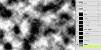
First, create a new alpha channel in the Channels panel (say that ten times fast). Make sure your foreground/background colors are the default black and white, and apply Filters>Render>Clouds. A little-known trick is to hold down the OPT or ALT key while doing this; it will give you greater densities of your foreground and background colors. This is what you want because you are working in an alpha channel. The blacks will be transparent and the whites will be opaque. In other words, you are building a selection. White will be 100% selected, black will be 0% selected (or deselected), and the greys will be the various strengths in-between, based on their brightness.
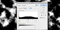
With this in mind, apply a Levels adjustment to the alpha channel. Click Image>Adjustments>Levels... Black will be your sky and white will be your clouds, so adjust it as you see fit. Move the black slider to the right to create more sky by increasing black. Move the white slider to the left to create denser clouds by increasing white. The grey slider adjust the value of midtones. The ratio of cloud to sky is up to you, but generally, you want more sky (black) for these kinds of clouds. The closer the sliders are to each other, the harder the edge of your clouds will be.
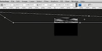
Now you will transform the channel to create the right cloud shape. It helps to choose the Full Screen Mode with Menu Bar screen mode because you will be stretching the channel far beyond the edges of the canvas. In Photoshop CS3 and earlier, you could make this change while you were transforming, but in CS4, you can't. You must switch modes before you transform. Thanks for the new feature, Adobe. Free Transform with Scale, Skew, Distort, and maybe even Perspective. What you want is to make it long and skinny. Skew the bottom corners closer together to give the illusion of the clouds' receding overhead. You will have to zoom way out to have enough room to work.
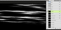
You should end up with something like this. It won't be exact, but that's the great thing about this method: you get random, natural results. You can also paint on the channel with a soft brush if you need more sky (black) or clouds (white). Now you want to load this channel as a selection. CMD+click (Mac) or CTRL+click (PC) the channel thumbnail or just click on the Load Channel as Selection icon. It's the leftmost one at the bottom of the Channels panel.
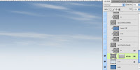
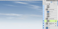
With the selection loaded, go back to your layers and create a new layer above your sky gradients. Fill it with an appropriate color. I chose a light Cool Grey from the Pantone solid coated library. It has a great selection of greys right in the middle of the colors. You can then move it around or transform it again if needed. I lowered its opacity to 70% and named the layer 'wispy.' I even added a layer mask with a gradient to simulate the density of the air around the clouds near the horizon. The will start to fade away, so a linear gradient on the mask does the trick. This mask also affects all layers clipped to this layer, so it's like having multiple masks!
It looks pretty good, but the clouds could use a little highlight. You could try using the Bevel & Emboss effect with the shadow turned down, but it doesn't always work well for clouds. A better option is to paint the highlights on another layer that uses the clouds layer as a clipping mask. Make a new layer directly above the wispy layer and OPT/ALT+click between the two. This will make the lower layer a clipping mask for all upper layers that are clipped to it. That means that the pixels on the bottom layer will act as a mask for the upper layers. Where the bottom layer is transparent, nothing will be seen on the upper layers, even if they they have opaque pixels there. It's exactly like loading a selection from the bottom layer's opacity and using that to make masks on the upper layers. But this way is much more flexible, plus the clipped layers inherit the opacity, blending mode, and layer effects of the bottom masking layer. On the W layer, I painted white with a soft scatter brush. Using a tablet and stylus like a Wacom is essential for this kind of work. Next we need some big, puffy Cumulus clouds, but that will take hand-painting with custom brushes and that's another tutorial. Stay tuned.



Hi Dan, thanks for the tutorial. I've done a lot of browsing for cloud tutorials and many of them are wonderful. However one thing that most of them have in common is in the use of some stock image. And while I don't see anything wrong with this method, I think it can be somewhat of a hindrance in that developing creative skills are made to rely on external assets. Did you ever get around to making the cumulus clouds tut?
ReplyDelete