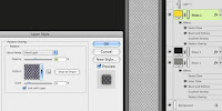
Next, we need to make the bump map. This is a greyscale image that gives the 3D program information about the relief or depth of the image surface. Our color texture looks good, but if it were applied to a 3D model, the result would be rather unrealistic. On the real item, the non-skid pattern sticks up from the rest of the yellow panel, the metal strips are a bit lower, and the seams or gaps would be even lower recesses. All of this detail could be built into the geometry of the model, but that would be time-consuming and the result would be a much more complex model.
 This detail can be simulated with a bump map. The grey values will give the 3D renderer this information; light values will be high and dark values will be low. So what we need is basically a greyscale version of our texture that is exactly the same size as the color version. But we also need to remove any unnecessary parts like the dirt or splotches. Turn off the Clouds layer. Disable the Pattern Overlay on the grey strips layer and the Gradient Overlay on the yellow layer. These details make the texture look better, but they are not part of its depth. Now, add an Adjustment layer to remove the color. You could use Black & White or Hue/Saturation and take the Saturation down to 0. This looks pretty good, but the non-skid texture is lacking in contrast. As it is now, these little bumps won’t stick up very far. With this pattern, changing its Blend mode to Hard Light, then lowering the Opacity to 40%, it looks about right. If necessary, you could use a Levels or Curves Adjustment layer to push the contrast a bit more, but this will work.
 Save this file as a new image and that’s it; your bump map is done. But before going to the time and trouble to do a full render from your 3D scene, you can use Photoshop to test it out. To do this, open up your original texture, Select All, Copy Merged, then Paste on a new layer. We need a flattened version of the texture for this technique. Now do the same thing to your bump map image. Go to the channels of your color map image, make a new Alpha channel, and Paste in the merged copy of your bump image.
Go back to the layers and click on the merged copy layer of the color texture. We’ll try a nifty trick with Photoshop’s lighting effects. Go to Filter >Render >Lighting Effects… Grab the light source and move it up and away from the image to get some more even lighting. Now for the important part: for Texture Channel, choose the new Alpha channel you just made. Make sure that White is high is checked. You may also want to move the Height value down somewhat from its default setting of 50.
Click OK and you see your texture lit with the Alpha channel acting as a bump map. The higher areas are catching more highlights and casting shadows on the lower areas. Your texture is no longer flat; it has some depth. It is becoming three-dimensional. This is similar to what your 3D program will be doing, but you can get a nice preview here in Photoshop to see if there are any problems. Check in next time as we start working with 3D geometry.


Very interesting, I have just written some InDesign Training top tips for CS5 and I hope you can find them useful, perhaps you could suggest a few more?
ReplyDeleteI use InDesign, but not for the really advanced stuff. This kind of thing is more of what I do.
ReplyDelete