28 December 2012

Photoshop, Resolution, and You

Resolution is a topic that is misunderstood by many, including some professional artists and designers. The problem lies in the fact that it can refer to different concepts: the number of pixels in a monitor’s display, the quality of a printer’s final output, and the amount of detail in a raster image that is prepared for printing. The last definition is what we want to cover here.

In this case, the issue of resolution only pertains to raster images that are to be printed, nothing else. It is common to think of resolution in terms of DPI, or dots per inch, but as we will see, this is incorrect. Photoshop has a command just to take care of this issue, Image Size. All images that are prepared for print should pass through this dialog box. It is divided into two sections: Pixel Dimensions and Document Size. A quick look at its options shows that resolution is connected to the printed (or document) size and is actually measured in PPI, or pixels per inch. Inches (or centimeters in most of the world) are a real world measurement and only apply to printing on paper. Monitors, mobile devices, and other screens measure increments in pixels, not inches. We often think of high resolution as 300 PPI and low resolution as 72 PPI. This is true, but remember that you only need to worry about it when printing. Since your monitor measures images in pixels and your printer measures in inches, you need to translate pixels to inches when printing. That’s where Resample Image comes in. Resample means to add or remove pixels. No matter what resolution an image has when you open it in Photoshop, you can change it here in Image Size. Uncheck Resample Image to lock the Pixel Dimensions. Only the print size changes; the number of pixels stays the same. Therefore, resolution is relative. Using Photoshop, you can adjust it to what you need. Just make sure you have a large number of pixels to start with.

It is a common misconception that you need to work in 72 PPI on images for web. The truth is that browsers, monitors, and other screen devices don’t use resolution because they don’t see inches. You can work in whatever resolution you want; just keep the pixel size in mind. It is actually a good idea to work larger than your final image because you have more detail to work with. You can even work in high resolution or print size. To make the final web image, the best way is to use Save for Web. With this dialog box, you can choose the format you need, adjust compression (if applicable), and resize the image. Notice that here there is no resolution, only pixel dimensions. No matter what resolution your image has, if you make a JPG, PNG, or GIF with Save for Web, then open that image up, its resolution will default to 72 PPI.

With these few points in mind, the mystery surrounding resolution can finally be solved. Just remember, you only need it when going to print. For the web, think in pixels and you’ll be fine.

26 December 2012

What's new at the end of the year

Classes are over and I'm in the middle of grading projects, working on my own, and looking for more work. I'm also preparing to recertify in the latest version of Photoshop, CS6. This has never been my favorite thing to do and I have three tests to take if I want to keep current with Adobe. When I do (hopefully) pass, maybe I'll have to change the name of this blog. I'm still on CS5, which is fine for the kind of work I do. Not all of the additions are that useful, but I am looking forward to some of them. Here are some changes in CS6 that are small, but very nice. Oddly enough, they aren't getting much attention by Adobe or the experts:
  • Masks can now be feathered by tenths of a pixel, for example 1.3 px. Very helpful and needed.
  • Vector masks can now be feathered. Very cool!
  • With a selection active, the Background layer is automatically converted to a regular layer when you add a mask; it saves you a step.
  • Layer effects can now be applied to groups. Extremely cool!
  • Layer groups can now act as clipping masks. Even cooler!
I was contacted by a website a while ago to write some Photoshop articles for them. They were even offering money. That sounded good, so I thought up a few topics and submitted them. After getting approval, I wrote two articles and sent them off. After a long wait, they finally told me it wasn't what they were looking for. Nice. So rather than have them go to waste, I will be offering them in my next posts free for everyone to enjoy. I hope they are useful. Merry belated Christmas.

12 December 2012

Fun Photoshop projects

I've been doing a few little projects for the past few days. Some of them were inspired by things some of my students were doing for class projects. This first one is based on the usual Photoshop miniature effect. I was showing some examples to a friend of mine who had never seen them before. As I was looking at them again, I thought that what they need is a hand coming down to really complete the miniature look. It would be funny to see a hand placing what is supposed to be a miniature car or person into the scene. To me, it seems like that's what these images are missing. We also thought that having a little plane suspended on wires from the top would be funny as well. Anyway, here is my version and the original photos I used. What do you think?

07 December 2012

The illustration is completed (I hope)

Well, I think I finally have it. All the changes are taken care of and I went through and fixed little areas that had been bothering me. As you can see, the main foreground pipe is now green, whereas it had previously been white. Before that, it was green, and it started out white, so I hope this is it. This image is an example of what happens when clients have too much input into the final result. There is only so much that can reasonably be squeezed into one image.

Personally, I was a bit happier with some earlier versions of the illustration.  The problem is that images are created to fit into the scene in specific locations to match the overall perspective. It's hard to do much moving around and keep things looking correct. Also, since I am really the worker there, I have my beard. However, the client wasn't very comfortable with it, so it had to go. Too sinister, I guess. Anyway, I like the final more than I thought I would, but I think I prefer this version.

03 December 2012

I'm still on this image and I thought I would be done by now. Sometimes it goes this way. Obviously, the clients aren't too worried about the deadline, because they keep asking for changes to the final, even on parts that were approved. Things that I thought were done are getting revisited. This can be frustrating, but things that look okay on a rough comp may not look as good in the final version. It is pretty close, so it shouldn't be too much longer. 

By the way, the guy in the front is me. The client didn't provide any source material, so I got to dress up and be my own model.

21 November 2012

Progress on the illustration

It has been a while, but I'm still on this job. I actually took some time off during Thanksgiving week (not to rest, but to work on another project). Some differences are evident. The refinery is shifted over to the edge more and the offshore platform is smaller and more in the distance. A ship laying pipe is now more prominent, and there is an attempt to show a network of pipes underwater, but I'm not sure how successful it is. The final client made some unexpected late changes that made much of the work I had already done unnecessary. This kind of thing doesn't usually happen, but if it does, it should bring with it an increase in the final fee and an extension of the deadline. As it was, I spent about an extra day changing things to meet the new request, but that doesn't count the time spent on parts of the image that are now cropped out. Remember that darn refinery?

12 November 2012

The refinery is done

Well, this part is done, finally. The major structures are finished and little details are painted in. I even used some atmospheric perspective to knock it back in the distance a bit, so the foreground objects stand out. I hope I don't have to paint something like this again. Too much work for something that really is just background filler. I probably should have figured out a quicker way to do this. But at least it looks cool, right?

11 November 2012

Working on the whole image

Here you can see a view of the entire image. I'm working at 300 PPI and the size is 12"x9." It's a pretty big image, but the complexity of the refinery portion really bogs Photoshop down. I'm using lots of vector Shape layers to create the tangles system of pipes and structural elements. Also included is a detailed shot of the refinery itself. Because the view is from overhead, I'm using 3-point perspective. A separate Shape layer contains thin vector lines going to each vanishing point. Because they are comprised of vectors, I can reposition them as I need. All I can say is that painting a refinery (or whatever this is) is a lot harder and more time-consuming than I had expected. This part of the illustration may end up taking the most time, but ironically, it's not really that important. It just hast to be there. The important stuff will be in the foreground and is yet to be done.

10 November 2012

New illustration

Well, I'm back to work on a big project. As is not too uncommon, it's probably a bit too big for the time and budget allowed. Here is a detail. I'll post more as it goes along. Yes, it's another offshore platform. They can be fun to do, but I didn't have great source photos for this one and I was trying to hurry the project along, so it's a bit loose. I like how it turned out, but I had to change some color and details on request of the client. Sometimes the final can't look too much like the source material. I'm posting this version because I like it better. If you are curious as to how it's done, I have already posted a tutorial on the last offshore platform image I did. The same techniques apply here, so you can just refer back to it.

09 November 2012

What's going on now

Just a quick note to let everyone know what I've been up to lately. Last month, I started doing some work for Cogent Legal in Oakland, a firm specializing in graphics and animation for litigation. I worked on one project, but since someone is always suing someone else, let's hope that more come in! I also was interviewed for a podcast about photography and digital editing. When the interview is online, I will post a link.

02 October 2012

New bridge illustration

Much of my time lately has been taken up with teaching for the College of Marin in Novato and Napa Valley College in Napa, but I do have some time for freelance work. For the past few weeks, I've been trying to finish up a new digital painting of the Ambassador Bridge that connects Detroit, Michigan with Windsor in Canada. This was a challenging illustration because of the size of the image, all of the detail it needed, and the lack of good source material for the entire scene. Unlike many bridge 'portraits' I have done in the past, this one is really in the background and the surrounding landscape and buildings have more emphasis. It's not as detailed as I would have liked, so out of necessity it ended up being a bit looser than many of my other images.

Click here for a larger, full-length image.

13 July 2012

What I'm doing now

It has been a while since my last post, so I thought I should give everyone an update. Unusual for me, I am not teaching this summer. State budgetary problems may have something to do with that. So I am concentrating on freelance and self promotion. I also figured it was time to gain some new skills, so I am currently taking an online class in Nuke. This program is node-based compositing software often used for special effects in the film industry, which is something I am very interested in, especially for matte painting. It's very complicated, but it can do some amazing things.

20 June 2012

Winner in an art contest

Recently, I entered a few images of mine at Anything Goes, the latest art competition at Exhibitions Without Walls. To my surprise, one of them was picked as best in show. Another surprise was the image that was chosen (the cow at the left). The original image was done as part of a promotional piece for Ninetimes, and I adapted it for the show. I do like it, but I never thought it was one of my best illustrations. However, I guess it fit the theme of the contest better than other images I submitted. Anyway, it's nice to win something again. I'm trying to promote myself more to new markets, so maybe this will help. I just hope they like diving cows.

21 May 2012

Recent work

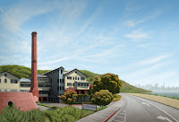
You may have noticed that I've been absent from the blog for a while. It's because the last month or so has been quite busy for me. As classes get near the end of the semester, there is a lot for me to do to get ready for finals. Also, I took on an onsite contract at a firm in the Bay Area specializing in legal graphics and animation that took all my 'free' time. They recently moved their office location and I created a digital illustration for the front of their mailer to inform clients of the new address. Here is that image. It's a straightforward illustration of the historic building that houses the new offices, but some details have been simplified and its position relative to San Francisco has been fudged a bit, so it becomes a bit conceptual.

06 April 2012

New large illustration

Another exhibit image has come my way. This one was not as large as some I've done, but it was quite complex and quickly zoomed up to over 2 Gb. My time was running out as the deadline quickly approached, so I had to cut some corners near the end and leave out a few details. The day before it was due, I stayed up all night trying to get everything finished on time. I ended up being awake for 41 hours straight those two days, but I wasn't working on this illustration the entire time. I also had to go out and teach a few classes, then I went to San Francisco for a concert after the image had been sent off. Still, it was a grueling process and I'm glad it's over. I kind of like the image though, after all that.

03 April 2012

New class last weekend

I taught a digital illustration class at the BAVC last weekend. It was all day Saturday and Sunday and I think the students learned a lot and had a good time. I'm working on updating the handout I give them, so when I do, I'll put a link to it here. I'm also working on putting together a new tutorial to share and I have some upcoming news, so stay tuned for more.

28 February 2012

New magazine cover assignment

Recently, I was contacted by Foreign Policy and offered a job illustrating the cover of their upcoming March/April issue. It was a quick turnaround, but the money was good and it seemed like a good opportunity. This is the first time I've been contacted by a publication like this directly, so that is nice. The image was pretty straightforward, so I just needed to do an accurate rendering and try and make it look cool. Along the way, I learned a bit about UAVs and Hellfire missiles. This particular UAV is a Reaper.

15 February 2012

Sample file for the Photoshop class

For tonight, we are going to try some cool stuff. You may need a sample file to start with, so here it is. Click on it to get the fullsize version, then download it.

23 January 2012

Teaching this semester

Spring semester has started and I am teaching once again. In addition to teaching Flash and related courses at Santa Rosa Junior College, I also began teaching at Napa Valley College. This is a Digital Art class, DART 130, using Photoshop. Students in this class should download this image for their first assignment, Creating a Face using Selection tools.


Homework is due on 30 January.

20 January 2012

Read my interview

Happy 2012! I've got some new stuff planned for this year. Recently, I was given a set of interview questions from the website Exhibitions without Walls, the same site that had me as one of their judges in their last competition. The questions were thought provoking and commercial artists just starting out might find some helpful info.

Click here to read the interview.