
I have painted water by hand before, and I have also used a combination of filters to try and get a water effect. Both have their place, but usually neither one looks realistic enough and both can be time consuming. For this water, we will start with a photo.

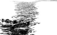
This is the photo of water that I chose. It has a nice expanse of empty ocean. I don't want to just use it as is, but it can help to create some nice photo-based textures. What we need is a selection made from the highlight areas of the water. The best way to make selections from photos is procedurally, with the channels. See which one has the most contrast between the lighter wave tops and the darker areas. In this case, that turned out to be the green channel.
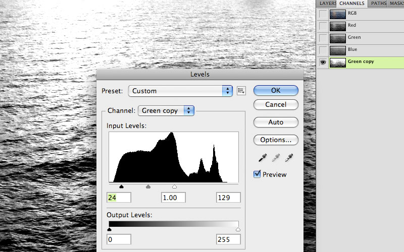
Duplicate the channel and apply a Levels command. Pull in the highlight and shadow sliders to increase the contrast so that the tops of the waves turn white and the shadow areas turn black. Then, load a selection of the alpha channel by CMD (Mac)/CTRL (PC)+clicking its thumbnail.

 With the selection active, create a new layer on the illustration and fill it with PMS 291. Change the Blend mode to Screen and the Opacity to 50%. Clip it to the 5395 Shape layer. The result looks pretty good, but in this photo, the sun's reflection on the water was blown out and is now a solid color. It needs some shadow areas to make it blend in with the rest of the water surface. This is best handled with a mask. Add a mask to this layer and paint black wave shapes back in with a small brush. Try to mimic the surrounding water texture. Incidentally, the lightest part of the water faces upward to reflect the sky. That's why it's blue. The darker part faces more to the side and can contain more colors like green and brown. That's because you are looking through the water and seeing what's below.

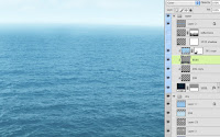 To add some shadows back into the water, look at the photo's channels again and see which one has the most contrast in the darker areas. This time, it was the blue channel. Duplicate it and Invert it so that you have a negative image. Now, perform the same kind of Levels adjustment to get enough contrast and make a selection. Make a new layer under the highlights layer and with the selection active, fill it with 296. Change the layer's Blend mode to Multiply. If it isn't dark enough (mine wasn't) you can always duplicate the layer. Make a new layer in Color mode and add a foreground-to-transparent gradient of PMS 5535. This will add a nice touch of green as the water gets closer. To finish things off, make a new layer above the highlights. Make sure it is not clipped along with the rest and change its Blend mode to Screen. Put a Reflected gradient of medium blue to transparent along the horizon to really fade it into the distance. Lower the Opacity if you like and that's it! You've got a great ocean that's not quite a photo and it didn't take all day to paint.

 With the selection active, create a new layer on the illustration and fill it with PMS 291. Change the Blend mode to Screen and the Opacity to 50%. Clip it to the 5395 Shape layer. The result looks pretty good, but in this photo, the sun's reflection on the water was blown out and is now a solid color. It needs some shadow areas to make it blend in with the rest of the water surface. This is best handled with a mask. Add a mask to this layer and paint black wave shapes back in with a small brush. Try to mimic the surrounding water texture. Incidentally, the lightest part of the water faces upward to reflect the sky. That's why it's blue. The darker part faces more to the side and can contain more colors like green and brown. That's because you are looking through the water and seeing what's below.
 To add some shadows back into the water, look at the photo's channels again and see which one has the most contrast in the darker areas. This time, it was the blue channel. Duplicate it and Invert it so that you have a negative image. Now, perform the same kind of Levels adjustment to get enough contrast and make a selection. Make a new layer under the highlights layer and with the selection active, fill it with 296. Change the layer's Blend mode to Multiply. If it isn't dark enough (mine wasn't) you can always duplicate the layer. Make a new layer in Color mode and add a foreground-to-transparent gradient of PMS 5535. This will add a nice touch of green as the water gets closer. To finish things off, make a new layer above the highlights. Make sure it is not clipped along with the rest and change its Blend mode to Screen. Put a Reflected gradient of medium blue to transparent along the horizon to really fade it into the distance. Lower the Opacity if you like and that's it! You've got a great ocean that's not quite a photo and it didn't take all day to paint.


No comments:
Post a Comment