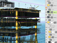
It's time to start thinking about perspective. Actually, perspective needs to be taken into account when starting the illustration. For architectural subjects, having accurate vanishing points is crucial. The Line tool is an obvious choice, but try using it to make a vector Shape layer. That way, you can extend the ends far beyond the canvas size of the image. You can also reposition them once they are down. I like to use a different layer and color for each dimension. Remember that parallel lines converge at the horizon.
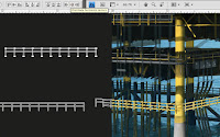 Most of the necessary detail consists of pipes, beams, girders, and so on. As on the other parts of the base, use the Line tool in varying weights to make vector shapes. Use PMS 447 for these ones and then paint on a clipped layer. Follow the vanishing point lines as guides and move them as needed. For railings that have evenly-spaced vertical pieces, create them straight on with the Line tool. Hold down Shift as you make the lines so that they will be perfectly vertical or horizontal. With the Path Selection tool, select all the vertical bars, then use the Distribute horizontal centers button to space them out evenly. Duplicate these shapes by ALT (PC)/OPT (Mac) + dragging them or just Copy and Paste. If you like, click the Combine button to join all the shapes into one compound path. Transform the duplicates using Skew so that they match up with the perspective lines. Not only do the horizontal lines converge, but the vertical ones get smaller and closer together as they recede into the distance. How cool is that? The only way to efficiently do this is with Shape layers. Aren't they great?
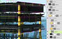
Keep building up the different parts of the platform. So far, the only colors you need for the Shape layers are 123 for the yellow and 447 for the grey. Use the Line, Rectangle, and maybe the Pen tools to make the shapes. For this image, Layer Styles are minimal; most of the detail comes from painting. You can see that the painted details are really loose. Just suggesting the details they represent will be enough. Organize related sections of the oil rig into Layer Groups to keep things tidy. Naming and color coding them helps, too.
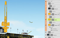
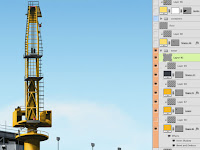 For this corner tower, these same simple Shape tools will do the job, except this one also requires the Ellipse. Just eyeballing it should do okay. When you break it down, there's not much to it. Hold down Shift to add paths to the current Shape layer. Here you can see the three Shape layers that combine to make the basic shapes of the tower. Since its color is a bit more orange than the rest of the rig, use PMS 1235. Each shape layer has a layer with painted details clipped to it. For the final details, you can paint those on a new layer on top of it all. Painting them instead of building them with vector shapes will be okay, because it allows you to work a little more freely. To make these thin lines, use a small, simple brush and a mouse. This is one instance where a stylus isn't the preferred tool. Click with the Brush on a starting point, then Shift + click on the end and you get a perfectly straight line between the two points.
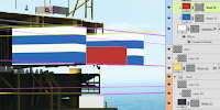
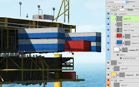 This rig has some cargo containers mounted on the side. These are basically big boxes, so you can make them with the Rectangle tool. Use the vanishing point lines as guides. Create the main shapes as vector Shape layers in white and add a black Gradient Overlay in Multiply mode with very low Opacity. Create the blue and red shapes as separate Shape layers using the same techniques and clip them to the white base layer. Now to texture them. The containers are made of corrugated metal, so they will need a pattern of light and dark vertical lines. This pattern is in a layer in Luminosity mode and low Opacity and clipped along with the rest of the layers. You could probably also do this with a Pattern Overlay. Create a new layer to paint in some dark details like streaks, dirt, and grime, then create another new layer in Multiply mode for the shadows and paint them with PMS 296. Adjust the Opacity as needed. As you can see, all these layers are using the bottom Shape layer as a clipping mask. Where would I be without this technique?



No comments:
Post a Comment