12 November 2010

Adding building details and signage (2 of 4)

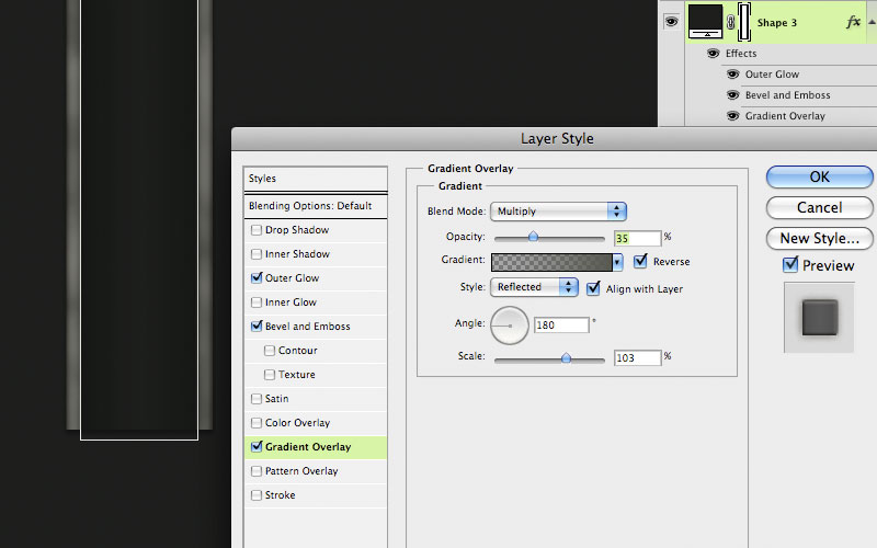
Upon closer inspection of the photo, some lines or seams become visible. To make these, use the Line tool to make a new vector Shape layer. Set the Weight to 1 pixel and use Warm Grey 11. Hold down Shift to add additional lines to the same layer and constrain them vertically or horizontally. For their effects, you can copy them from the windows layer. Right+click on that layer and choose Copy Layer Style, then right+click on this lines layer and choose Paste Layer Style. All we need here are the Outer Glow and Bevel and Emboss, so turn off the other styles. Lower the layer's Fill to 40%, make sure the lines layer is using the main building layer as a clipping mask, and they're done.

For the doors and display windows, use the Rectangle tool to make a new Shape layer. Use PMS 419. Since there are only two sizes of rectangles, make one of each, select them with the Path Selection tool, then duplicate them and slide them over. Line them up with your guides or select them all and click the Distribute horizontal centers button to space them out evenly. Copy, then Paste the Layer Style from the lines to this layer.

To make the signs attached to the building, use the Type tool. I don't know for sure the typeface that Louis Vuitton uses for their logo, but Century Gothic regular looked like a close match. It needs a dark Outer Glow, similar to what is on the lines and windows. It also needs a bit of Drop Shadow. Set the Size to 0 so that it is nice and sharp. A hint of Bevel and Emboss will help out as well, but it needs to be very small. As you can see, you can set the Size to 0 and there is still a bit there. For the illuminated signs, use the same typeface, but this time in bold. Give them a bit of Outer Glow, this time in the default Screen mode. A little Inner Shadow gives them a look that matches the photo.

Century Gothic also seemed to match the Macy's logo. Use PMS 4515. We need to make this sign look like it's metallic, shiny, and standing out from the building wall a bit. Layer Styles should do that for us. Use the Drop Shadow settings as shown. Taking the Spread up to 100% will keep the edge sharp, so if you take the Size up a bit, the shadow widens out and attaches better to the shape. Just like the other elements, this sign needs a dark Outer Glow and a little bit of Bevel and Emboss. For the shiny, metallic look, use a Gradient Overlay. Try a light Cool Grey in Color Dodge as shown. It looks pretty good, so I'd say this part is done. What's really cool about what we have done so far is that since it's all done with vector shapes and Layer Styles, this image is pretty much resolution independent. If you use Image Size to scale the image up and make sure the Scale Styles option is checked, everything should be fine. 

10 November 2010

Building with shapes (1 of 4)

To start out, we'll need a photo of the building; this isn't the kind of stuff you can just make up. For this project, we'll use the corner Macy's building. The photo isn't great quality, but it will do. The first thing to do is to Transform the photo so that all the lines are horizontal and vertical, at least as much as is possible. Guides will really help out with this task. In fact, you will probably need lots of them before this image is done. I have been ridiculed by co-workers for the amount of guides I use, but in cases like this, they are really important.

Start by using the Rectangle tool to make a vector Shape layer with Warm Grey 3. You can build it right on top of the photo. Try to work in increments of 10, 20, 50, 100, and so on. It will make things easier later on. Much of the work here is going to be done with Layer Styles. As you can see, I am using a lot here, much like I have done on earlier projects. There is a grey Inner Glow in Multiply mode, a subtle Gradient Overlay in Multiply mode to darken the bottom half of the building, a small Bevel and Emboss, a Pattern Overlay of just thin lines that make a grid, but the surprise here is the Drop Shadow. It's being used to create a bit of the side of the building. If the Size is set to 0, the Blend mode to Normal, and the Opacity to 100%, you get a nice hard edge. Since this view will be from the bottom and the right, adjust the Angle so you can see the bottom and right edges.

If you are wondering how to make the holes at the top, use the Rectangle tool again, make sure the Shape layer is selected and the path visible, then hold down ALT/OPT. You should see a little minus sign (-) next to your cursor. Make a small rectangle and presto! You have cut a hole out of the building. Use the Path Selection tool (that's the black arrow) to select the rectangle. You can either Copy and Paste it, or you can ALT/OPT + drag it to make a copy. When you have all the holes you need, select them all with the Path Selection tool, then use Photoshop's Align and Distribute buttons to align all these small rectangles to the same baseline and distribute their horizontal centers. What could be easier?

To add a bit more texture to the wall's surface, make a new layer and clip it to the vector Shape layer. Fill it with a color; any color will do. Take the Fill down to 0%, then add some kind of brick Pattern Overlay. I chose one that has randomly-sized bricks. Experiment with Opacity and Blend mode until it looks good. The idea here is just to add a subtle hint of texture.

For the windows, use the Rectangle again with PMS Black 4. Hold down Shift to make a square. Make the duplicates and align them in the same way you did the holes at the top. Once you have the top row in, click the Combine button to make them a compound path. Now you can easily select the row of windows as one element. Make the duplicate rows. For architectural images, it's crucial to keep things perfectly centered and aligned. Make sure the margin to the left and right edges of the buildings is the same. Using the guides becomes almost necessary at this point. For the taller windows at the bottom, you can Scale them vertically. Now, it's time for the effects. That will really pull things together. Dark Inner and Outer Glows in Multiply mode should be standard. A small outer Bevel and Emboss helps to inset the windows a bit, but the real surprise is a 2-pixel inner Stroke in Black 4 to suggest a bit of the frame. To top it off, add a cool grey foreground-to-transparent Gradient Overlay from the upper left in Screen mode to show a bit of sky reflection. Make sure this window layer is not clipped to the main building shape layer; it will need to act as a clipping mask for other layers later on.

This is a good start, but now we need to work on the details. Tune in next time for that.

09 November 2010

More advanced archtectural textures tutorial

This month, we will work on a project that shares some techniques with the previous one. Making building textures is very useful for both implementing into 2D illustrations and texturing 3D models. Here is a detail of a very large illustration I did a while back of Union Square in San Francisco. Even though most of the buildings are in some sort of a foreshortened view in perspective, they need to be created straight-on with parallel lines and right angles. In the next post, we'll begin this tutorial on how to make building textures. Our primary tools will be vector Shape layers and Layer Styles.

08 November 2010

My student work

Last month I visited my alma mater, BYU, to speak to the illustration students. I talked about my time there, then shared my student work with them. It's interesting to see how different my work was then, compared to work as a professional. What I liked doing then and what I thought I would do after school are nothing like what I ended up doing. I think that's probably not that unusual.

If you are curious about what I was doing as an illustration student, you can download a screen-res PDF that I showed to the BYU students. It has some of my best or most interesting student work, along with my musings about working on the pieces.

Click here to download the PDF.

26 October 2010

Texture-mapping the 3D model (3 of 3)

If you want, you can make a specular map as well. Just like the bump map, this is a greyscale image, but this time it controls shininess. The lighter parts will be shiny and the darker areas less so. Start with the color image and add Adjustment layers to remove the color and increase the contrast. Save it as a separate file.

Now it's time to go into a 3D program. I am using Cinema 4D, but you can use Maya, 3D Studio, or just about any other. Make a cube primitive. Since the images are 200x1000 pixels, it will work best to make the X and Z dimensions of the cube that same ratio. Lower the Y value or height so that the shape is a thin slab. It's also a good idea to add just a bit of a fillet to the edges. Nothing in real life has the perfectly sharp corners of a default 3D primitive; there is always some bevel or rounding. Create a new material and load the color, bump, and specular maps into the appropriate channels. For this model, a cubic projection is the best way to apply the texture. I won't go into detail here because each program is different.

Your main decision here will be to adjust the amount on the bump map. You may need to do some test renders until you get the right look. Add some lights and any other effects you want, like Global Illumination or Ambient Occlusion. I used AO here. For a long strip, scale the cube along the Z axis and make sure the texture is set to tile.  Render out your scene and there you have it: a nicely textured 3D model. You see, 3D isn't so hard after all.

23 October 2010

Making the bump map (2 of 3)

Next, we need to make the bump map. This is a greyscale image that gives the 3D program information about the relief or depth of the image surface. Our color texture looks good, but if it were applied to a 3D model, the result would be rather unrealistic. On the real item, the non-skid pattern sticks up from the rest of the yellow panel, the metal strips are a bit lower, and the seams or gaps would be even lower recesses. All of this detail could be built into the geometry of the model, but that would be time-consuming and the result would be a much more complex model.  

This detail can be simulated with a bump map. The grey values will give the 3D renderer this information; light values will be high and dark values will be low. So what we need is basically a greyscale version of our texture that is exactly the same size as the color version. But we also need to remove any unnecessary parts like the dirt or splotches. Turn off the Clouds layer. Disable the Pattern Overlay on the grey strips layer and the Gradient Overlay on the yellow layer. These details make the texture look better, but they are not part of its depth. Now, add an Adjustment layer to remove the color. You could use Black & White or Hue/Saturation and take the Saturation down to 0. This looks pretty good, but the non-skid texture is lacking in contrast. As it is now, these little bumps won’t stick up very far. With this pattern, changing its Blend mode to Hard Light, then lowering the Opacity to 40%, it looks about right. If necessary, you could use a Levels or Curves Adjustment layer to push the contrast a bit more, but this will work. 

Save this file as a new image and that’s it; your bump map is done. But before going to the time and trouble to do a full render from your 3D scene, you can use Photoshop to test it out. To do this, open up your original texture, Select All, Copy Merged, then Paste on a new layer. We need a flattened version of the texture for this technique. Now do the same thing to your bump map image. Go to the channels of your color map image, make a new Alpha channel, and Paste in the merged copy of your bump image. 

Go back to the layers and click on the merged copy layer of the color texture. We’ll try a nifty trick with Photoshop’s lighting effects. Go to Filter >Render >Lighting Effects… Grab the light source and move it up and away from the image to get some more even lighting. Now for the important part: for Texture Channel, choose the new Alpha channel you just made. Make sure that White is high is checked. You may also want to move the Height value down somewhat from its default setting of 50. 

Click OK and you see your texture lit with the Alpha channel acting as a bump map. The higher areas are catching more highlights and casting shadows on the lower areas. Your texture is no longer flat; it has some depth. It is becoming three-dimensional. This is similar to what your 3D program will be doing, but you can get a nice preview here in Photoshop to see if there are any problems. Check in next time as we start working with 3D geometry.

20 October 2010

Making the color map (1 of 3)

The first part we will work on is the color map. This image will provide the overall color of the 3D object. Texture maps have many different properties in the 3D program; this one will be called color or maybe diffuse, depending on the program you use. 

When creating the image in Photoshop, work in pixels, not inches. And don't worry about resolution; all the 3D program will see is pixels. Resolution only matters when you are going to print your image. Another thing to be sure of is that you are working in the sRGB color space, as opposed to Adobe RBG (1998), which is designed more for print. How large should you make your image? That all depends on what size it will be in your final rendered scene or animation. A good rule of thumb is to estimate the final size in pixels, then work at 150% or 200% of that size in Photoshop.

This image is at 200x1000 pixels. That's probably much larger than is necessary, but there is no problem working big and it will make our job in Photoshop easier than if it were a tiny image. To start out, use the Rectangle tool and make a vector Shape layer using PMS 416. Even though the final will get rasterized on the 3D geometry, working with vectors is a great way to work in Photoshop because they are so flexible and editable. You can also easily extend them beyond the canvas so that layer effects don't stop at the edge of the image. This shape will be the dull metal strips on the sides. To make things look used and grimy, add some effects like a dark Inner Glow in Multiply mode and maybe Bevel and Emboss. A Pattern Overlay will work here as well, in this case, Photoshop's default Clouds pattern is useful. Take the Scale up and set its Blend mode to Multiply, so we get a nice, dark, splotchy texture.

Next, we will create the channel in the middle that the non-skid strip will fit into. Make another vector rectangle on a new Shape layer, this time with PMS 419. As before, extend the top and bottom past the canvas size of the image. This is because this texture needs to tile vertically. Add some dark Outer Glow and a Bevel and Emboss. Give it a Gradient Overlay with the settings shown here. The idea is to darken the edges a bit.

For the yellow part, make a new vector rectangle using PMS 108. Extend it past the canvas on the top, but not the bottom. Select it with the Path Selection tool, then Copy and Paste. Move your second rectangle down so that there is a little gap between the two. Now you have two non-skid panels. They will need the same Outer Glow, Gradient Overlay, and Bevel and Emboss as the other layers. In fact, you could just Copy and Paste the Layer Styles to save time. But this one needs a stamped metal texture or something similar like this. If you don't have a pattern like this, it should be easy enough to find on the web. Scale it down to the right size and set the Blend mode to Overlay. That way, you get the lights and darks of the texture, but the midtone values drop away. Now we are starting to get somewhere.

It looks good, but the problem is that it's a bit too clean. The trick with computer graphics is to make things look scuffed, used, and dirty. To get the look of dirt stuck in the recessed areas, make a new layer, set your foreground/background colors to the default black and white, then apply the Clouds filter. Change the Blend mode to Multiply and lower the Opacity if needed. Then, clip it to the non-skid panel's layer so that the vector rectangle becomes its Clipping Mask. Now the non-skid texture appears on top of the Clouds texture and it looks like there is dirt in the crevasses. It's done! Next time, we will make the bump map.